
I am continuing on my path to gain digitizing skills! What better time to work on an applique design than near Valentine's Day, where "cute" and "punny" are everywhere and expected!
For embroidery digitizing, I use Embrilliance Stitch Artist. Stitch Artist allows me to import an image to use as a reference over which I draw lines and add stitches. In this post, I show you my initial effort as well as each test stitch and what I figured out. I show them as "errors" but that is not as negative as it sounds: I learn from my errors when I figure out how to fix them, just like everything in machine embroidery! I share my notes here for my own use and for anyone else who finds this helpful.
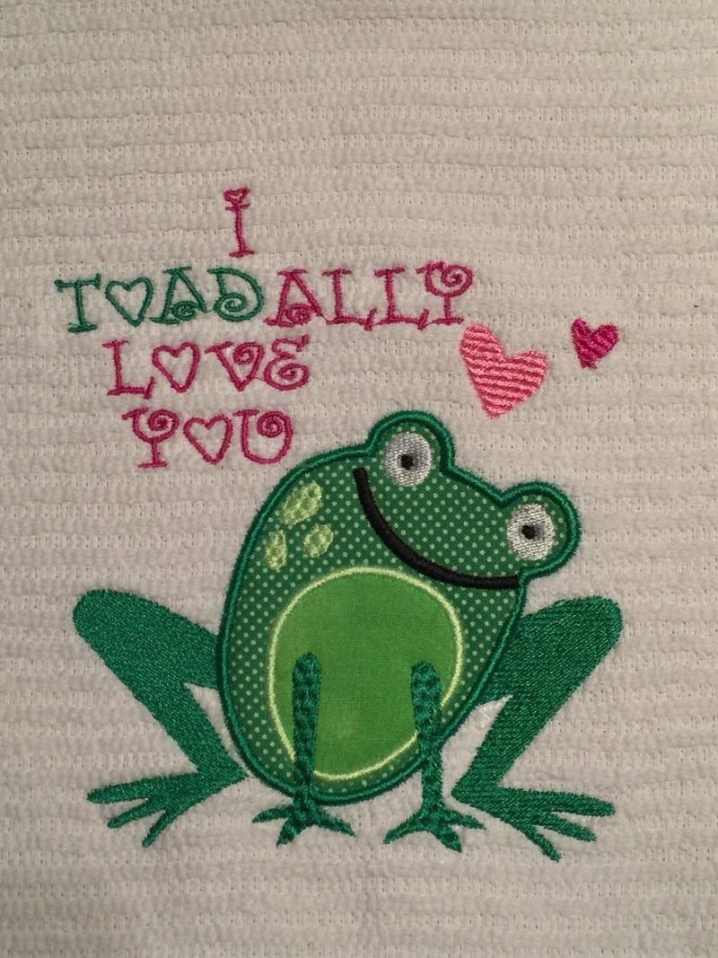
I began with a design from Lettering Delights called Frogs and Kisses.
I began with a design from Lettering Delights called Frogs and Kisses.

I bought this set a couple of years ago when I made mini Valentines for my daughter's dolls. You can see that post here. I contacted LD to see if it was acceptable to use their purchased designs to digitize for personal use embroidery projects and was told yes! I liked this set because the frogs were made of simple shapes.
I started by thinking in terms of which part of the frog I wanted the machine to stitch first, second, third, and so forth. I decided I wanted it to stitch in this order:
I knew I would be using a purchased font since I have a few that would be fun for Valentine's Day. The one I used here was Loving from Applique Corner.
- fill on the legs
- large outer body as an applique
- belly as an applique
- facial features as fill
- arms as fill
- hearts as fill
I knew I would be using a purchased font since I have a few that would be fun for Valentine's Day. The one I used here was Loving from Applique Corner.
I used the Draw with Points button and traced parts of the body in order according to my outline above, adding stitching after each addition.


For the eyes, I used a feature of Stitch Artist 3 that removed the pupil from the center of the whites so that when the black stitched, it would only be going through only one layer.

This feature is the Cut/Subtract feature (Logical Subtract is what it is called when you hover over it.) To learn how to do this, I watched this video on Stitch Artist 3 Controls Part 2: https://www.youtube.com/watch?v=ezz5qzhc61o (it is at 2:22 minutes in). To summarize, for each eye, I created a large circle for the outer shape and two smaller circles for the inner shapes. I selected the large circle and one smaller circle and clicked the Logical Substract button to make the donut shape above. The remaining small circle becomes the pupil. (I want to take a quick moment to thank Jeannie of the Scraps In My Life blog for piquing my interest in the SA3 controls! Her recent Stitch Artist tutorials have given me a nice boost of confidence for trying some new things!)
I decided to add a little texture to the spots on his back. This was done by selecting a pattern in the fill tab. This pattern is Scales 2.

I did take care to check the order of things stitched so that like colors stitched together when possible and that everything was in the right order to get stitched properly, moving as needed on the Objects Pane.
After I digitized this, I did the first test stitch. That's how I found my errors.


My first error is also my on-going challenge: how to digitize so that parts on top (like the arms) would not stitch over areas underneath (like the satin stitch around the belly and outer body). That bump is a problem!

The answer for me on this project: when I draw with points to make the applique parts, I do it twice. The first outline is for my position and tack-down stitches only. That will allow the tack down to go all around the shape. I don't want the satin stitch at this point.

To do that, I check the position and material boxes, but select 'none' for the border. (I learned that I could do that from one of Brian's videos on the Briton Leap videos on Youtube).
Then, to do the satin stitching, I selected "Draw with Points" again, but this time, I skip the areas where the arms will stitch on top so that I won't get those bumps! The belly, for instance, is outlined in two parts: the semi-circular area that curves up under the smile and a second piece, the curve between the arms. The stitching I apply to those is done as 'satin border' (not as applique!) I did the same for the outer body applique.
 |
| You can see on the object pane that the belly is an oval for applique (position and tack down only) and the satin stitching is in two pieces as satin border. |
Second error I had was with the outline stitch that I did around the legs.

I originally thought of making the outline in a contrasting color. Since I didn't do that and since the fill stitch pulled the outline away from the right leg, I just removed the outline. I think that, if I had needed to keep the outline, the advice I got was to change the inclination so the stitches would pull in a different direction (making that note for future reference).
Third error was that the satin stitch on the outer body seemed too narrow. I changed the width of the satin border for the outer body. This was a bit of a guess but I changed it from 3.5mm to 4.0mm. I made a mental note that I wanted to do a sample of several different widths for future reference!

I figured... since I was guessing and experimenting anyway... I would also try to see if I liked textured arms. I needed a way to bring the arms a bit to the foreground and since I didn't have a green that was just a bit more saturated than the leg color, I thought that maybe adding more detail to the arms would help. This is Scales2.
Fourth error The smile was too narrow and didn't stand out enough. I was trying to copy the artwork too much. I made the smile line thicker; I just grabbed nodes and pulled them to make it wider.

Fifth error Also trying to copy the art work too much, I made the spots on his back too small. I just grabbed nodes to enlarge those too.
Sixth error I altered my fabric and thread choices. I made some simple changes to get a frog I liked better.
With changes made, I did a second test stitch.
I decided I really did not like my experimental arm texture so that became the Seventh error but it was an easy one to change back to the Tatami pattern to match the legs.
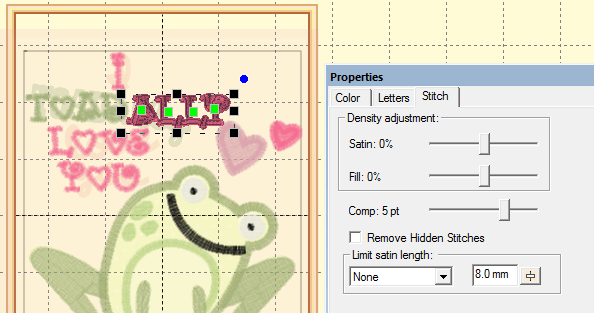
I also decided that the hearts needed something to make them stand out. This was an Eighth error that was solved by making duplicates of each and changing the copies from fill to satin border and making sure they stitched AFTER the filled hearts.

I changed the font to make it a little thicker. This was another experiment. The font is a BX font from Applique Corner called Loving. I selected each part of the font (I did it in sections so I could place it as I needed and have it in two colors.

To each section, I increased the pull comp by 5 points.
I decided to test stitch only the font, the hearts, and the new arms with satin body outlines. This was the third test stitch.

I was happy with the outlined hearts and new arms but decided to dial back the pull comp on the font from 5pt to 3pt. I loved the thicker font on letters like the heart-shaped Os but not on the curly letters, especially the Ys.


My test towel really helped me to learn and to try things with the software that were new to me! It was the best use of a 75¢ small towel!!

I was ready for the final stitch out on my kitchen towel! I used the same inexpensive kind of towel, prewashed (like my applique fabrics), but I added a fabric band to the bottom. To see how I add a fabric band, check out my tutorial on making burp cloths here.


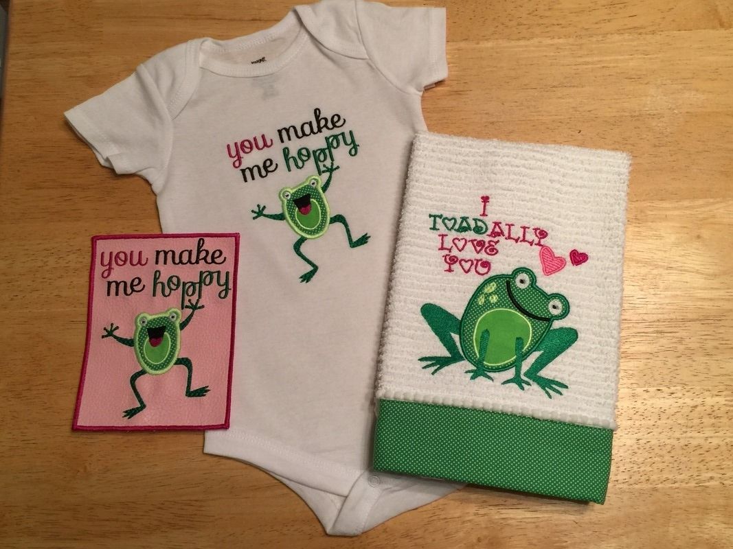
I took what I learned on this and tried another one of the Lettering Delights frogs.

This time, I added texture to all the limbs and I really liked it. I also used a font from Stitchtopia called Daphne. The test stitch out was done on vinyl floated over vilene.

I am happy to report that this little guy took only a fraction of the time that the first one took because I was able to apply what I had learned!

I learned so much from these frogs today! I also stitched out my jumping frog on a onesie! (Onesie tutorial coming soon!)
List of links in this post (none of these are affiliate links; they are all direct links):
- Embrilliance Stitch Artist- click here.
- Lettering Delights Frogs and Kisses Graphic Set- click here.
- How to Cut/Subtract in Stitch Artist 3: click here (it is at 2:22 minutes in on the video).
- How to digitize an applique shape without a satin stitch in Stitch Artist 1, part 3 Applique: click here (it is at 58 seconds from the beginning).
- Font from Applique Corner called Loving: click here.
- Diaper cloth tutorial for how to add fabric ends to the towel: click here.
- Font from Stitchtopia called Daphne: click here.
- Scraps In My Life blog for Stitch Artist tutorials: click here. (You may need to scroll; she is also a papercrafter and has all kinds of posts!)
To see all of my other notes on machine embroidery, check out my Embroidery page or click here.
To see my papercraft projects, a number of which feature Valentine projects, check out my Paper Gallery or click here.

3 comments:
Thanks for the shout out! This is great! Love these frogs! They are in my inventory, too. Now, to follow your lead and try to digitize them! You did a great job and your embroidery looks amazing!
This is so great. Thanks for sharing this. I love it and learned so much
I loved all your frogs, even if the first few tries didn't give you what you had wanted! Did you know knitters use the term "frogging" to rip back rows of knitting when they catch a boo boo? I did what you're doing now, documenting everything I learned for myself and in hopes of helping others when I taught myself how to do Fair Isle knitting (http://fairisleknitting.blogspot.com/) That is so, so sweet of you. Happy Valentines to Piper, Papa and you! (Did I miss anyone else?) I hope Piper loved her special gift I saw posted from a few weeks ago!
Hugs,
Kathy
Post a Comment