Saturday, November 17, 2012

Secret Hollow Book Card! (and a Piper project to share)

I love hiding spots... old homes with hidden rooms, desks with secret drawers... and I love the idea of a book with a secret hollow!  That is why I fell in love with a tutorial from Tracy of 'I Wanna Build A Memory' blog and her Tracylovestoscrap YouTube channel!  In her video, she said she got the idea from the blog Wenches Kort og Papir.  I made one... and then I changed the size, added a couple of extra score lines, and figured out how to make the cover look like embossed leather!

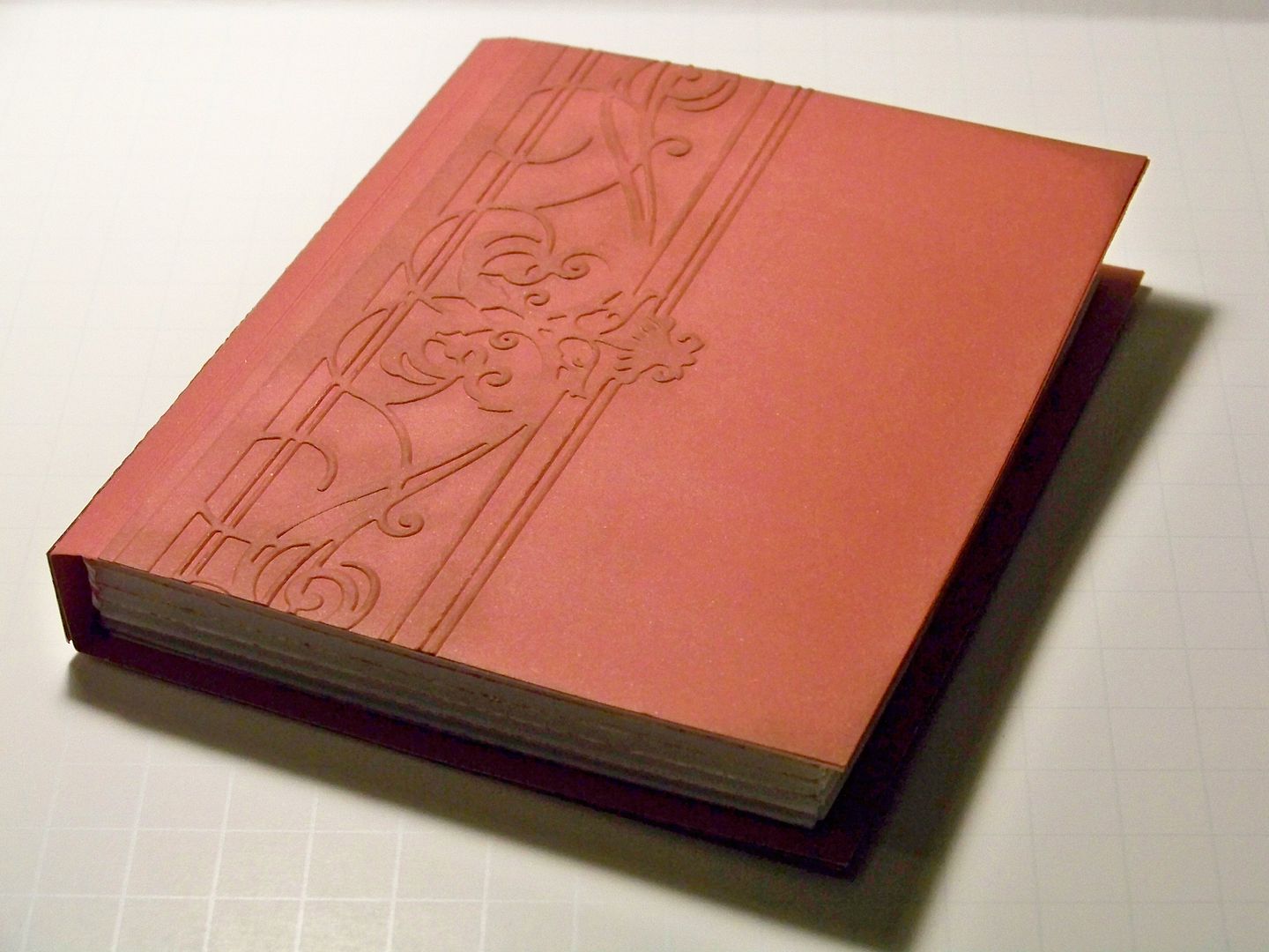
So... on the outside, it looks like this....


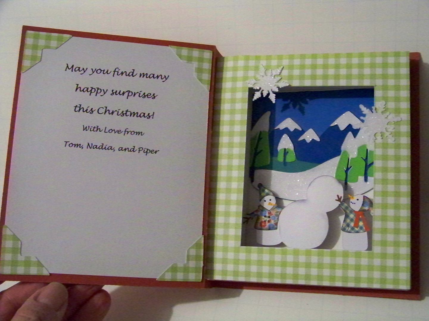
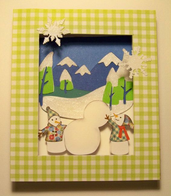
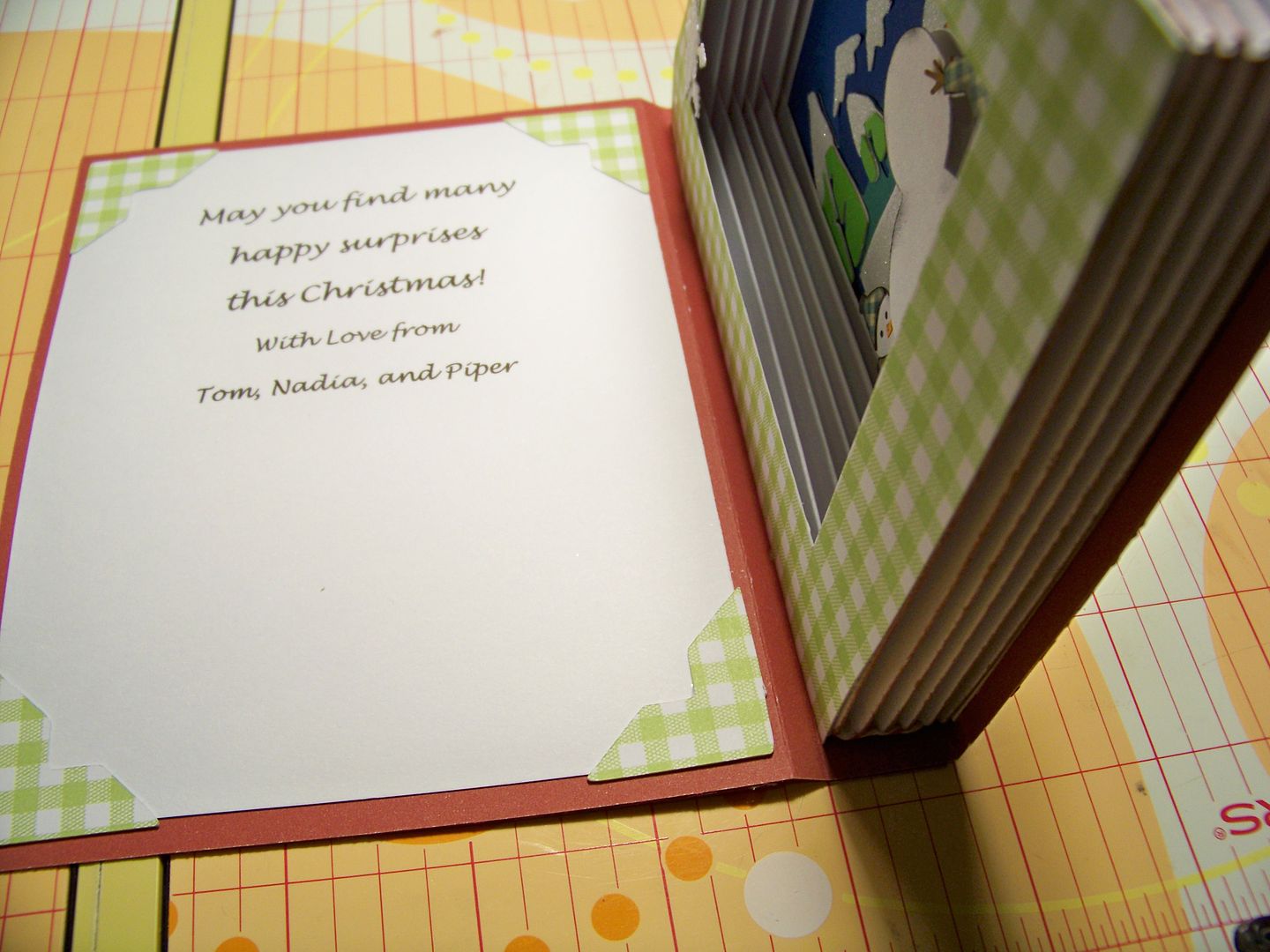
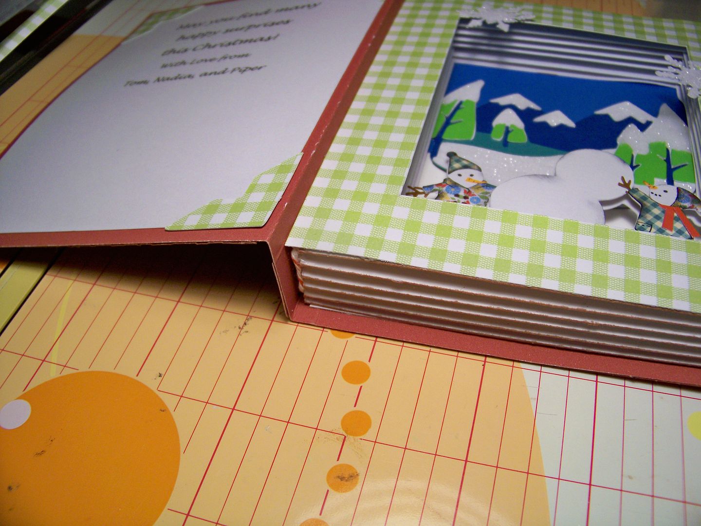
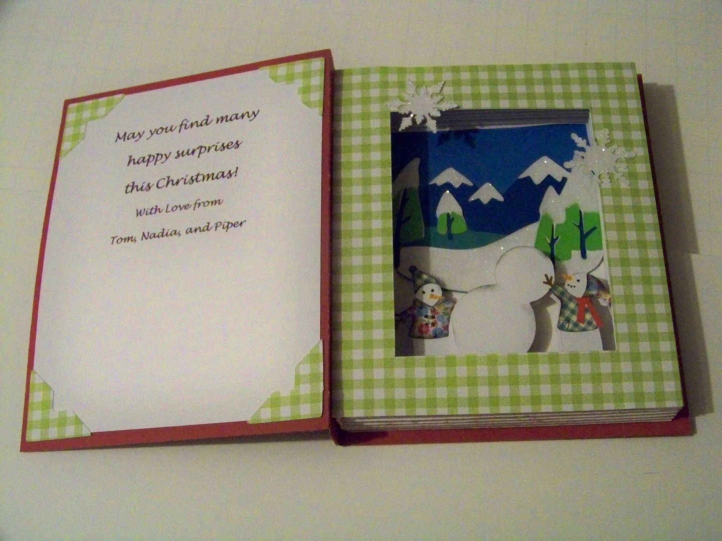
But when you open it up, there's a hollowed out space, perfect for a little paper vignette!


I used my computer to print a sentiment on the end paper.  I printed it high enough to allow for space for a gift card!


I will suggest watching Tracy's video (click here) and following up with a trip over to her blog (click here).  I am also providing you with all of my changes!  My finished  book card is 5-7/8" x 4-7/8".

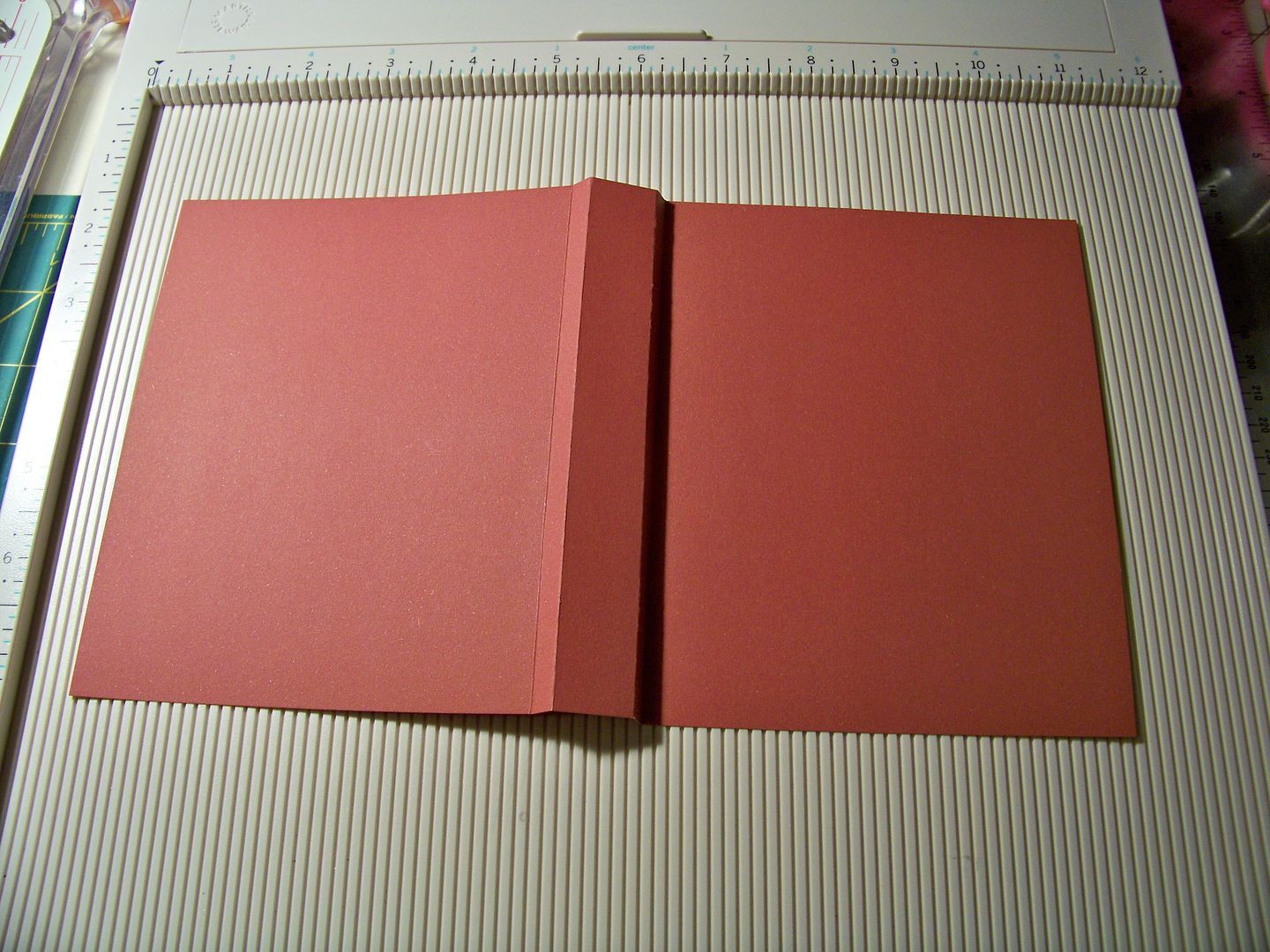
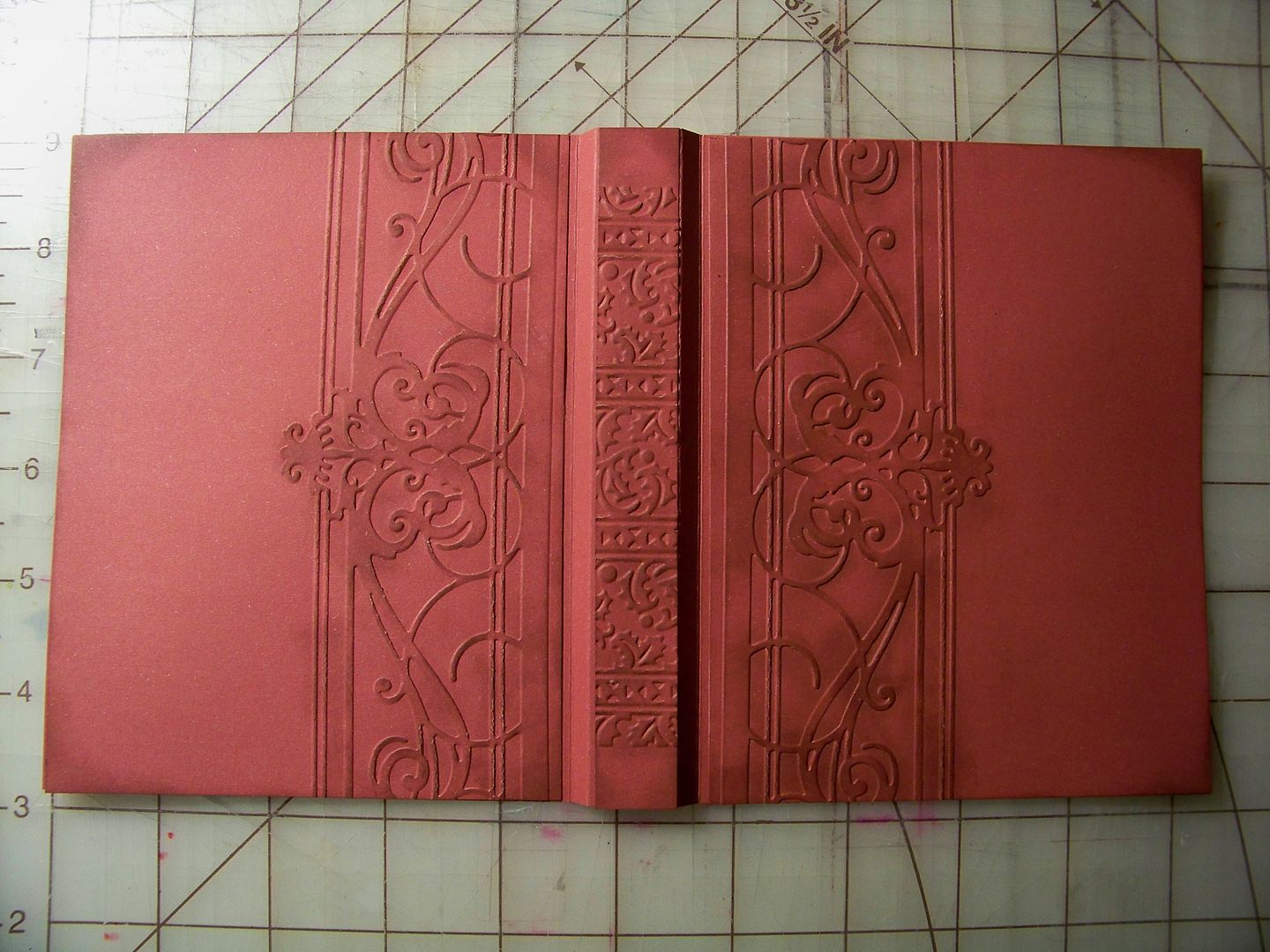
For the cover, I cut a piece of card stock 5-7/8" x 10-1/2".  I placed the 10-1/2" side against the top of my scoring board and scored at 4-5/8", 4-7/8", 5-5/8", and 5-7/8".  You will notice that this adds two more score lines than Tracy's tutorial. I think the extra lines allow the cover to look more like a book and it allows the card to open easily with the spine of the inside "pages" glued to the center (spine) of the cover!  Tracy did not glue her spine to the cover, but I really like mine glued.


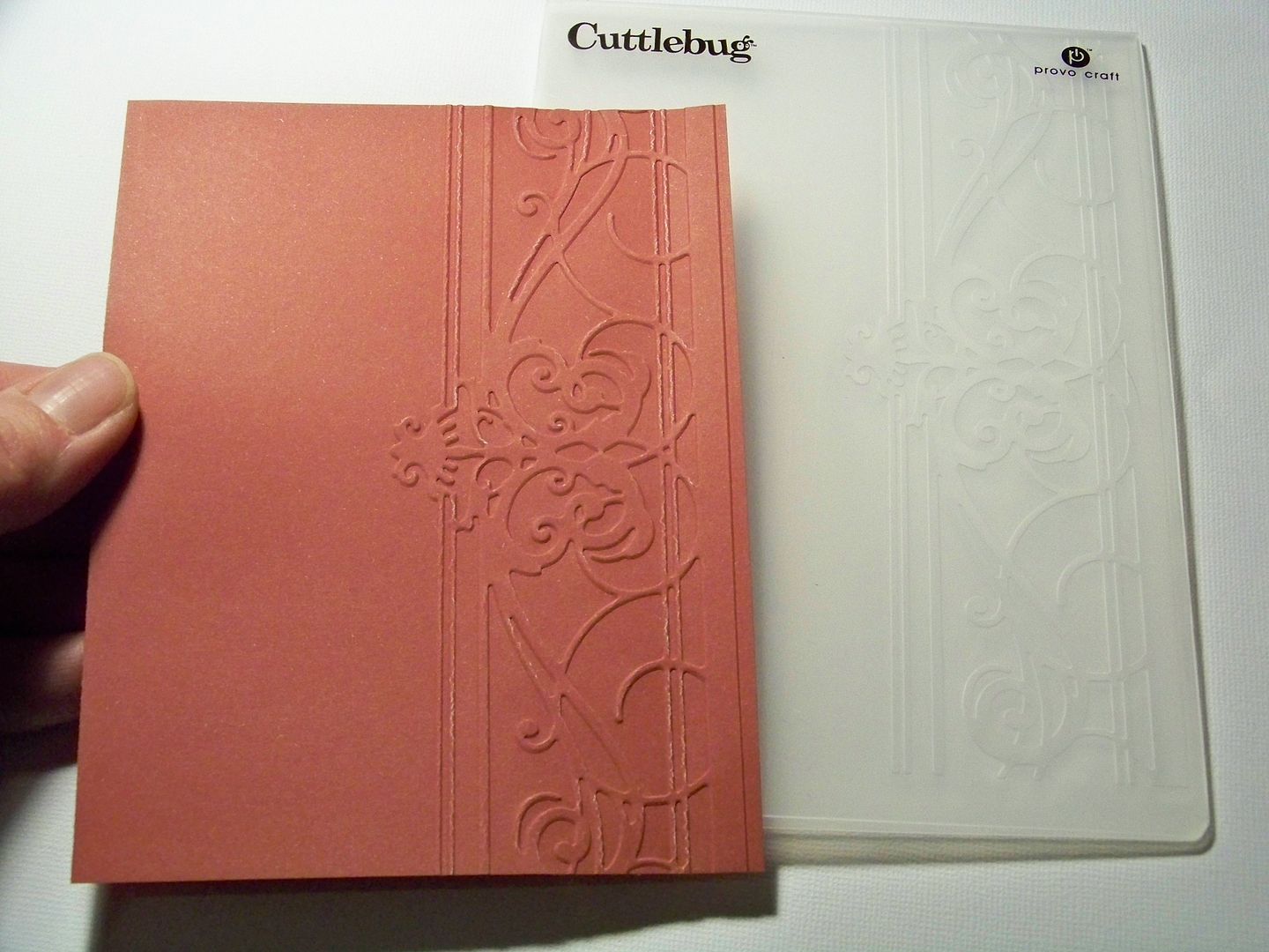
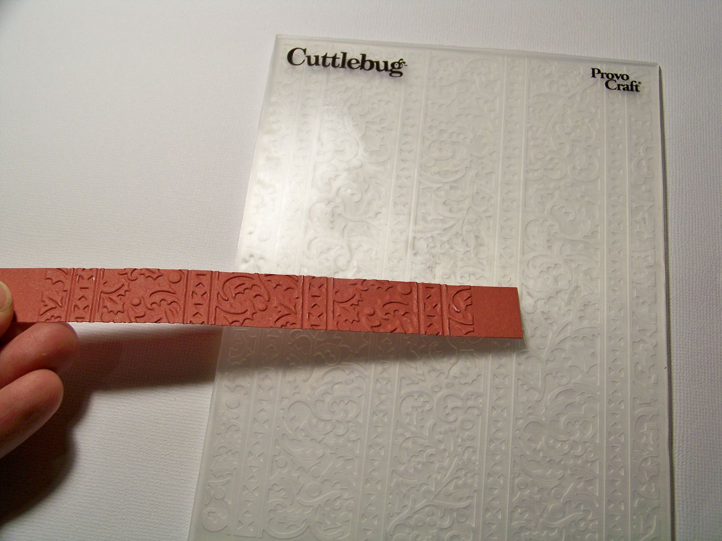
I cut pieces to emboss for the outside of the cover from the same paper.  For each side, I cut card stock at 4-1/2" x 5-7/8" and a piece for the spine at 11/16" x 5-7/8".  I peeked at some old books we had just to get an idea of what older books really looked like and found a couple of embossing folders in my collection that would be good mimics!


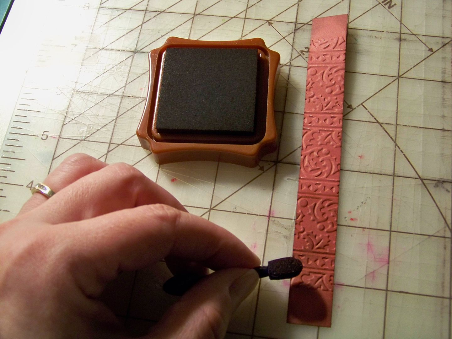
I used a brown ink pad to rub over the embossing and used a sponge applicator to ink the corners and edges.


I glued the embossed pieces onto the cover with ATG tape.  The added layers made the cover more substantial too.


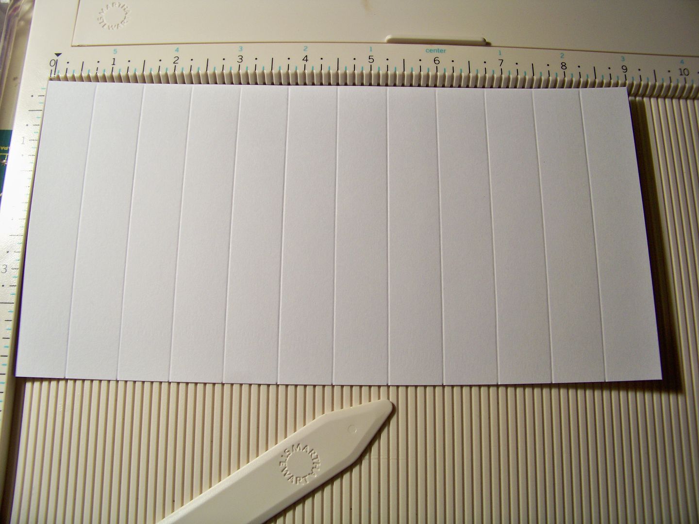
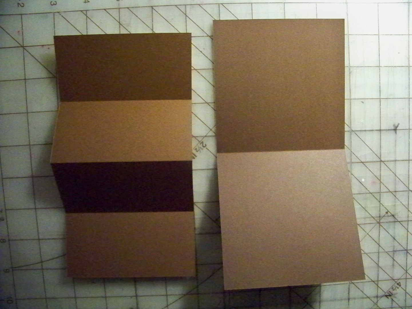
For the inside, I cut two pieces of white card stock at 5-3/8" x 9" and two pieces at 4-1/2" x 9".  I placed the 9" sides against the top of my scoring board and scored at 3/4" all the way across.  This follows Tracy's directions exactly.


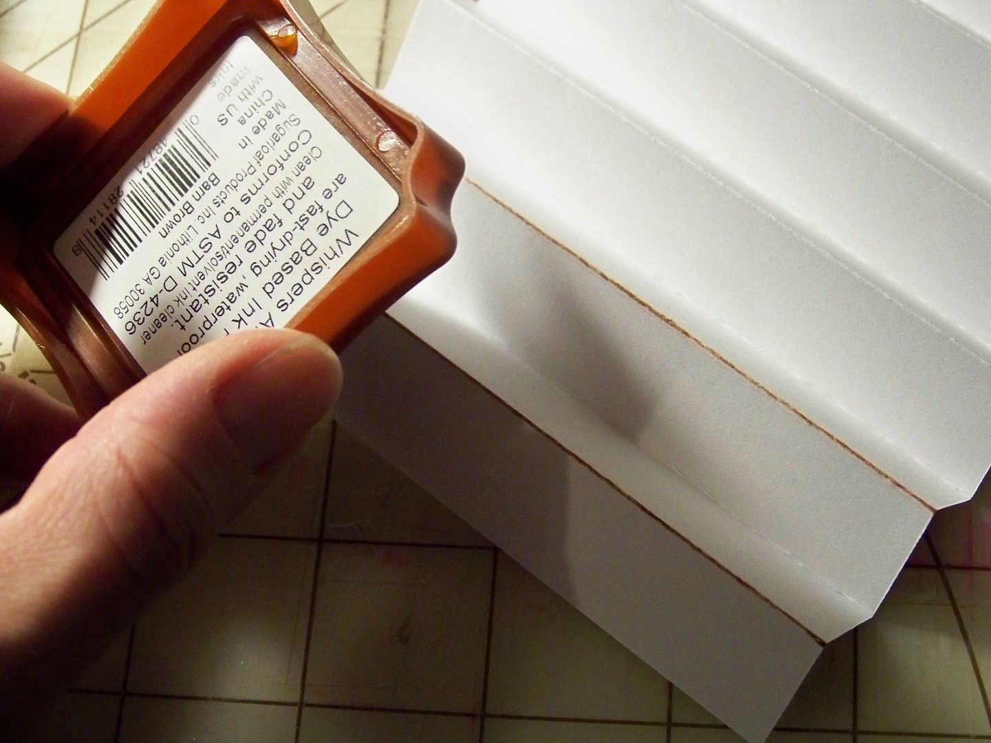
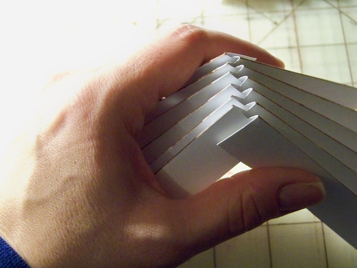
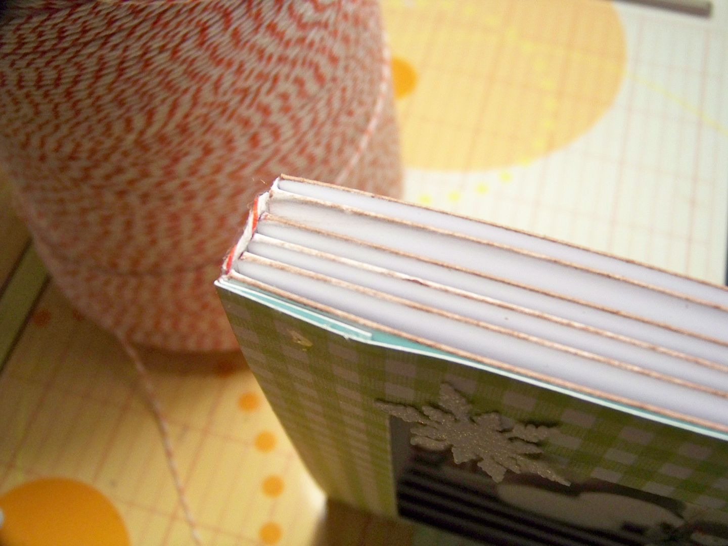
I folded them up, accordion-style and inked the edges by rubbing an ink pad over the folds.


I assembled the folded 'pages' just as Tracy instructed and glued in place with Scotch Quick Dry Glue.


I cut a green gingham mat to place over the 'pages'.  This was cut at 4-5/8" x 5-1/2" with the inside cut to allow for a 7/8" border.  This created a frame for my vignette.


These were my cuts:

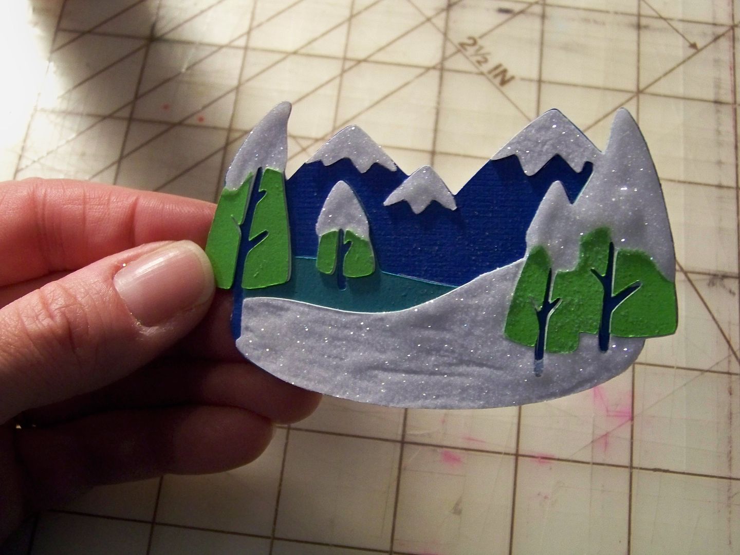
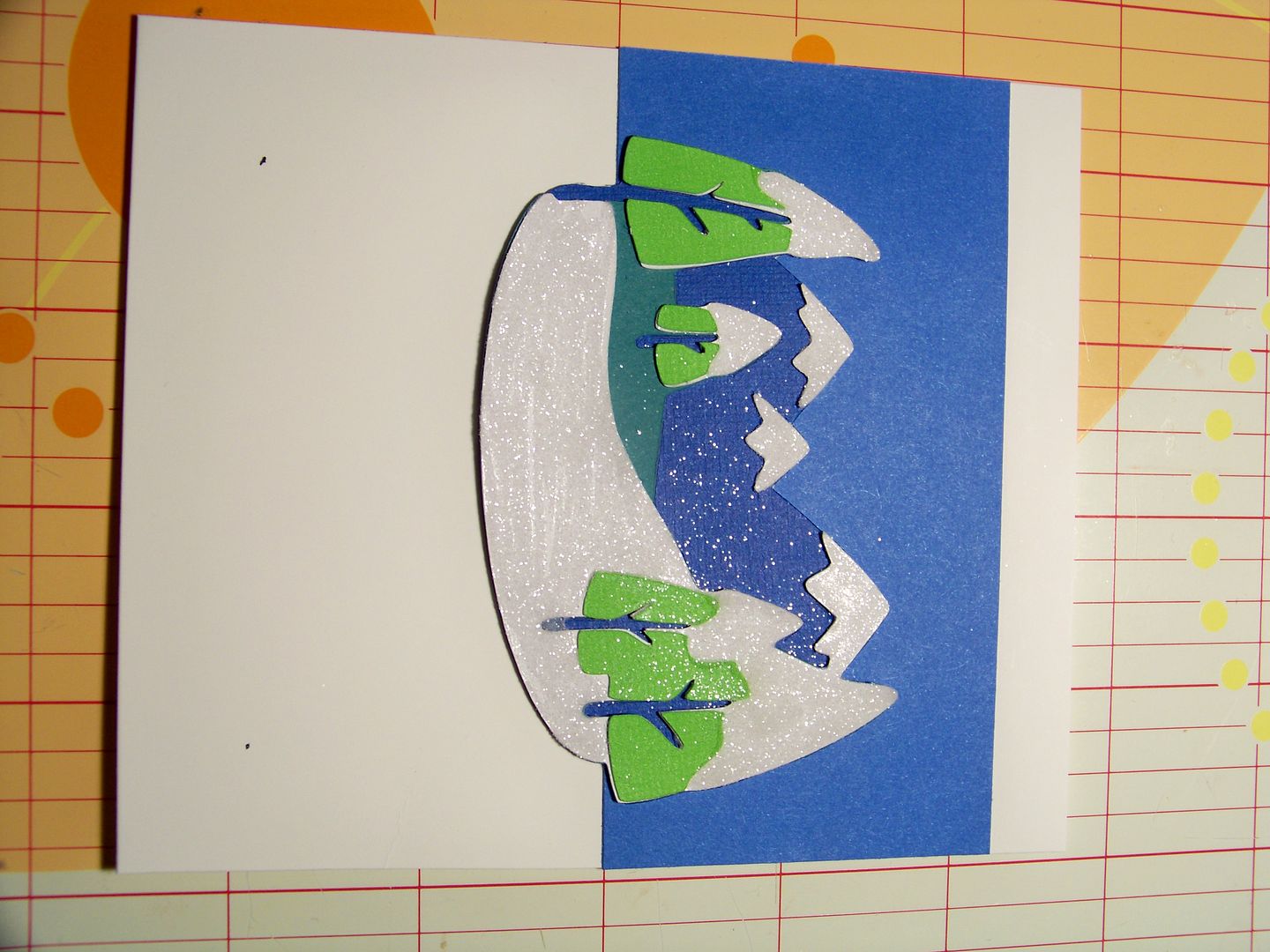
  • Snowy background - Campin Critters (page 66), 2-1/4".  I used Scotch Quick Dry Glue and Martha Stewart fine glitter.
  • Sky - 2-1/4" x 4-1/2" strip.  I applied it to a card stock base.


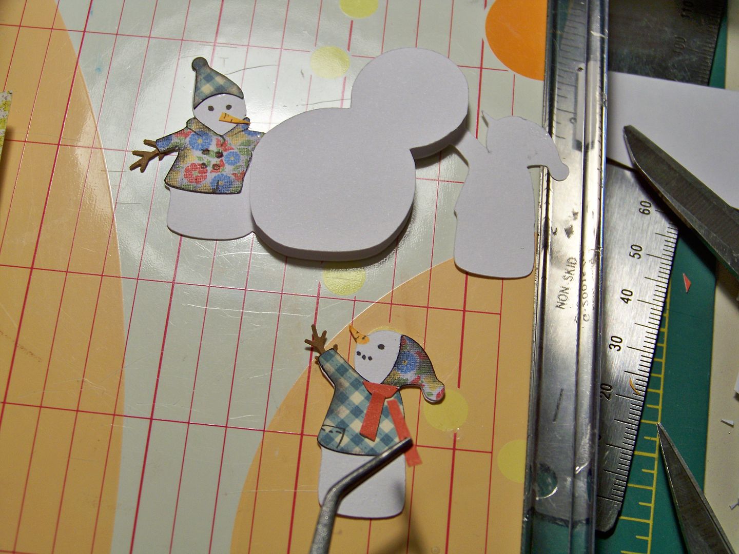
  • Snowmen - Snow Folks, 1-3/4".  I cut two of the base cut in white and used the Martha Stewart branch punch for their hands.  I popped up the snowman they are building and the snowman on the right 1/8" after cutting them free from the duplicate cut.  I inked their jackets and hand-cut a scarf for the snowman on the right.  I hand cut the carrot nose and drew in the eyes for the guy on the left and colored in the nose and eyes for the guy on the right. I inked them in black.  This was popped up 3/8".

  • Snowflakes - When It's Cold Outside, 1".

I couldn't find any bookbinding headband on hand (although I know I have some!), so I used bakers twine.  This is a crazy little detail that I added.


I printed the sentiment on my computer.

  • Photo corners - Holiday Frames and Tags (page 44), 4".

I glued the vignette and 'pages' into the cover on the right and the sentiment sheet on the left, adding photo corners.  I glued the cover to the spine.  I used Scotch Quick Dry Glue.


So, all that's left is to apply the gift card....


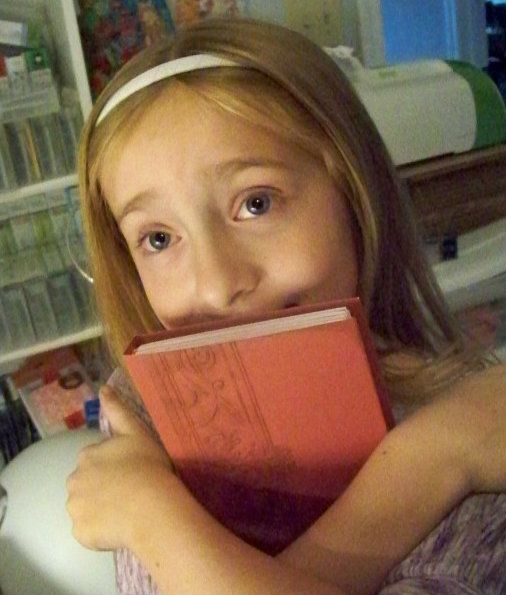
I loved this project.  I have some others planned to do as well!  There are endless possibilities with this concept.  Guess who wanted to keep it for herself.....


Speaking of my little paper crafting buddy, she just finished a project of her own that I wanted to share with you!


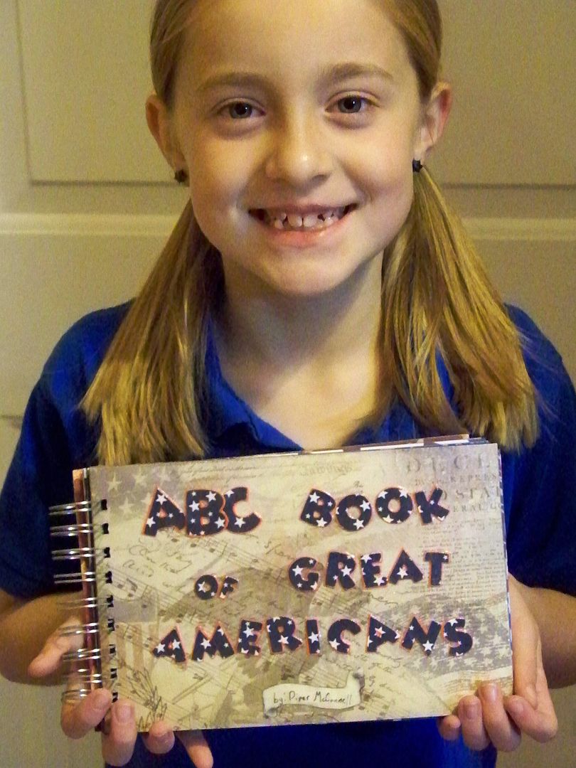
I loved special projects when I was in school... and  if I had the internet, a Cricut, and a Bind-It-All at my fingertips, oh, how much more I would have loved those presentations!  So, when my daughter was given a history project to make a book of Americans that she considered 'great', I decided that this would also be a great time to start teaching her how to use some more of the crafty tools we have in this house.

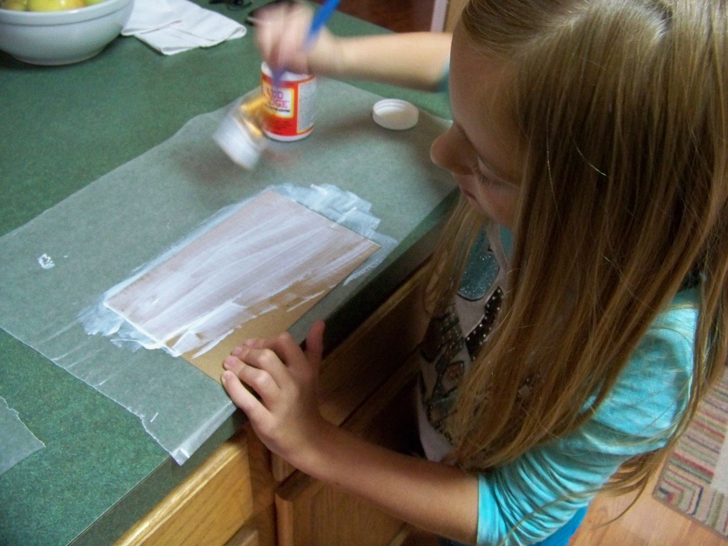
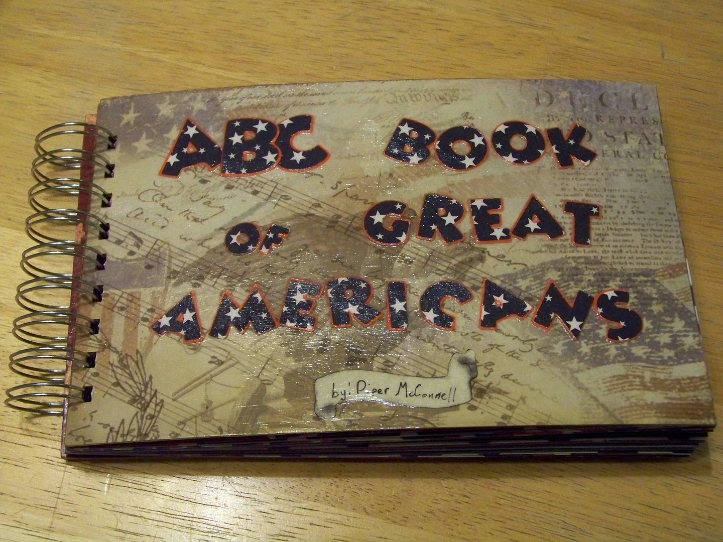
It was the first time that either of us had used Mod Podge, but since it was in the house, and so was some chipboard, I decided that I would teach her to make a cover using those materials with decorative papers.


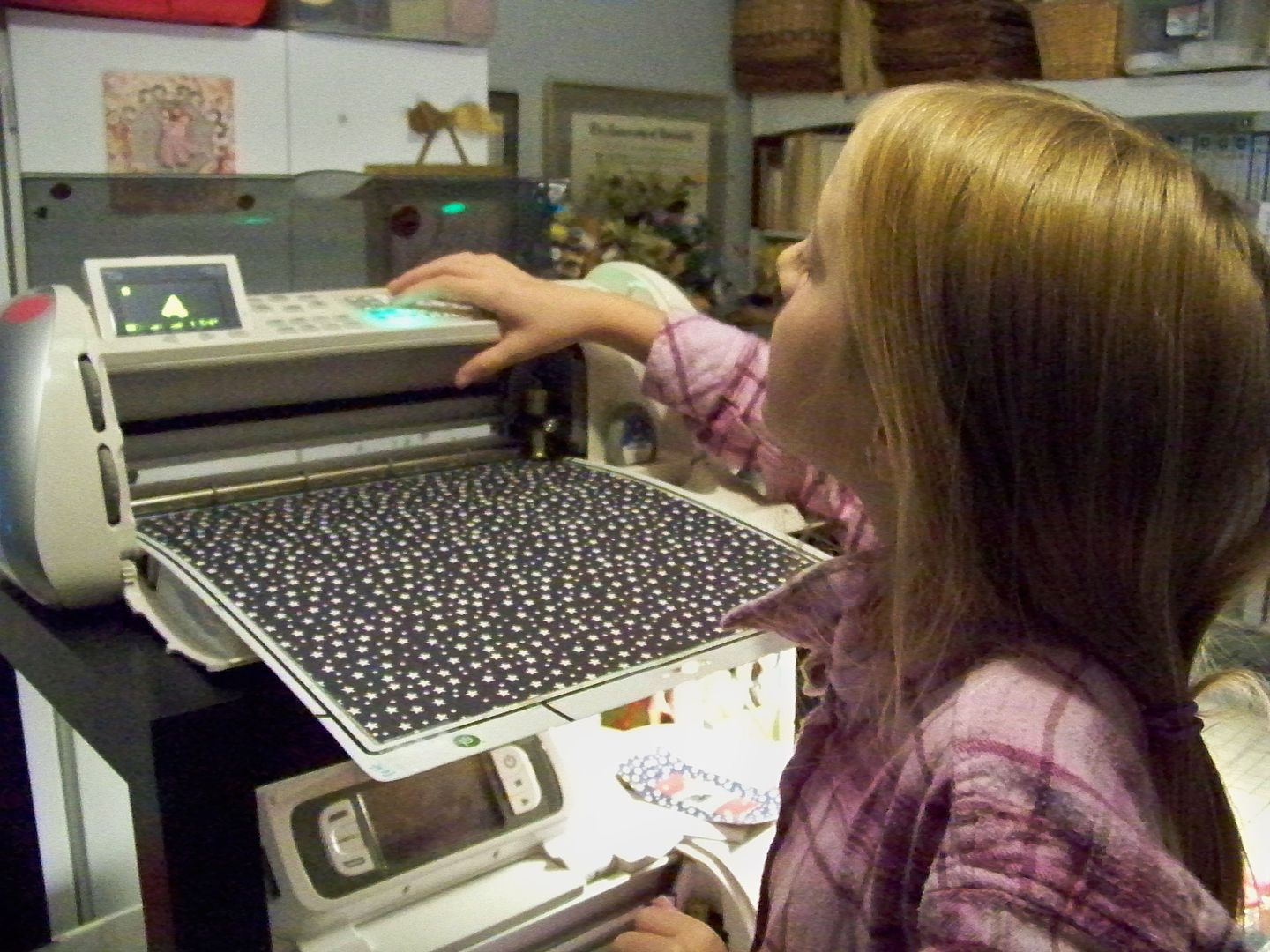
She used a Cricut and Mickey Font to make letters for the front.  The papers were some I won from a challenge back in the summer.  (Piper has used a Cricut many times before.  She actually has a Baby Bug and her own cartridges in her room, but we did this project in my crafty space instead).


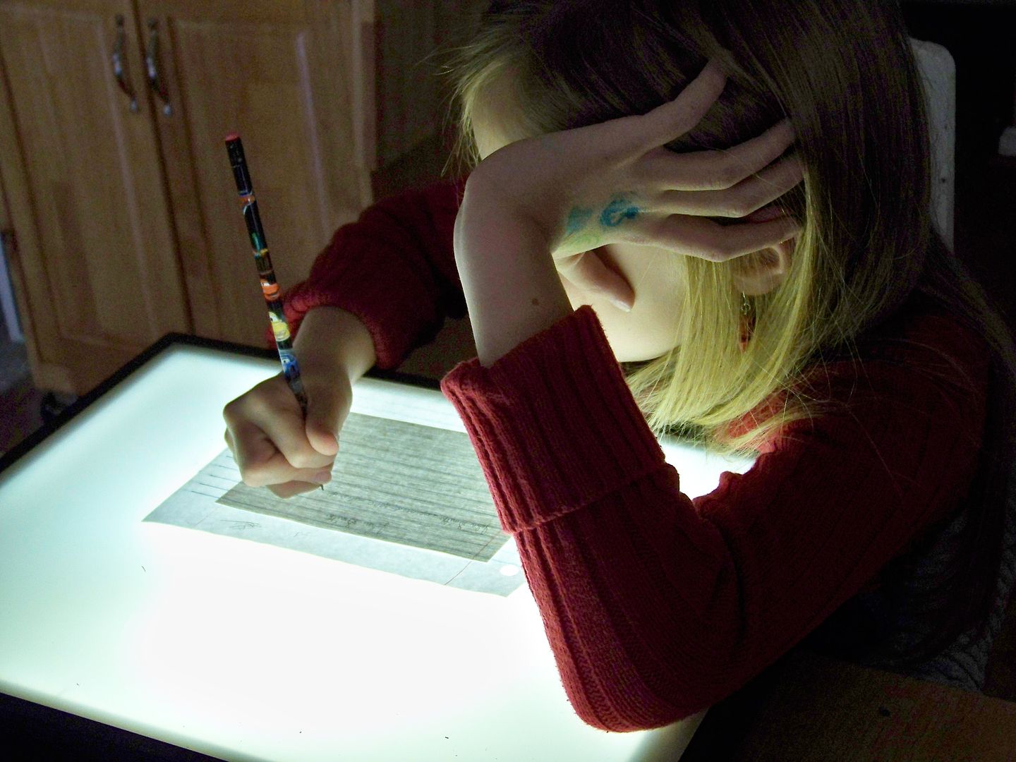
She used my computer, finding facts for her little reports.  She took the notes from that and learned how to use a light box to write straight on linen paper placed on top of lined paper.  (Yes, there is penmanship grade tied into this.)


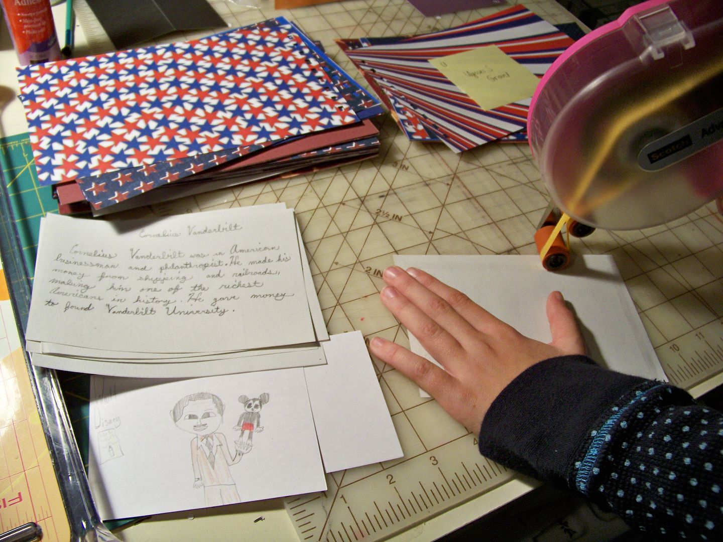
She got really great at using the ATG!  She taped her drawings and reports on the decorative papers.


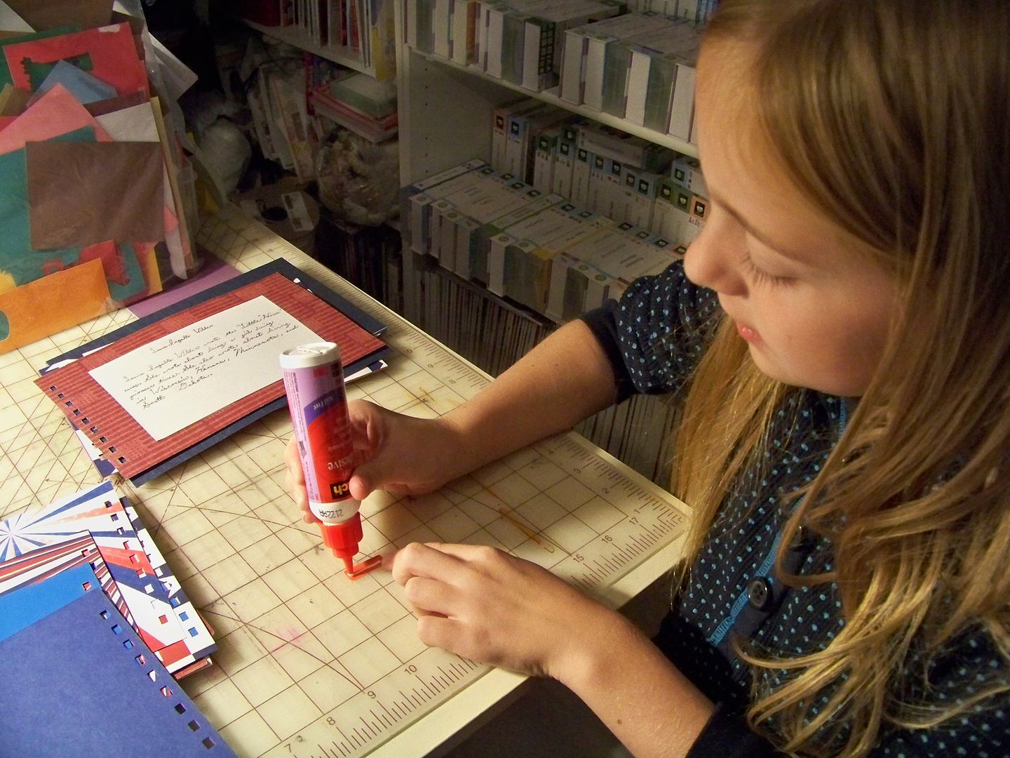
She learned how to make a font with a shadow, something that she had never done on the Cricut before. She is a master with glue, now that she has learned how to blot off excess glue.


She learned how to punch the holes in her pages with the Bind-It-All, but had me close her o-wires for her.  I think she loved the project, even though it seemed to go on forever, swallowing weekend after weekend... so she also loved when it was done!  (So did I!)


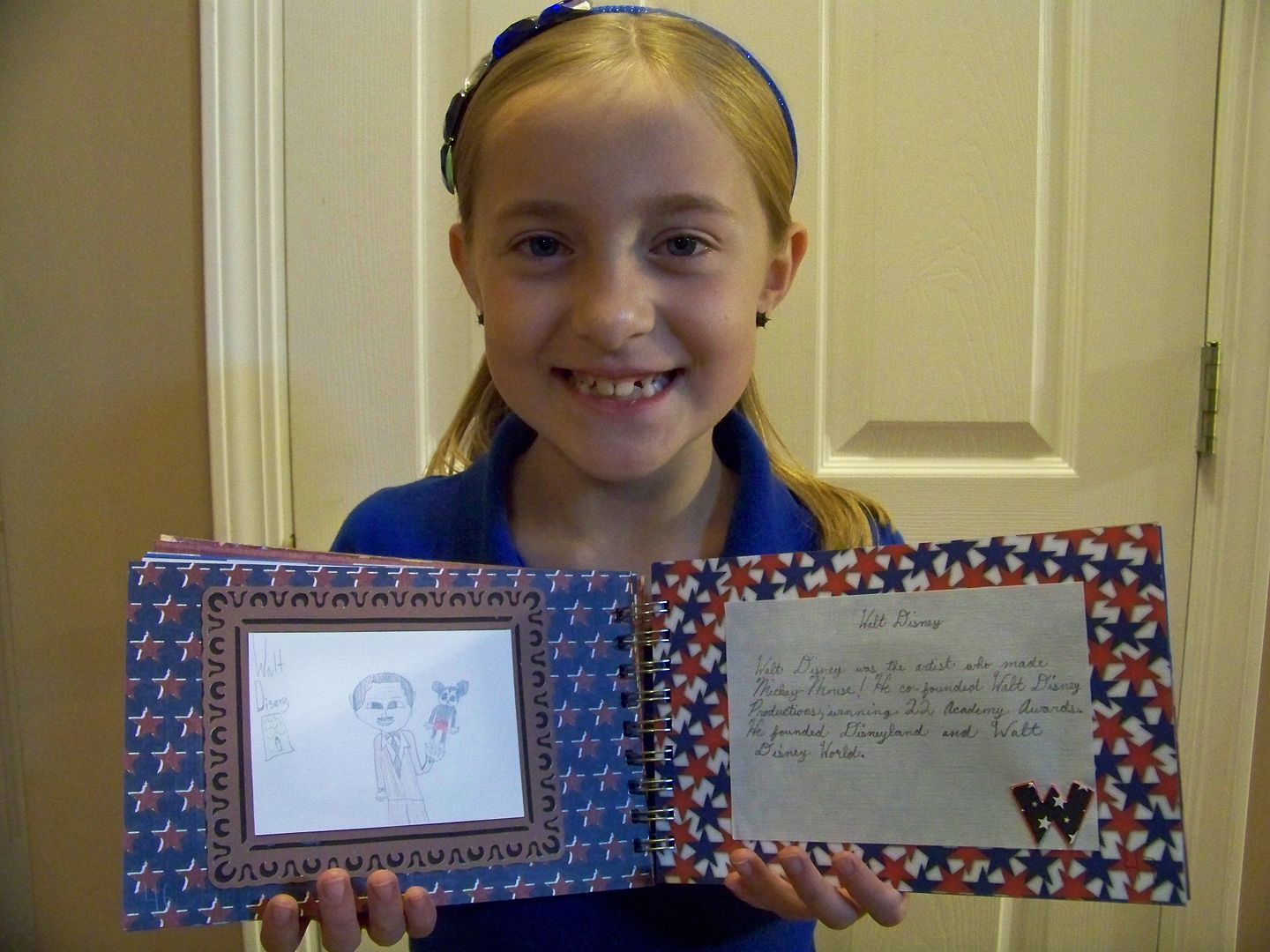
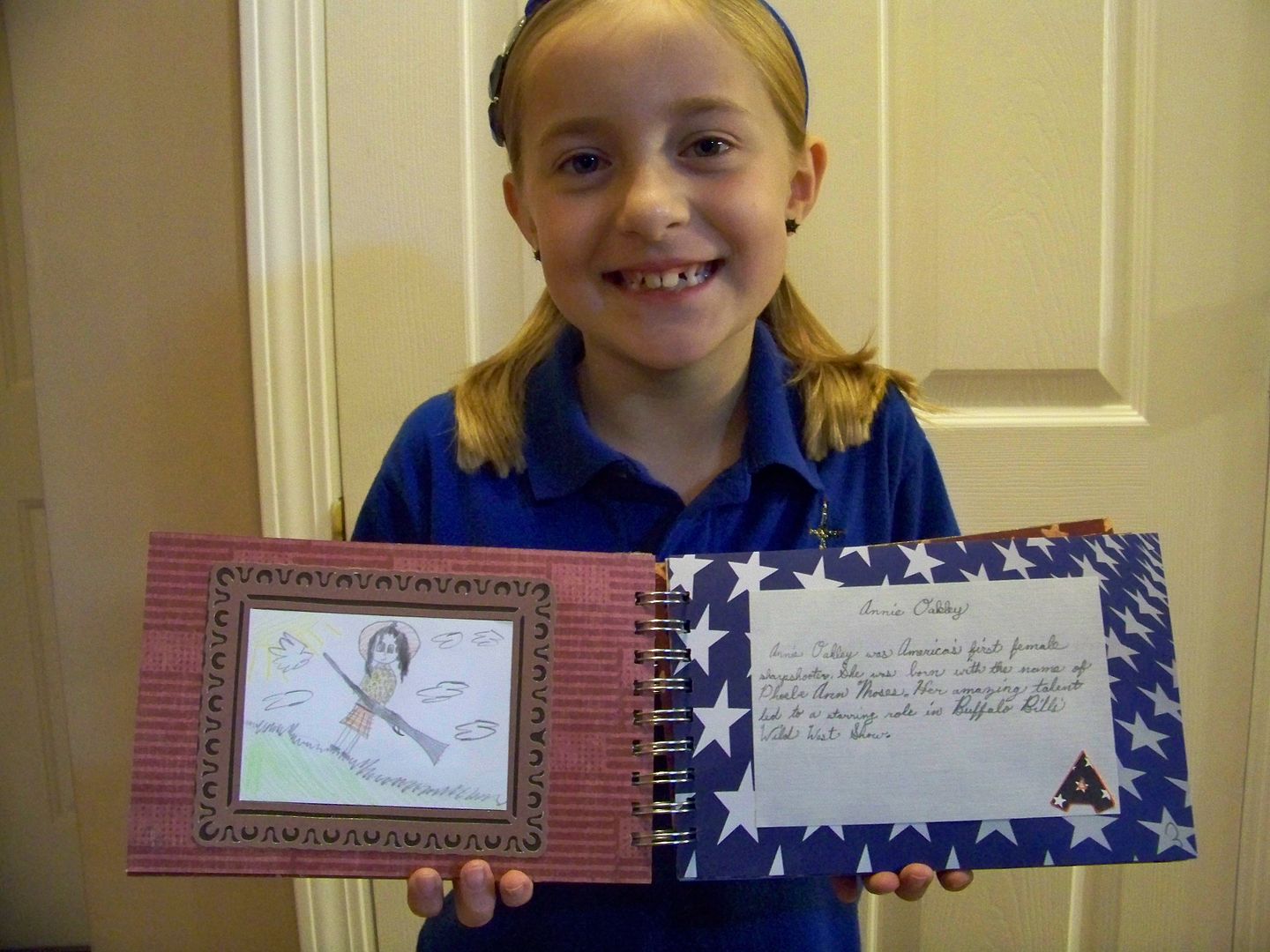
Her great American for "w" was Walt Disney... yep, she's a kid!  After dressing up like Annie Oakley for last year's end-of-term history project, she wanted Annie to be her "a" entry.  (You can see that Cricut project by clicking here.)


Along the way on to "z", she learned a lot that they didn't teach this year including facts about the Underground Railroad and Women's Suffrage.  She also learned to decoupage, how to put patterned papers together, how to  draw creatively from historical photographs without tracing, and how to create elements that are uniform to tie a project together visually.  It was an art assignment as well as a history assignment!


Thanks for letting me show off my kiddo and her 3rd grade history project.  As much as anything, we got to do it together and she was happy with the end result.  It took a lot for me not to take over the assignment and to let her design it and figure it out.  She was so excited when I told her I would put it on my blog.


Have a very Happy Thanksgiving!  
I already have a few more vignettes in mind for other secret hollow book cards... can't wait to show them to you!  For more inspiration on these, definitely visit Wenche's blog -- Google Translator worked great for me!  Start with this one:  click here.  To see many of my previous projects, check out My Project Gallery.

Edited 12/29/2012 to add:  To see a later post with more Secret Hollow Book Cards, click here.
Wednesday, November 14, 2012

Surprise Inside Greeting Cards

In my last post, I figured out how to make a pop-up accordion mini book.  While I was making it, I thought that those little scene pages would make great cards.  These are the ones I came up with...


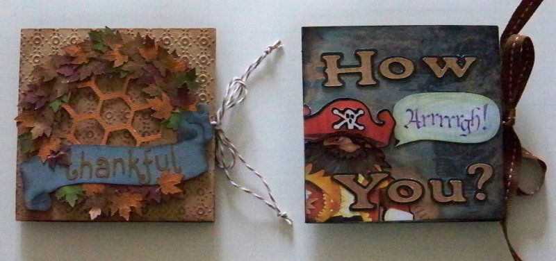
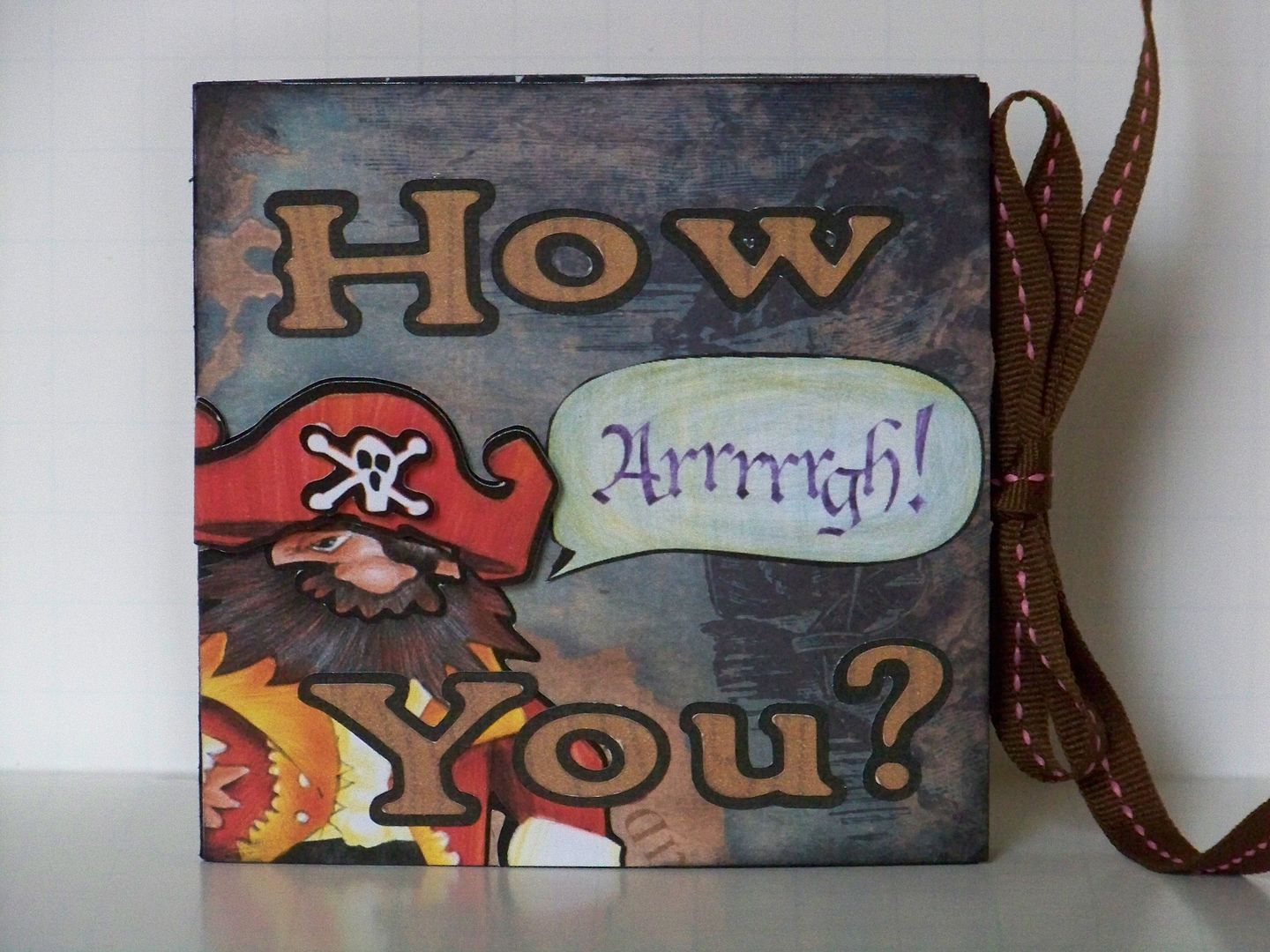
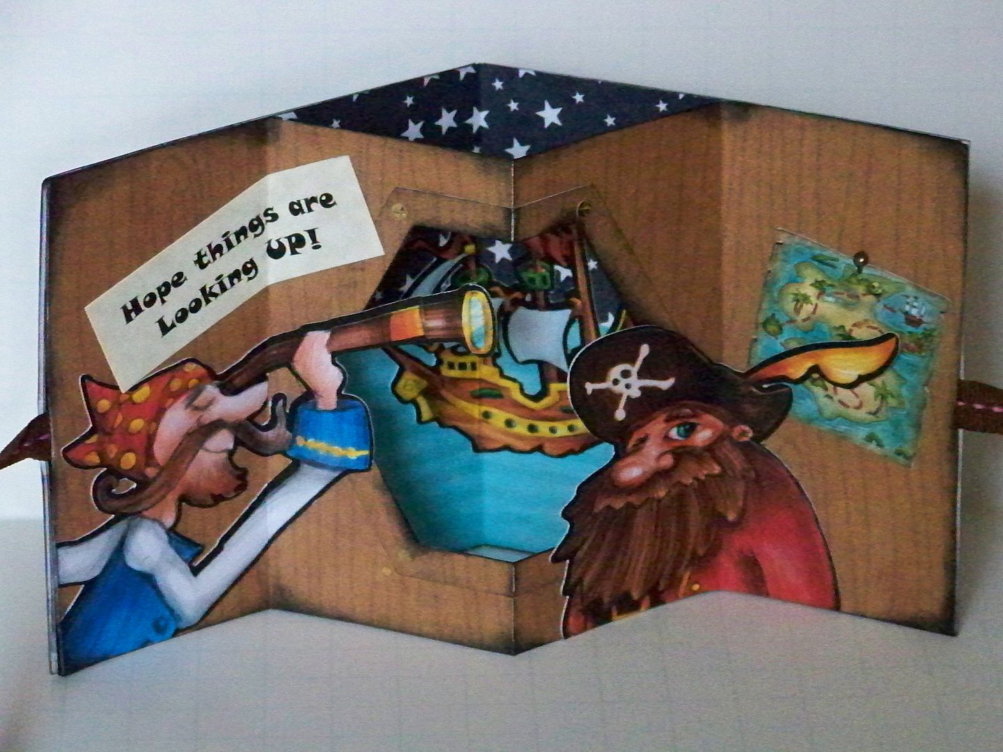
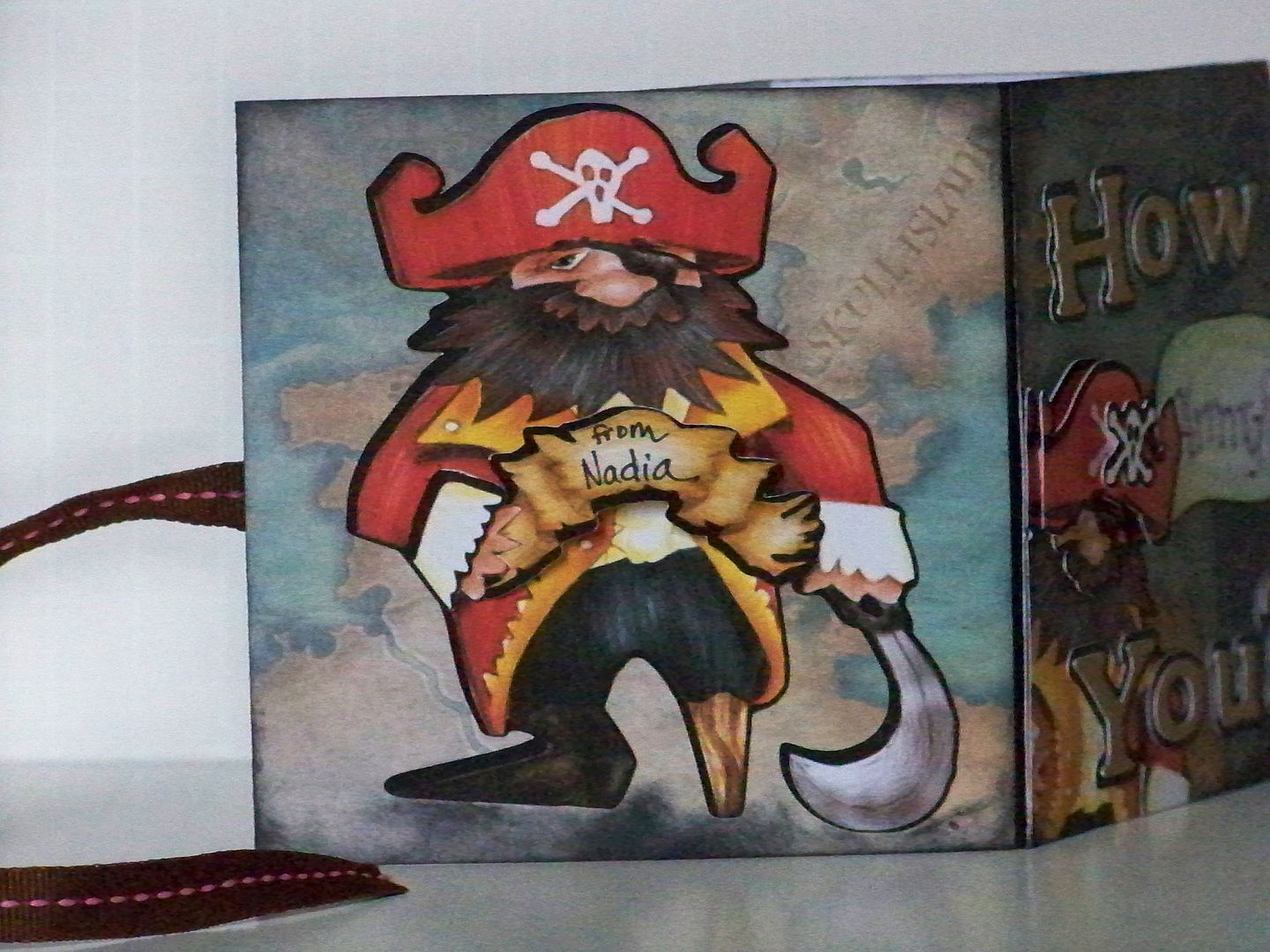
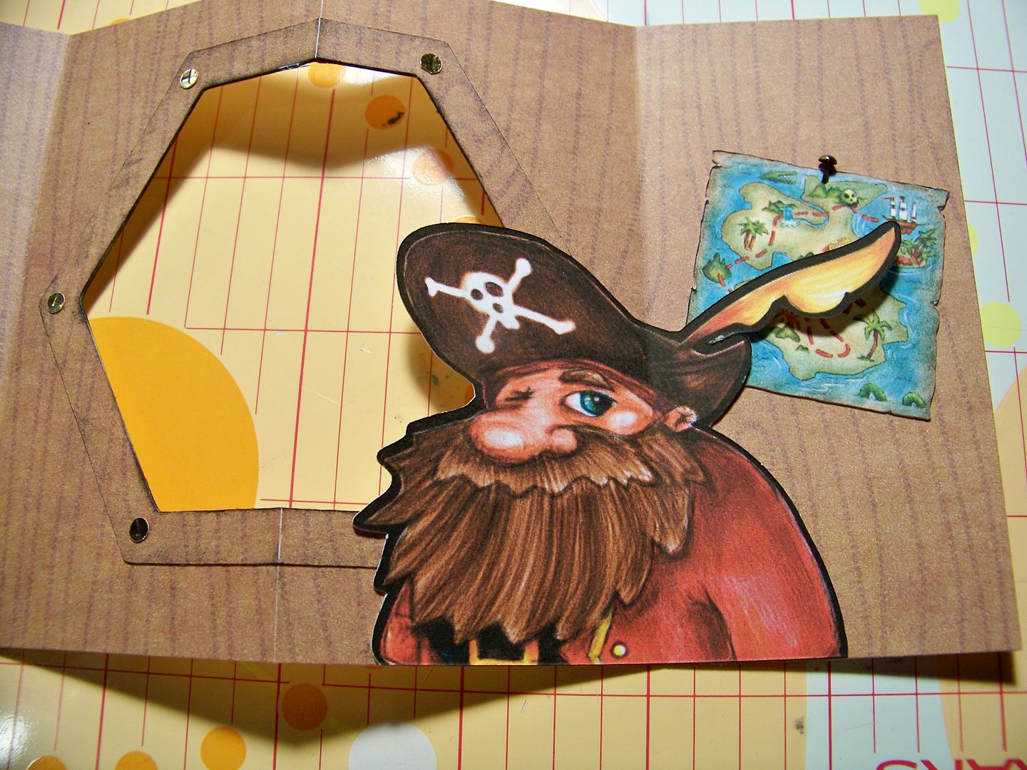
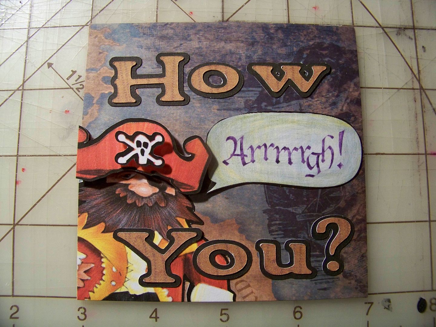
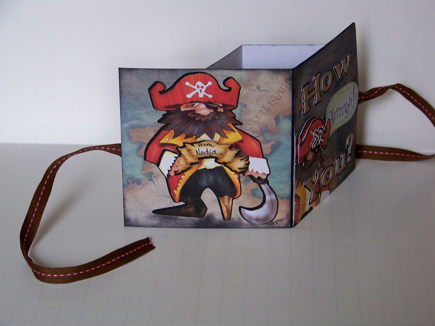
I made a pirate card to mail to a friend...


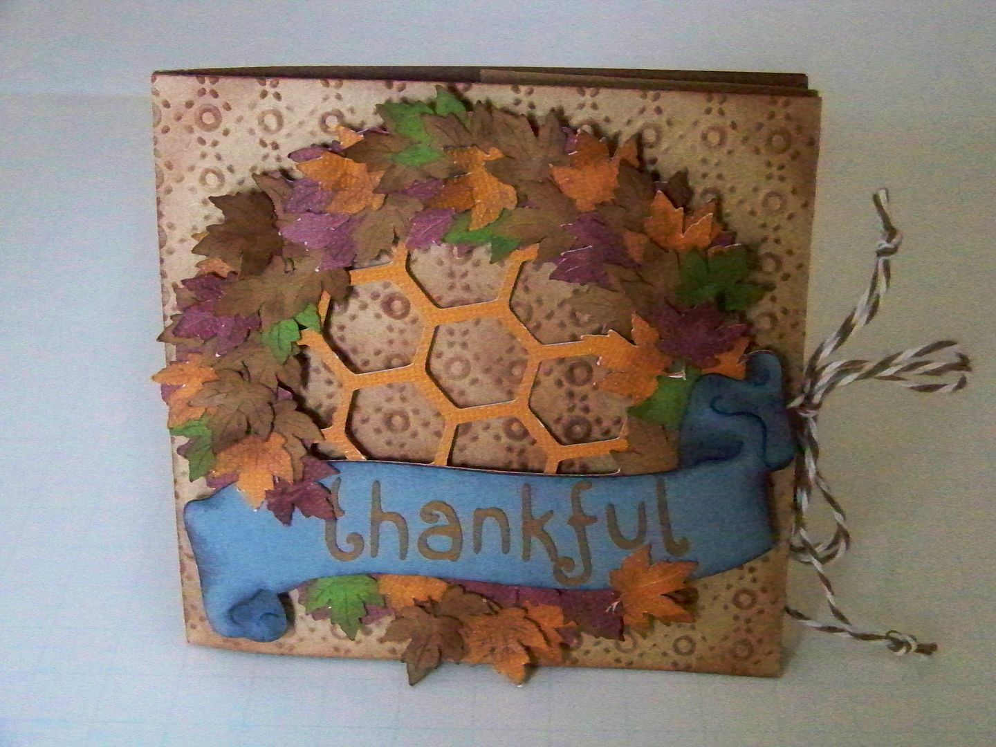
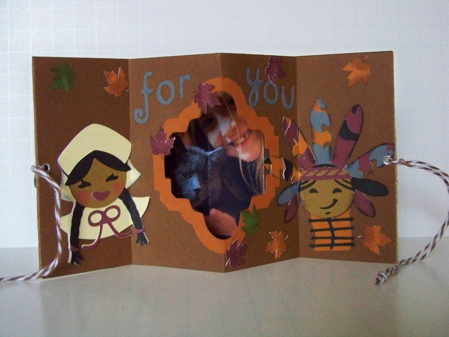
And I made a 'thankful for you' card to give to my daughter at her school's Thanksgiving luncheon...


After making the mini books on that last post, there were several things I wanted to try, including setting up the scenes before attaching the base papers.  WOW!  What a difference that made!  I wanted to use my Imagine to create quick, un-bulky die cuts.  I also wanted to investigate when it was best to score with a bone folder versus when it is best to use an Xacto knife.  These cards gave me lots of opportunities to figure it all out!

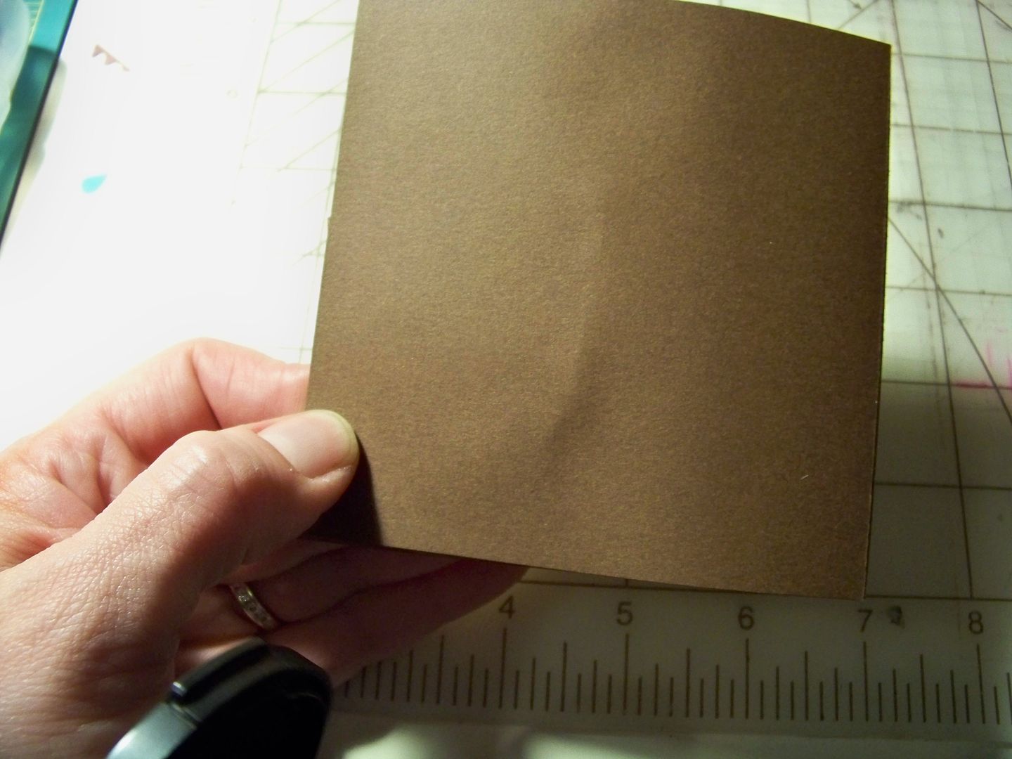
For each of my cards, I cut two pieces of 4"x8" cardstock. These form the inside of the card.  I cut two 4"x4" pieces of cardstock for the outside covers.  I cut all of my die cuts and adhered them flat to the bases before joining them.

Pirate Card (How Arrrrrgh You?)


I cut the paper that would be the majority of the inside of the card-- the one that would have a window cut into it.  It was cut at 4"x8" and scored at 2", 4", and 6".


I cut a window in the middle of the paper using the Centerpoint feature. I also cut a frame with the same cut.  This is from Holiday Frames and Tags.


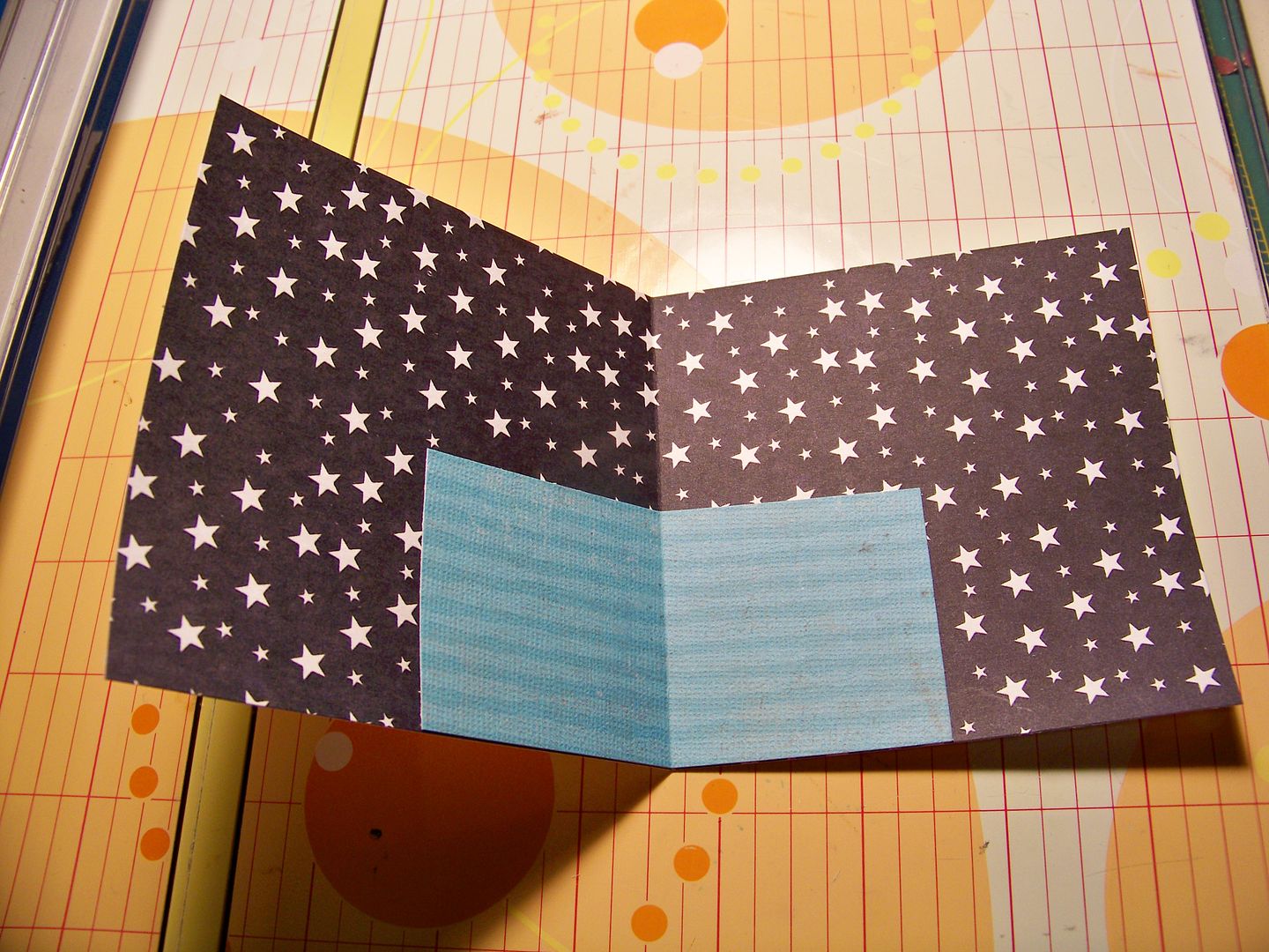
I cut the paper what would be seen when looking through the window at 4"x8" and scored in the center.


This would be the sky!  I wanted to add water.  I cut a 2"x4" piece of cardstock, scored it, and adhered it to the star paper.


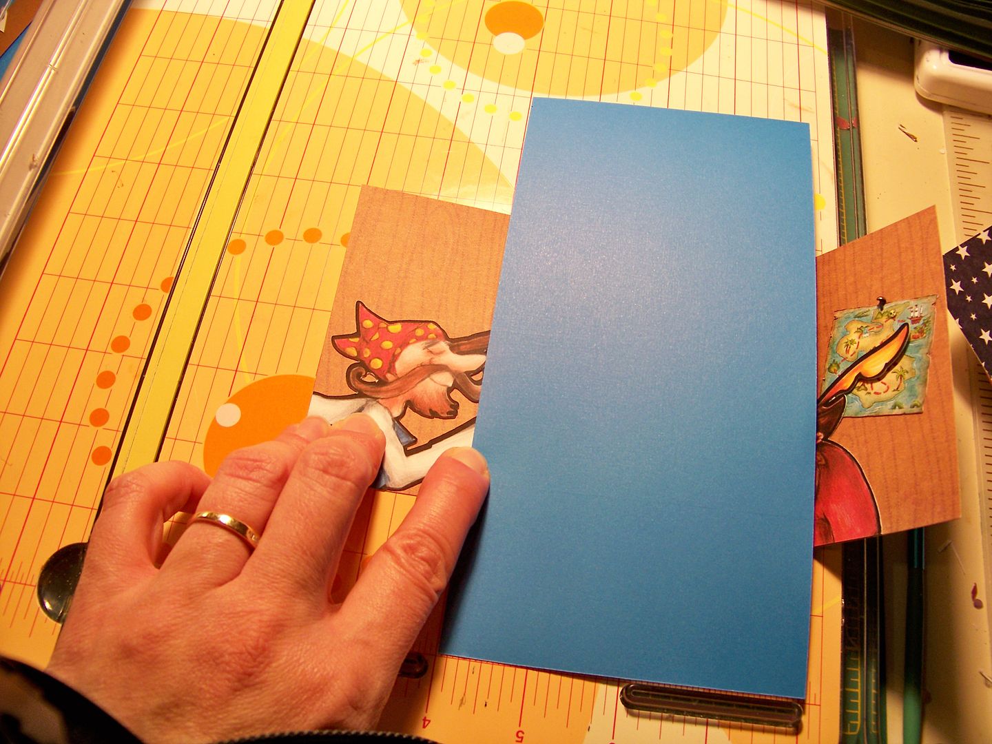
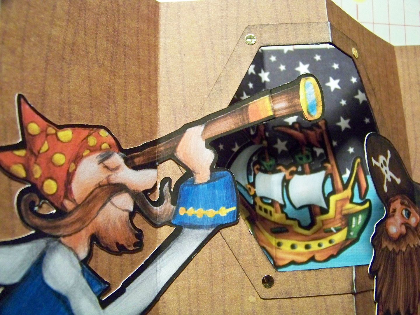
I cut the ship and added it.  I cut the characters and map and adhered them to their papers.  I cropped the characters to fit.  I used a brad that was inserted only part way to look like a nail holding the map up.  I did not glue the feather on the pirate's hat, allowing it to give a little dimension and create a shadow.


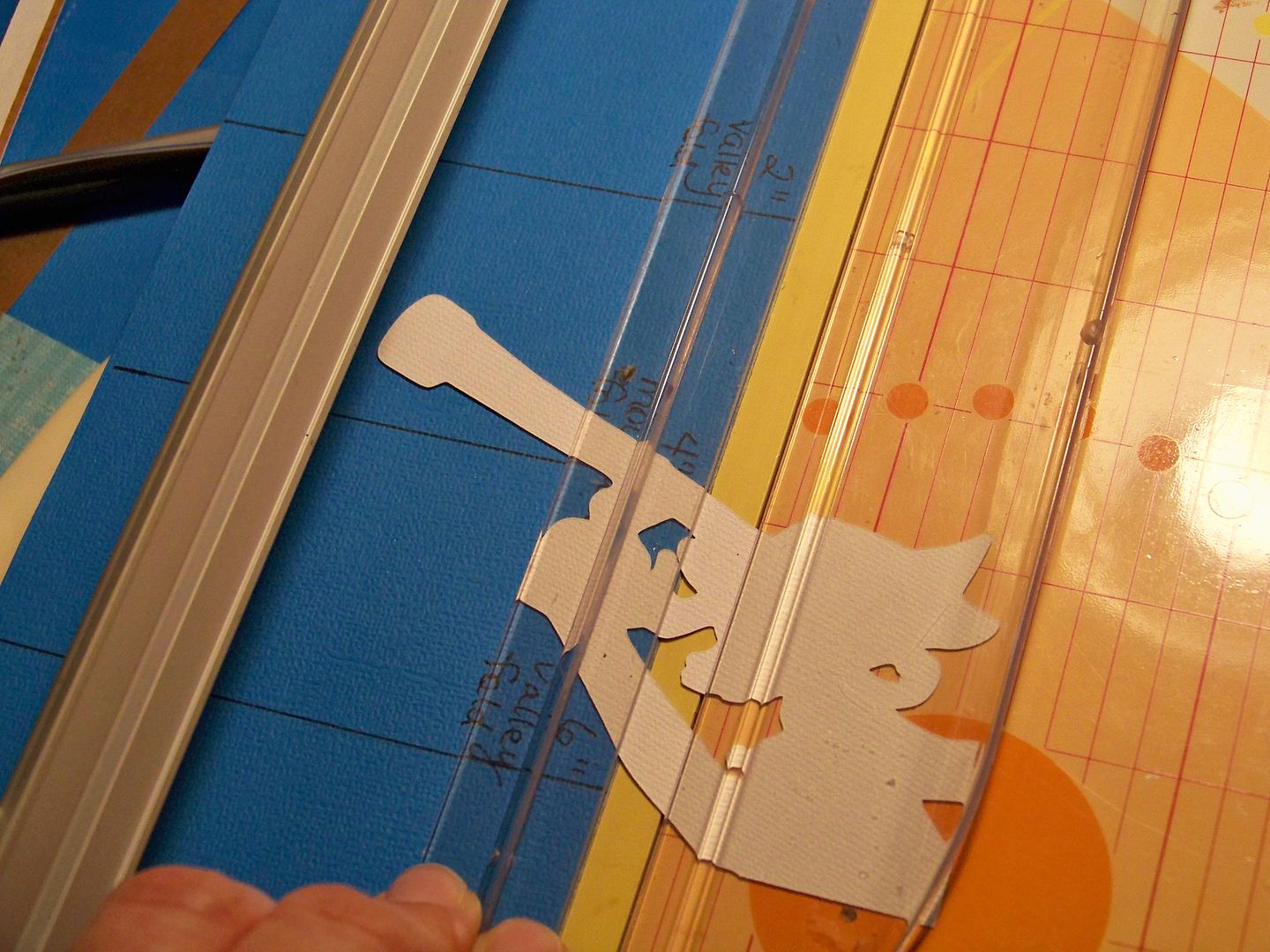
I used the straight edge of a piece of scrap paper to help me determine where to score a die cut (remember you have to score anything that covers a score line!).  I used the paper to indicate where the score goes, then I flipped it over and scored along the line.
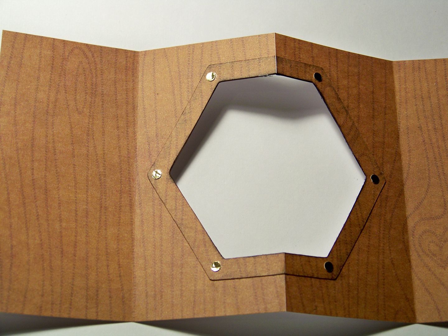


Then I joined the star paper to the faux bois paper.  The valley fold of the star paper lines up directly behind the mountain fold and window of the faux bois paper.  The side flaps were adhered using ATG tape.
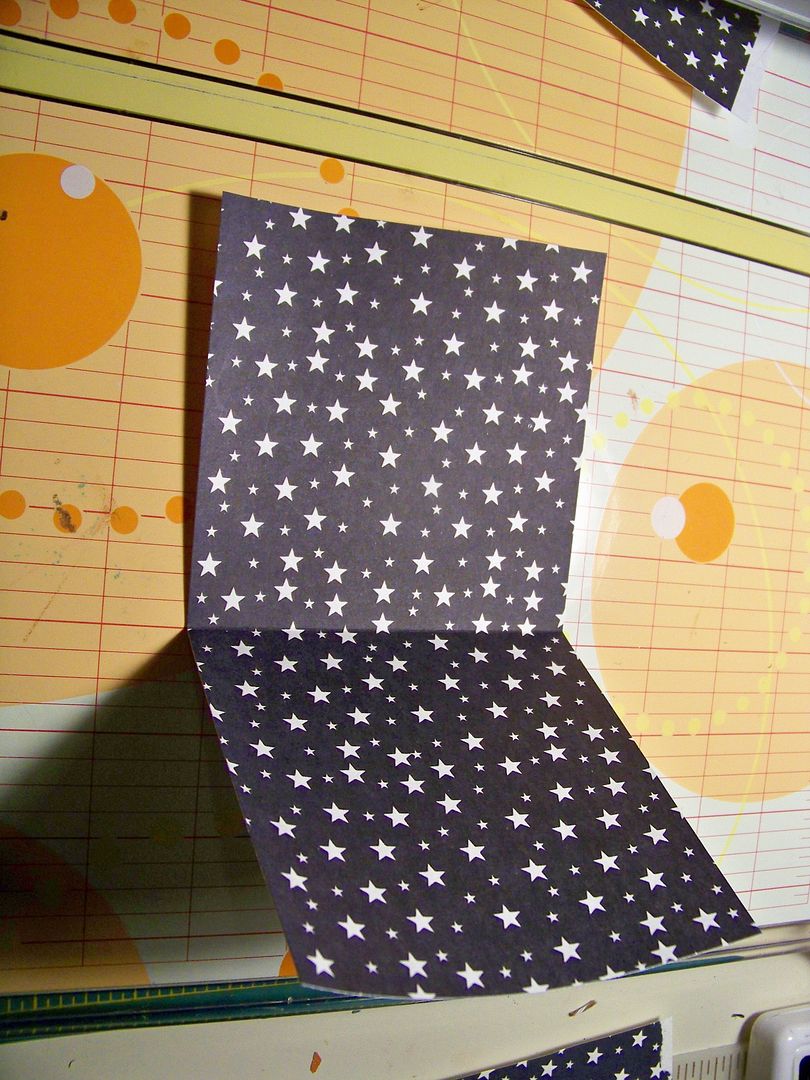
I realized that the telescope surpassed the center of the window so I manually cut it down.  Otherwise, when closed it would have been visible on the outside of the card.

I snipped off the end of this pirate's nose.  The lesson I keep re-learning is that small shapes overlapping a score line will never stay adhered and set correctly!  Best to avoid that at all costs!  

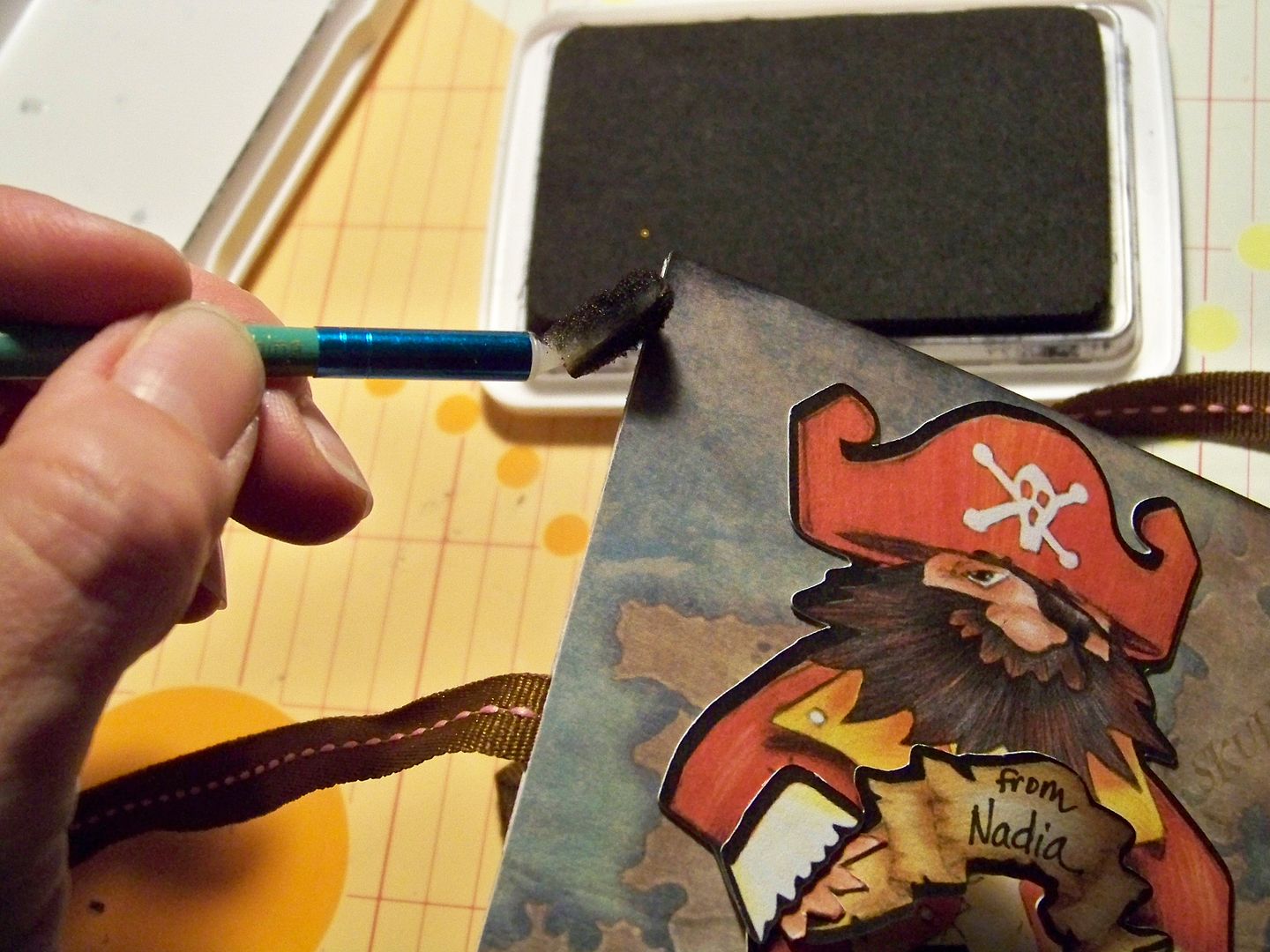
I added a computer-printed sign and inked the inside corners and edges.


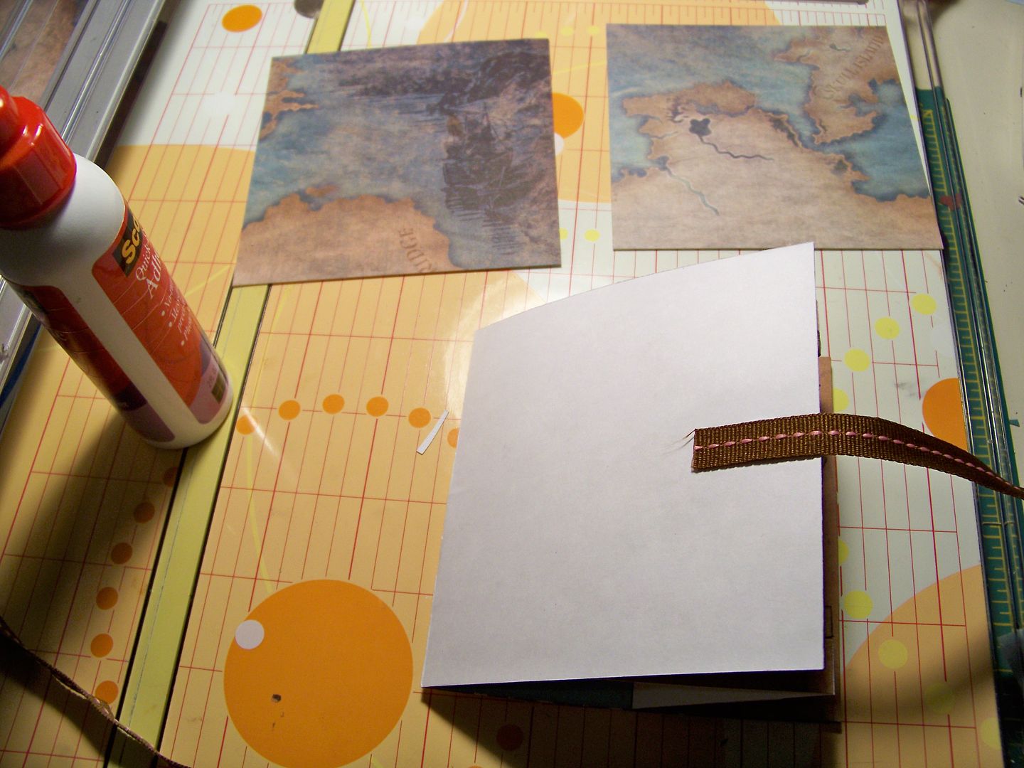
Once the two inside papers where attached.  I attached ribbon so that the card could tie closed.  I glued and taped the ribbon ends in place.


I embellished the covers and then adhered them to the front and back of the card with Terrifically Tack Tape.


Then, I cussed because, oh yes, I applied the front cover upside down! After prying the cover off and re-attaching it, it all worked out, but I can definitely assure you that it really is terrifically tacky.  grrrr....

Once it was worked out, I applied the back cover.  I added a little dimension to the front and back covers because those are the only places to add it!  Everything inside must be as flat as possible to enable it to close.


I finished by inking the corners and edges.


Crafty details for Pirate card:
  • Inside window - Creative Memories Holiday Frames and Tags Cricut cartridge, cut at 5-1/2" on an Expression.  I used the Centerpoint feature, layer plus shift.  I allowed it to cut the center of the cut and stopped the machine before it cut the outer shape. That created my cut-out window.  I cut this shape again on another piece of matching paper, allowing the machine to complete the cut.  This created the wood molding around the window.  I cut out little circles using an edge punch and applied them to look like screws.
  • Pirate with telescope - Buccaneer 5".  
  • Ship - Buccaneer 2".
  • Map - Buccaneer 1-1/2".
  • Captain inside - Buccaneer 3.7" cropped.
  • Arrrrgh! (word bubble) - Buccaneer 1.2".
  • Captain outside - Buccaneer 3.7" cropped on front, not on the back.  I also cut extra layers.
  • Text - Hannah Montana base font with shadow 3/4".
  • Banner (back of card) - Buccaneer 1".

Thankful for You card


I created the card bases, window, window frame, and covers just like I did on the Pirate Card.


Again, I loved the new Holiday Frames and Tags cartridge for creating the window and a frame around it.  I used the frame (Layer) for each cut.  To make the cut out, I simply stop the machine after it cuts the center, since it makes that part of the cut first!  Then I insert a contrasting paper and cut the shape completely and a frame is created to accentuate the cut out.


I find that Scotch Scrapbookers Glue is much more flexible than Scotch Quick Dry.  I liked Scrapbookers glue for anything that had to fold.

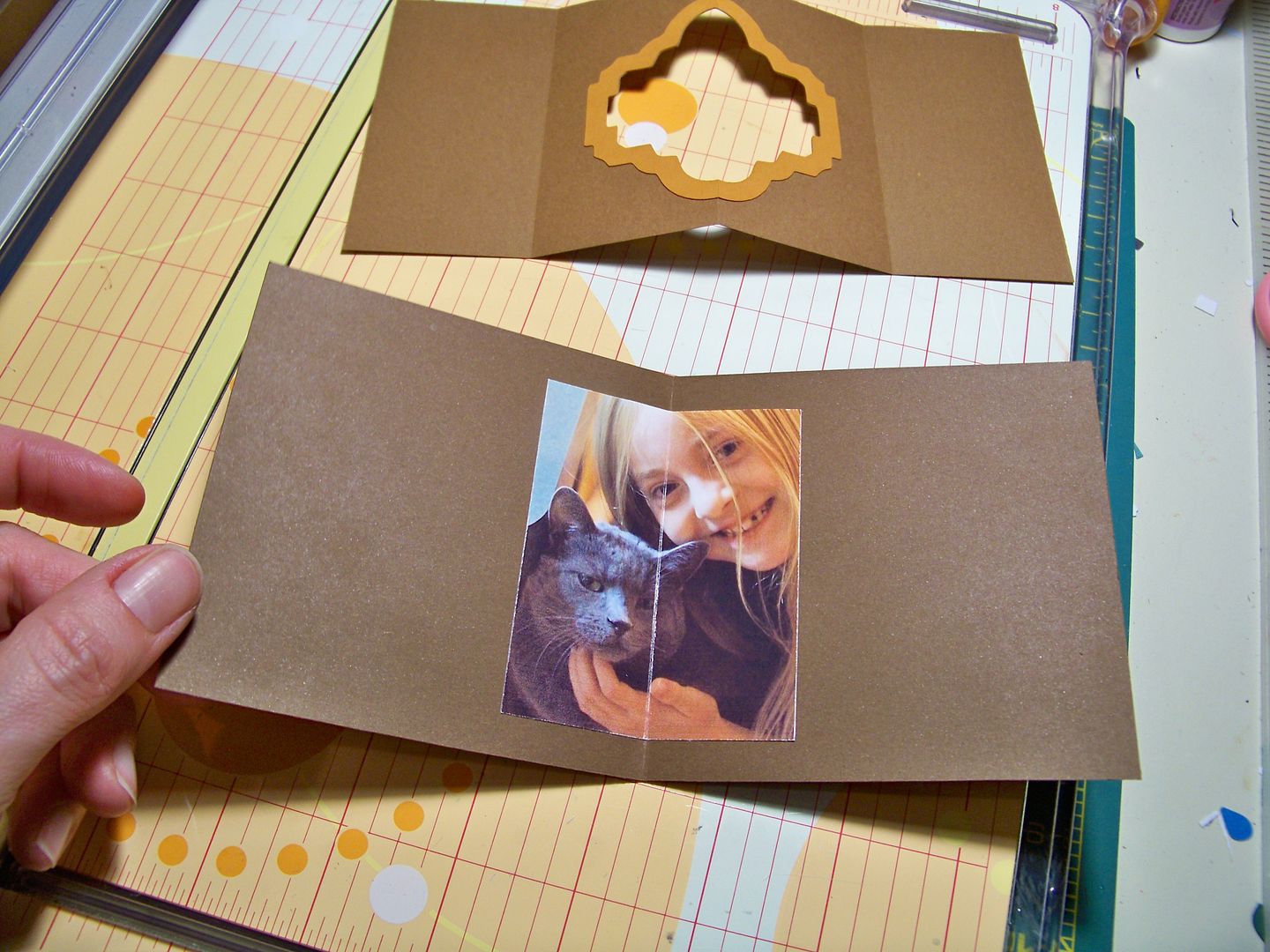
For the photo, I scored the photo on the back since it was a valley fold.  I used my Xacto knife to score.  I found that photos that I print with glossy photo paper do best when scored in this way.  Papers, I have found are fine to score this way whether mountain or valley, but layered cuts are better folded to score.  I decided this after fighting with the frames and die cuts here!


I attached the photo with ATG tape.  The line that you see is the light reflecting on the fold.  I took the pictures so that you could see the score line, but it is not cut all the way through; it is only scored.


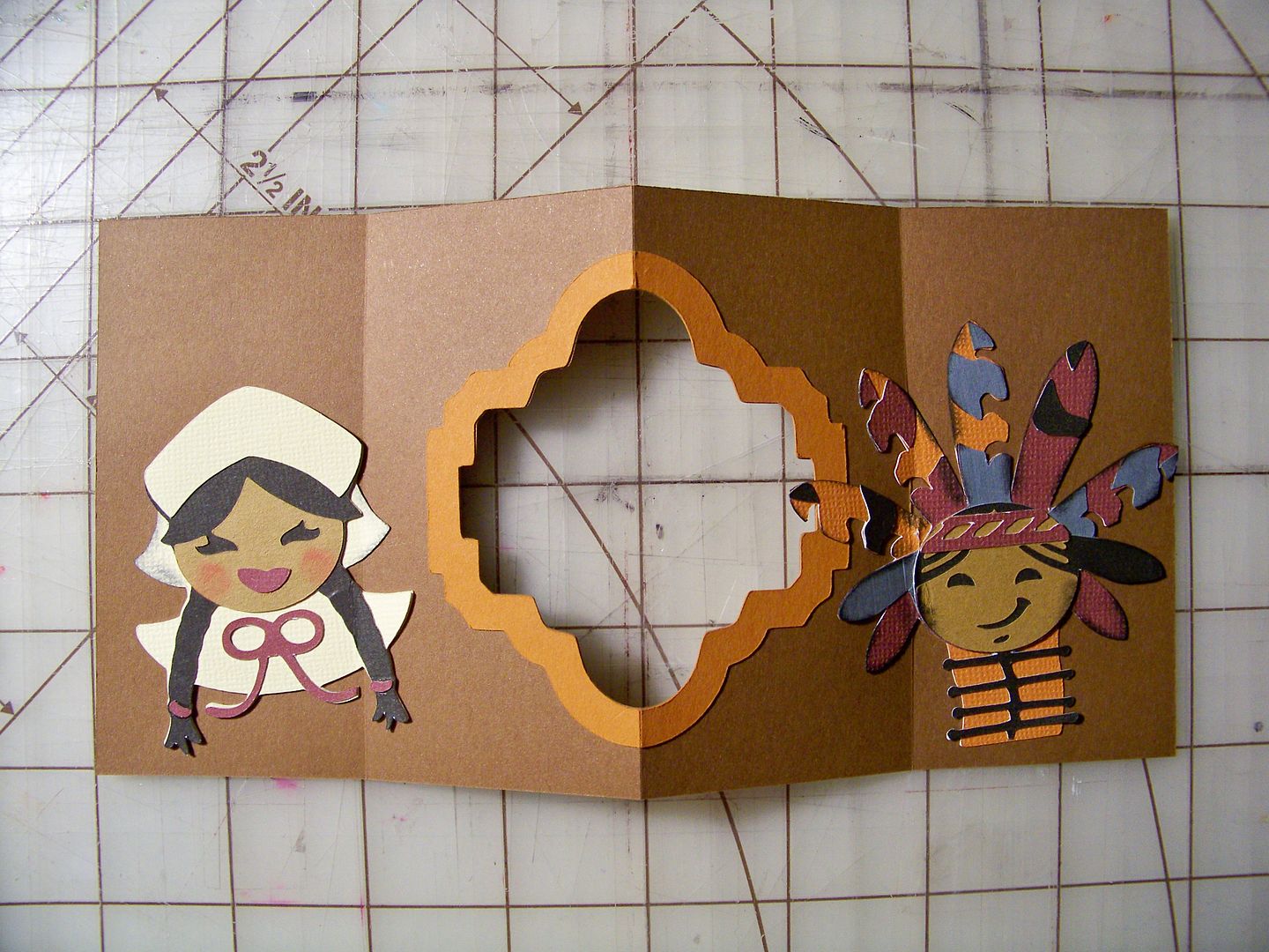
I wasn't as careful as I should have been on the layered die cuts.  It is so important to avoid small pieces in the score line.  Like the nose of the pirate on the above card, it would have been better if I had  trimmed the side of the Indian's face instead of allowing the edge of it to be folded in the score line!  The rule, I have found, is that the die cuts either need to far exceed the score line or not cover it at all.  Otherwise, the tiny piece will pop up no matter how much glue you use!


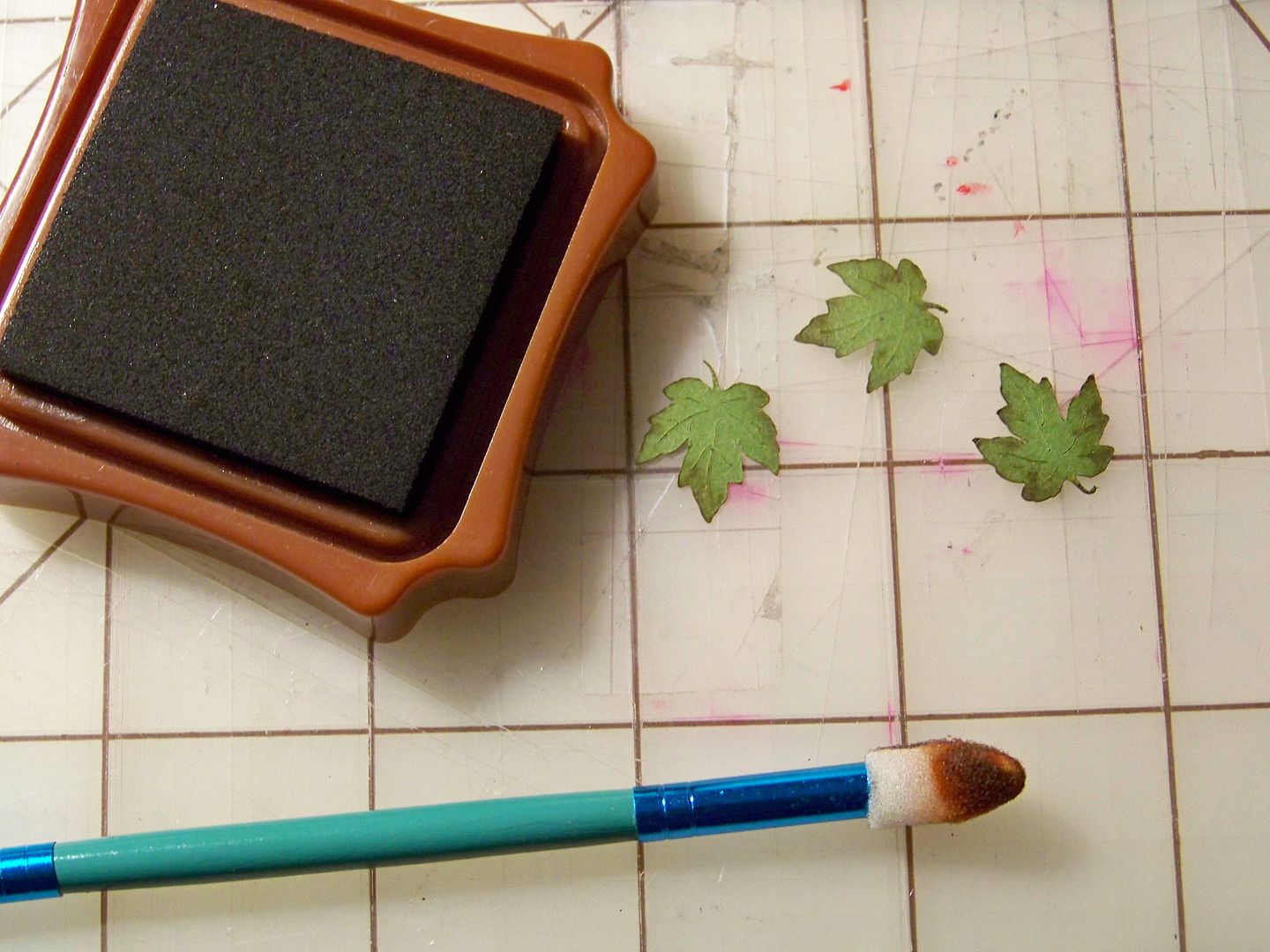
I cut and inked leaves and added them and text.


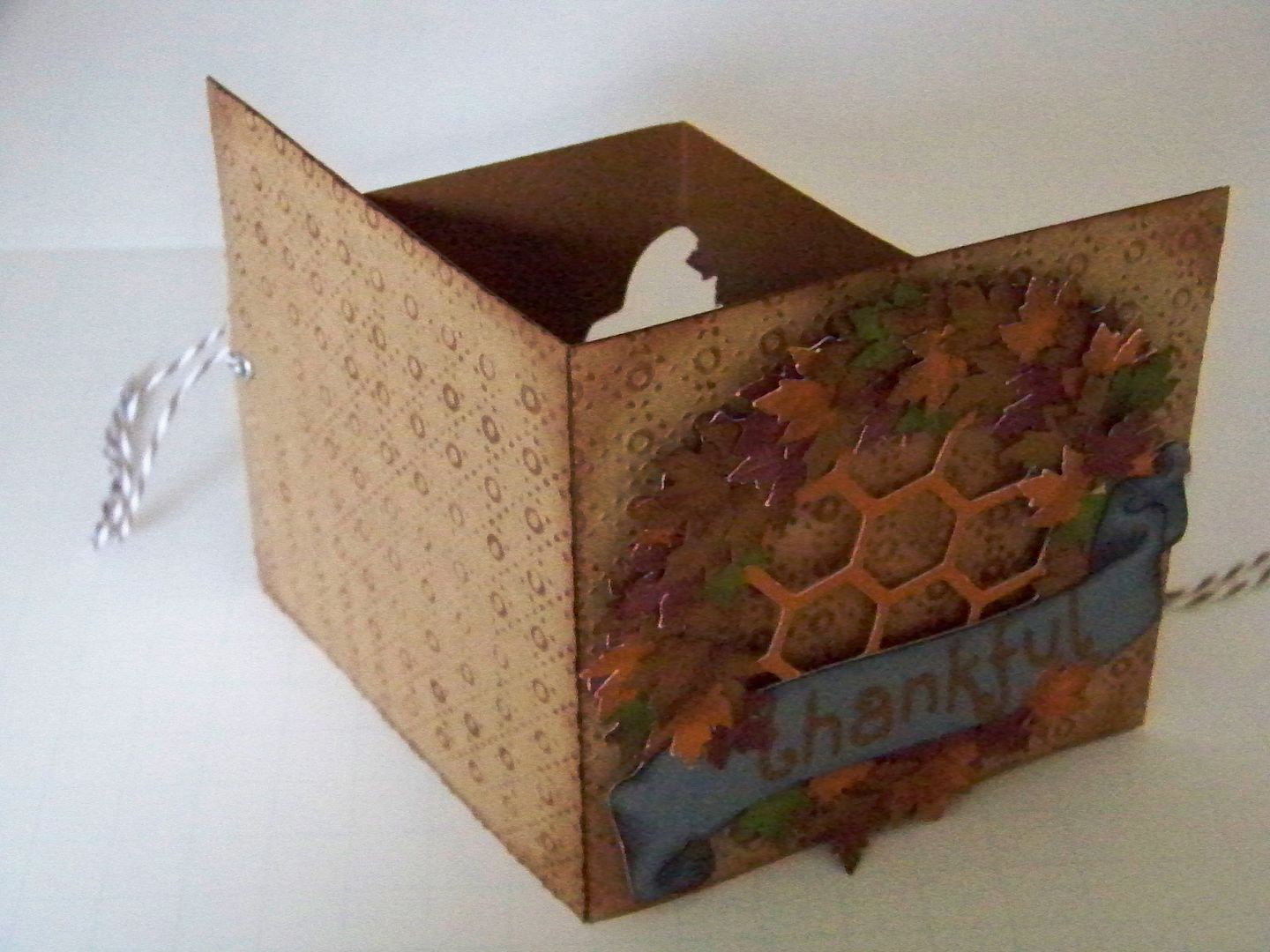
Initially, when I was planning this card, I had considered not cutting separate covers, using the backside of the inside paper for the outside of the card.  ....But then, my bulky die cuts which looked just fine on the front, created an unsightly bump on the reverse side.  *gasp*  Cutting 4x4 covers solved the problem by perfectly hiding them!


I embossed kraft paper, inked the embossed areas, and added eyelets for twine that will serve as a closure.  I also darkened in with ink the area that would be behind the wreath.  The covers were adhered to the card with Terrifically Tacky Tape.


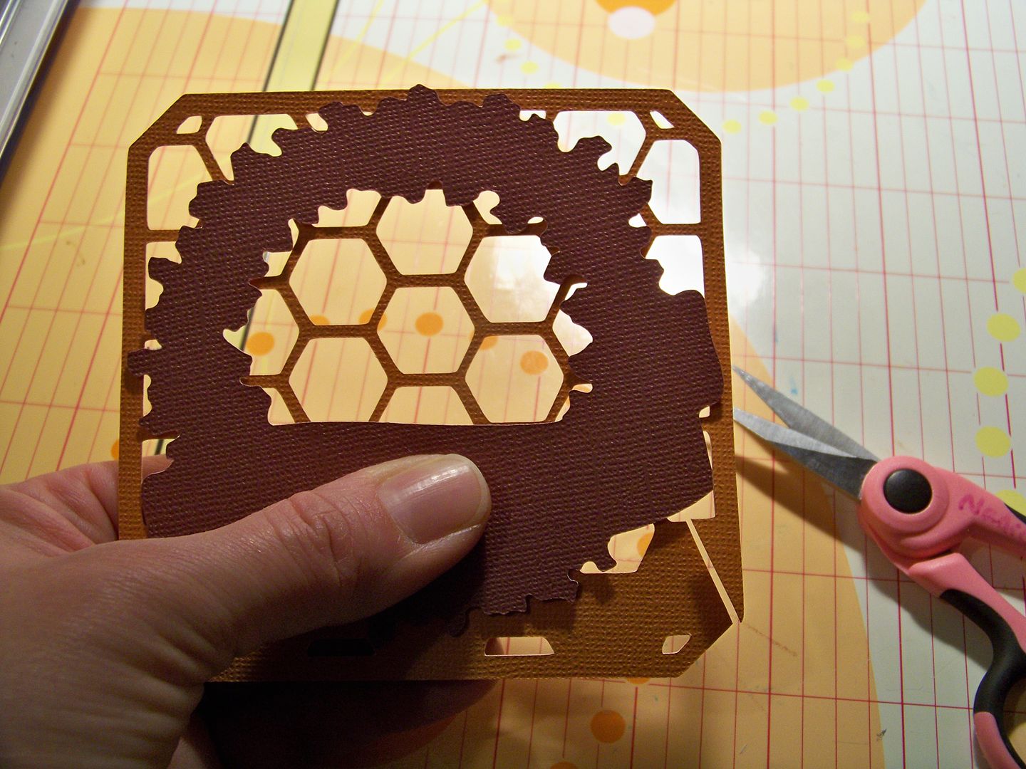
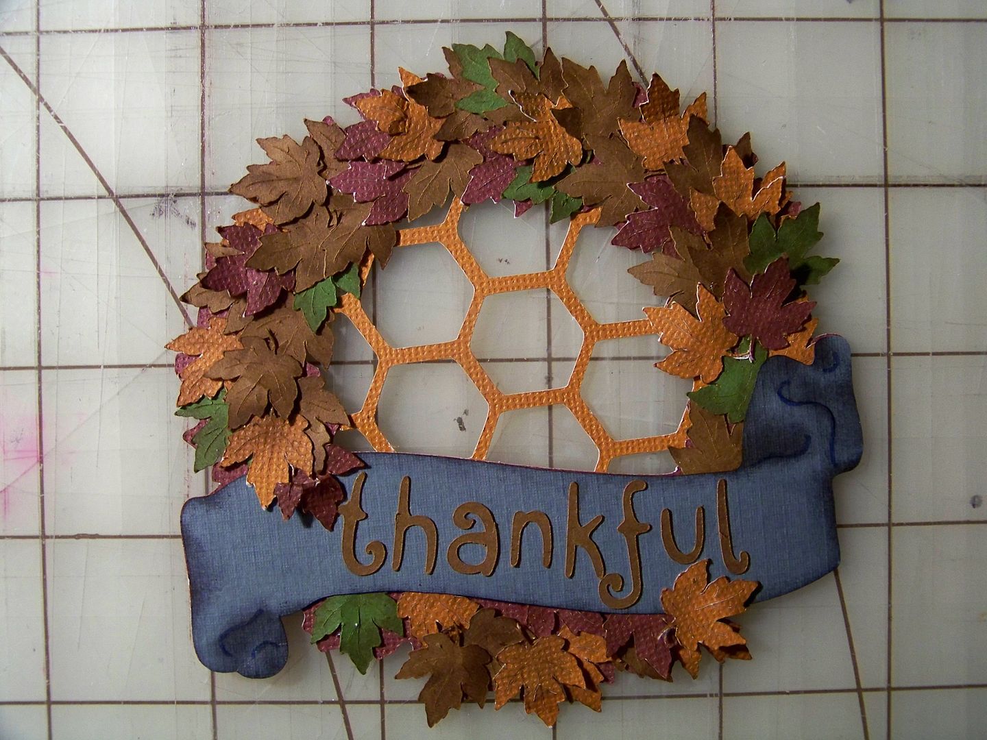
For the wreath on the front, I used the wreath from December 25th and leaves I cut and inked from A Child's Life.  I put that honeycomb/chicken wire pattern behind the wreath simply to avoid a hole in the middle of the card.  The cover papers were embossed and inked.


The wreath was added to the front cover with pop dots.


Crafty Details for Thankful for You Card:

  • Wreath - December 25th, cut at 3-3/4".
  • Honeycomb/Chicken Wire - Letter Envy Font (page 31), 4".  I placed it behind the wreath and manually trimmed away the excess
  • Leaves - A Child's Year (page 37), cut at 3/4".
  • Letters (on cover) - Holiday Frames and Tags (Jolly Font), 3/4".
  • Inside window - Holiday Frames and Tags (page 45), 3-1/2".  Just as the card above, I used the frame cut, but stopped the machine after it only cut the center to create the cut out.  Then I put in contrasting paper and cut the shape in its entirety for the frame.
  • Indian - Autumn Celebrations (page 66), 3".
  • Pilgrim - Autumn Celebrations (page 67), 2-1/2".
  • Letters (inside card) - Holiday Frames and Tags (Jolly Font), 1".

Thank you for checking my blog post today!  To see many of my previous projects, visit My Project Gallery!  My "thankful for you" card is also on the Cricut Fanatics blog today.

But wait! There's more! Click 'older posts' above!

But wait!  There's more!  Click 'older posts' above!