Saturday, April 25, 2015

Baseball Cap Embroidery Using Embroidery Foam


Today's post is a two-fer!  These are my notes on both how I used embroidery foam AND how I embroidered on a ball cap.

After seeing that there were special files just for use with embroidery foam (and a video on how to use them), I bought a number of colors from World Weidener.  They called the product they sell "embroidery foam" on their website, but what I received looked just like the 2 mm foam that I had in my craft room for other kinds of projects. (Embroidery foam is supposed to be washable so that is the benefit of using it!)  


Despite my concerns, I used it to start experimenting.  This is Apex's Panama font with one layer of 2 mm foam. I matched the color of the thread to the foam.  This detail is really important!  

This sample is stitched on canvas that has been hooped with tear away.  I didn't make any changes to tension.


The foam condenses down as it stitches.  The font feels firm, like there is a cord inside!  The stitching really pops off the surface!

This is the same font but with no foam.  The satin stitching is dense and it works great even without the foam, making it a great font just to have!


I also played around with a beautiful, new font called Violet Monogram, designed to work with embroidery foam.  I love the contrast outline stitch.  This was stitched with two sheets of 2mm foam.  


This has such nice texture and would be gorgeous for tone-on-tone projects!  I love how it lifts off the surface.  


On each of these, I floated the foam on top of the fabric to be embroidered.  I did not use a basting stitch or adhesive.  Once it started stitching, the foam was held in place.  I decided that using two sheets of the 2 mm foam yielded the best results.  After the machine finished stitching and I clipped my jump stitches, the foam tore off easily because the stitching itself perforated it so perfectly.  

At this point, I was ready to try putting a dimensional monogram on a cap!  I used a ballcap blank from Michael's Crafts.  

I found that there was no special tool needed, although I have seen hoops made from clipboards.  I simply used my regular 5x7 hoop.  I hooped cut-away and used a pencil to draw in the cross hairs, forming the center.  I printed my design using Embrilliance Essentials and decided placement on my hat, then transferred to the hoop.  (For details on how I do this, check out my post on stitching a pillowcase.  I go into a lot of detail on how I use thumbtacks to transfer the design from the project to the hoop.)


I flattened the hat as much as possible, lifting in order to spray a little textile adhesive under it.  I kept the bill in place by using a simple binder clip.  Once it was in place, I put the foam on top and allowed the machine to start stitching the design.  I used polyester thread from Metro Embroidery Thread.


Once it was done, I pulled the foam away, allowing it to rip off along the perforations.


As you can see, the foam left behind little raggedy bits.


This was easy enough to fix using a very hot iron and gently touching the sides and top of the stitched lettering.  I didn't lay the hat flat, I held it in my hand and worked with a light touch, making sure to only touch where needed.  It made the lifted lettering smooth!  


I did roll the bill of the cap a bit to restore its shaping, which was easy and effective.


I was pleased with the outcome!  


 Quick List of Links Provided in This Post:
  • 3D Foam Puff Embroidery video:  click here.
  • World Weidner embroidery foam (not so sure about this being washable):  click here.
  • Apex 3D Puff Panama script font:  click here.
  • Hang to Dry Violet Monogram:  click here.
  • Notes on how to transfer design from garment to hoop (on a previous post):  click here.
  • Michael's ball cap blanks:  click here.
  • Metro Embroidery thread for polyester thread:  click here.

Thank you for checking my post today.  All of my embroidery notes, suppliers, and projects can be found on my Embroidery page on my blog, accessible using the tab at the top of my blog or by clicking here

Thursday, April 23, 2015

Talk Derby To Me Embroidered Kitchen Towel


I spent some free time last night doing a fun little Derby towel for my kitchen.  This phrase is all over Louisville, where I live, as we gear up for the Kentucky Derby.  (I think it started many years ago with Roller Derby but was picked up by a shop called A Taste of Kentucky and now we all use it).  The actual horse race is about 2 minutes long but it is important to our town so we spend a couple of weeks celebrating it with a bunch of other activities, including a huge fireworks show, a steamboat race, a hot air balloon race, bed races, a marathon, concerts, parties, and dozens of other events meant to create a festive atmosphere to encourage visitors and citizens to spend money and celebrate!  If it is good for Louisville, I am all for it.

To make my project...

Screenshot from my Embrilliance file for this project

I used Embrilliance Enthusiast software to remove the bottom stitched elements of a frame I got at Boutique Fonts.  Click here to link to that file.

I used Embrilliance Essentials to place and size the horse and font.  The horse is from Embroidery Online.  Click here to link to the horse file.  The font is from Jolson's; click here to link to that one.  It is available as a .bx file so it is super easy to use with this software!  Embrilliance allowed me to print off my finished design at actual size so I used that to guide placing the design on my towel.

The towel was pre-washed before embroidering.  Fabric was sewn to the bottom of the towel after embroidering to make it look a little more "boutique" style.  I hooped two sheets of tear-away stabilizer and floated the towel on the hoop.  I used water soluble stabilizer (WSS) as a topper.  The threads were from Metro.

I was really pleased with this project and I think it would make a fun gift for a Derby party hostess.

Thanks for checking my post.  Since this is a short one, there is no "Quick Links" list.  Just click above for those.  (None are affiliate links; just regular links in the hope that it is helpful to you.)  I am happily stitching whenever I get a chance these days!  Hope you are crafting whenever you can too!

Monday, April 13, 2015

Embroidered Pillowcases - Using a Jumbo Hoop and Splitting a Design!


I love vintage linens!  I've bought them from estate sales and flea markets. I have a bunch of old pillowcases, handkerchiefs, table linens, aprons, and dresser scarves from my grandma's home that I saved from a yard sale pile that someone made after her death when we cleaned out her home. Some are beautifully decorated and others are perfectly plain.  I love having her linens the most because they were hers and they smelled like her linen closet in the downstairs hall.  I haven't used most of them, hoping to keep that scent as long as possible.

But that was long ago.  She and my grandpa died nearly two decades ago.  I have moved these things with me three times to new homes. Today I am ready to embroider on some of the plain linens now that I have figured out how to use a jumbo hoop with my Embrilliance software and my embroidery machine!

Let me just preface this post by saying that I have a Brother PE770 and Embrilliance software. I share this tutorial for two reasons (like all of my blog posts):  so that I can remember what I have done AND so that the information is available to anyone else who finds it helpful!

First a bit about the jumbo hoop.  By that, I am referring to the 5x12 hoop that I received in a set to use with my machine.  This is a link (click here) to what I bought, in case you are looking for one too.


This hoop allows for a longer field of embroidery without re-hooping by allowing me to move the hoop using the different hoop nuts.  My machine will only embroider in a 5x7 field, but by moving the hoop first to a top position and stitching and then to a lower position and stitching, I can add so much more length without worry about alignment because I am not re-hooping.

Next, let's talk about software:  The way I do this is with the use of Embrilliance Essentials.  (I currently have other Embrilliance software as well, so you may see extra buttons on my screenshots, but only Essentials is needed to do this!)  I saw a quick video on how Embrilliance can split a design for a large hoop.  To see that video, click here.   That piqued my interest in this process.

In Embrilliance, click on the Preferences button.


I select "Multi Position" in the Hoop Style box.  Then I select my hoop.  The 5x12 (inch) hoop is the 130x300 (mm) Jumbo Hoop.


To design, I often click the "Rotate 90" box in the Program Preferences box (above) too, but I always unclick it before I save and print because I like seeing the printout as it will be in front of me on the hoop!  I just find it less confusing and easier to be sure I have my fabric hooped (or floated) in the right direction!

This is my design for my pillowcase.  I want the bottom of my letters to be closest to the open edge of my pillowcase.  This is actually three fonts from Stitchtopia.  This is Grace, Grace2, and Grace3. Each of these is a scrolly font with alternate letters and all three work together!  I used elements from all three since they all have interchangeable alternate letters.  I love putting them together!  When I bought them, I printed out a screen shot of all the options of each and the "key" and then did a "pick-and-choose" for each letter so that the scrolls were different and looked good together.  This is similar in theory to the "Samantha" font that I have seen for papercrafting.  (I was never even interested in it for paper, but for embroidery, I love the options!)


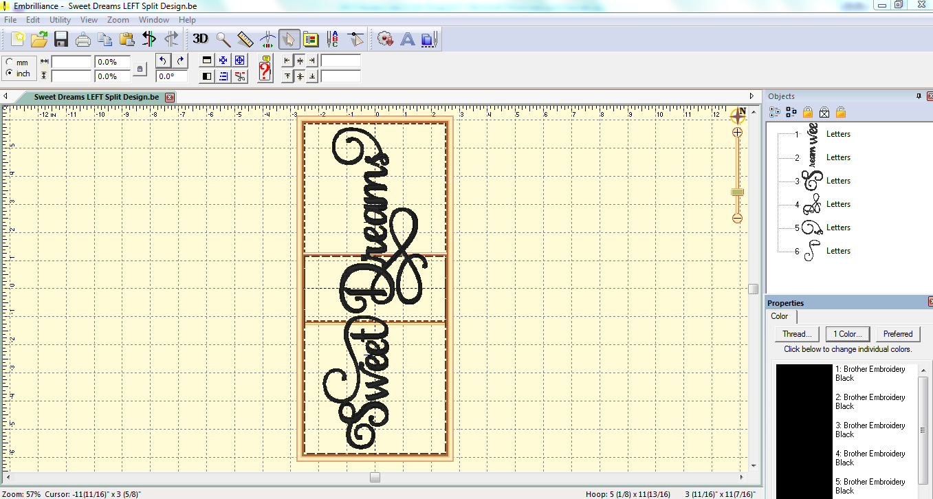
You can see that this is a longer frame.  The confusing part for me was the overlapping area in the center.  I really didn't understand what that was all about and wondered if that meant that I would need to move the hoop to a middle position.  The answer to that is NO and the program itself clued me into that because when I save this design in Embrilliance, in addition to a "working" file, I get two files for my machine (in my case, two .pes files).


One is listed as 'top' and the other as 'bottom' by the program itself.  That is how I knew I would only have the hoop in the topmost location (using the top hoop nuts on the side of the hoop) and the lowest location (using the lowest hoop nuts).  And just so you know, I know you are snickering at the term "hoop nuts."  I think (hope) that is the right term for them (like nuts and bolts), but, if not, it is more entertaining so let's keep the name!

I was trying to figure out which way would be easiest to hoop with the excess fabric.  I came to the conclusion that it would be best to have the bottom of the letters (and thus the opening of the pillowcase) to the left and the excess fabric rolled and pinned out the way on the right.  I simply copied the file by highlighting all of the elements in the objects box, and clicked the "rotate 90 degrees" button a couple of times.


Pillows for both sides of the bed are done using the same working file; one pillow simply flips so that the embroidered edges are parallel to the sides of the bed.

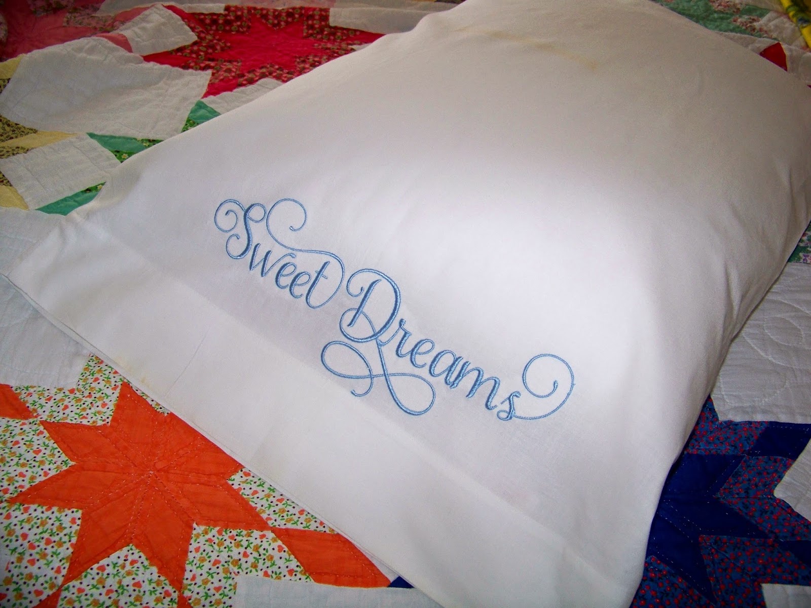
My design was 11" long!  I love that length for a pillowcase!  I also felt that I understood the process enough to proceed onto a real pillowcase.  I have a bunch of odd ones without a mate and decided to try it out on one as a practice before trying my matched set with handmade edging from my stash from Grandma's.

My practice pillowcase was also a discard from my grandma's house so it had been used and washed many, many times.  Normally, I would pre-wash anything that I know will be washed in the future.  That isn't the standard for professional embroidery services but I think of this as insurance against shrinkage (and in the case of bright fabrics, bleeding) so I always do this, just as I would something that I was sewing, in order to make sure that my projects look good after hitting the laundry!

To make something look brand new that has been washed, I iron with steam and starch!  It makes the item look like it has the sizing in it that factory-new fabric has and the embroidery looks more dimensional.  Besides, ironing with starch is a thing my grandma always did so it is especially fitting here (although I ALWAYS do this to prep smooth fabrics that have been washed before embroidering).  Spray starch is cheap and readily available at grocery stores, big box stores, and even dollar stores.  Use care NOT to scorch your fabrics so keep the iron moving over the fabric.

I use my Embrilliance software for everything I stitch out.  One huge benefit to this is that I can print out the design at real size to use to help with placement.


To prep my pillow case, I folded it in half, lengthwise and ironed it to make a center-line.


I hooped my jumbo hoop with tear away stabilizer.  I used the hoop insert to draw in a cross-hair. 


Now I really needed to decide my embroidery placement on the pillowcase.  I looked at this on-line guide (click here), as well as hand and machine-embroidered cases I already had for help in figuring out where to stitch on this case.  The online guide suggests 5.5" from the outer edge. Pillowcases I own vary.  To make the final determination, I cut around my Embrilliance printout and used that to place the design.


I laid my printout in the center of the hoop, matching cross-hairs on the paper and the hoop.  I make absolutely sure at this point that this is the orientation of the lettering!!  (By knowing this for sure, I know that my pillowcase opening will need to be on the left of the hoop and the rest of the pillow case will need to be on the right, rolled up and out of the way when it is time to stitch.  Not paying attention to this right now can ruin the project--just a little pressure here.)


I used something I learned recently on Lisa Shaw's blog (click here) using thumbtacks to help line up cross-hairs on the hoop to those on the item to be embroidered. I put thumbtacks in the very center and one on each end so that the sharp points are on the top surface of the hoop.  I went through the stabilizer all the way to the paper so that there are holes in the paper!


The thumbtacks look like this on the back!  (Yes, I had printed my design out on the back of princess paper so that is why you see that through the stabilizer!)


Then I remove my paper print-out but leave the thumbtacks!


So now, I place my paper printout on my pillowcase, placing it where I want it to embroider, lining up the cross-hairs to the center foldline.  I measure to make sure that the side markings are equidistant from the edge of the pillowcase to make sure it is straight!  I tape it in place but you can pin it.


 I turn my pillow case INSIDE OUT!!!  The paper printout is still attached to it and in place!


I lightly spray the stabilizer in my hoop with textile adhesive.


I carefully place the pillowcase onto the hoop, matching the holes in the paper pattern, through the fabric, so that the thumbtacks go back up into the VERY SAME holes as before!  

Then I remove the paper pattern, and the pillow case is perfectly aligned on the hoop!


I remove the thumbtacks at this point after I (carefully) smooth the fabric against the sprayed stabilizer to keep it in place.


 I roll up the pillow case and pin it back to avoid getting it caught in the stitching. I put the hoop on the machine, using the TOP TWO hoop nuts.  I will embroider the top first so that is why I have the hoop in the top two.


Next, I grab my flash drive and copy the file for the top onto it.  Because I am paranoid, I copy the bottom on a separate flash drive.  You can put both the top and the bottom files on the same flash drive, but I did this so that I don't make a mistake.  By now, you have probably realized that I constantly try to keep myself from getting confused.

The first thing the machine does is to stitch in the top alignment box.  It looks like a basting box but I didn't think it showed up in the "Objects" box in Embrilliance or get stitched on the Stitch Simulator. That was why I was surprised when it stitched!  (But is does show up in the objects box-- it was combined with the design and I failed to notice that! Just click on the + to see it and decide to keep or delete!!  Someone awesome clued me in to that after my project was complete!)  Because this box does not have an anchor stitch, I find that I have to hold the end of the top thread with my left hand and hand turn the balance wheel one turn with my right hand to help the bobbin thread get pulled up to the surface of the hooped fabric.  (The balance wheel is that thing that turns on the end of the machine to your right as you sit in front of the machine.)  Once the bobbin thread is on the surface, I can stitch out the alignment box but, without doing that, the stitches just don't hold.  I remembered seeing that tip from somewhere after I re-threaded my machine, replaced my needle and my bobbin!!  Come to find out, though, you can do this and just let the box NOT stitch, just leaving holes.  Personally, I like the stitching because it ensures that my pillowcase isn't going to shift!  And it is as easy as a basting box to remove at the end.

Then the decorative stitching begins.


Once it is done, I remove my hoop (NOT removing the fabric from the hoop; just taking the hoop off).  Then I slide the hoop away from me and put the hoop back on using the bottom hoop nuts.  I put the file for the bottom stitching on my flash drive and stick it back in the embroidery machine. The process from above is repeated with the alignment box and then with the decorative stitching.


I remove the hoop and take the pillowcase off.


 I cut all the jump stitches and started the process of tearing away the stabilizer.  I placed the pillowcase face-down onto a towel and pressed it to remove the pinholes from the alignment box.  You can just skip this step.


(This is a good time to mention something about those alignment boxes so keep this in mind if you are thinking of using the jumbo hoop on a material, like vinyl, that is not so forgiving of pin holes -- and I just learned this from someone after this initially posted-- if you click on the embroidery in the objects box in Embrilliance and see the +, the stitching will be broken out and you will see the alignment box!  You can delete it there!  It shouldn't have been a surprise to me, but it was!!)


Happy with my practice pillow, I am ready to embroider the "real" ones that I had in mind all along that prompted this whole process.  I wanted white-on-white embroidery using pillowcases with handmade lace.  I have no idea the history of these except that my grandpa's mom used to do this kind of lace, doilies, and tatting.  I really don't know that these were edged by her, but since my grandma had so many of her lace items (and now I do), I am romanticizing that these were made by my great grandmother.


I floated them just as before but I moved the design down a bit.  I used the hem as the mid-line for the lettering and that made it so easy.


I hope this post was helpful to you!  I loved this project and learned so much!  And I am so excited about the possibilities with this larger hoop!

Quick Links from this post:
Thank you for checking my blog post today!  All of my resources and links that I have for embroidery are now on my Embroidery page (tab at the top of my blog or click here).  

Saturday, April 11, 2015

Mapping Fonts with Embrilliance Alpha Tricks


I am continuing on my embroidery machine software journey with today's post.  I apologize to anyone here looking for papercrafting!  I still love paper, my Cricut, and all the whimsical and creative things that have to do with that, so those posts will be back shortly.  I get easily sidetracked and I am on a machine embroidery kick at the moment.  I am just really enjoying the possibilities with the software available to me.  This post is all about how to map letters and numbers from a font in a regular embroidery file (like .pes or .dst files) so that they work like bx fonts in Embrilliance.  The benefit of bx files is that they do not need to be uploaded one-at-a-time, but rather are typed in just as is done in Word Processing.  Additionally the letters are already aligned and so fast to put on the virtual hoop.  This information is specific to Embrilliance Software (only Embrilliance uses bx files) and Alpha Tricks (a separate purchase from other Embrilliance software).

This is what I do to map a font using Embrilliance's Alpha Tricks...

Start by opening Embrilliance, opening a page, and clicking on the Font Mapper (button).  It looks like a needle next to a vertical ABC.  


A pop up box asks if I would like to import a font.  The answer is YES!


A window will open so I can scroll to find my file with the font I want to map. The font I am needing is called Falling Snow from Applique Corner and was not available as an fx file. 

I click on it.  If there is a + sign next to the folder I click, I will notice that there are no samples of the letters in the box to the right.  In that case, I need to click on the + sign and then look inside to find the file.  In this case, my Falling Snow Font was a folder that had all the sizes inside in separate folders.  I have to do one size at a time, so I selected the one that is 1-1/2".  Once I did that, I got to see the font in the box.  Next, I clicked the "Sel. All" button to select all objects in the folder. Once they are all selected, I click the "import" button. (NOTE:  For this to work best and easiest, there must only be one of each letter/number so I deleted all file types but one!  This would be a pain if I did this and had .art, .dst, .exp, .hus, .jef, .vip, .xxx, and so on in there as well as .pes!)  


The Import Font box opens.  

Here, I can see:
  • The font as named in my computer and, under it, the name it has been given (which can be changed at any time).  
  • I look to the baseline field to see that this has a bottom baseline.  I keep it because I think it makes  the most sense for this font.  
  • I see that this starts with number, specifically the number zero.  Looking at the "letter" field, it has been mapped to "alf0" so that must change!  To change it, I can manually put in whatever I want, such as 0, but more efficiently, I can click the "0-9" button and it will automatically map 0-9 with those numbers for me!  After doing that, I can click on any number and look to the "letter" field to see that it is correctly mapped.

Next, I click on the first thing after the numbers, in this case, it is "a".  After I click on the "a-z" button, all the lower case letters are correctly mapped.  Here, I have clicked on the lower case letter a and I can see that it is correctly mapped.


Next, I click on the upper case A.  I click on the "A-Z" button to map all the upper case letters.


Now everything is mapped but looking at the letters, I can see that they are not aligned the way I want them.  Because the baseline is the bottom of each letter, some letters are raised because the bottom of the letter needs to go below the baseline.  I simply click on a specific letter, like this f, and use my mouse to drag it down to where I think it looks best.  


I do this for all letters.  (The numbers looked fine so I left them alone).

I manually moved the upper case letters.  You can see how the X, Y, and Z all needed to be lowered a bit.


At this time, I decided to slightly change the name of the font.  I alter only the "name" field, not the "font" field.  I can name it anything that makes sense to me so that when I am searching for it, I can find it easily.


I click 'save font' and all the changes are saved and the font is mapped!


I have to close Embrilliance and open it back up.  Once I do that, the font will show up in my properties box with all the other bx fonts as well as the built in fonts from Embrilliance!  I can still manually change the letters and spacing.  In this case, I moved the lower case letters closer together by grabbing each green square to isolate a specific letter so I can move it independently.  I want the letters to look connected.  I moved the upper case N to remove a bit of unnecessary space.


After my changes, I have the text the way I want it for stitching out.


At this point, if I wanted to go back to make another change, like the name of the font, or if I realized I forgot to align something, I just click the Font Mapper button and when it asks if I want to import a font, I answer NO and scroll to find my font.  I make my changes, and click "save font".  I have to exit out of Embrilliance and then open it back up to see that my changes have been made.

And one more thing regarding this font:  There are several sizes included in the Falling Snow font purchase.  I have just mapped the 1-1/2" size.  I will still need to open all the other sizes SEPARATELY.  Happily, the sizes are all separate files with the numbers, upper case, and lower case letters for each size in one file.  Sometimes when you buy a font, it is not organized in this way. The two that come to mind are (1) the case where a font has multiple height sizes all lumped together in one file and (2) the case where a font has its upper case in a separate file folder from its lower case. Following are mapping tips for those.

When a Font has Multiple Sizes All in One File:

For a font that is in a file with different sizes all together, I don't click "Sel. All" but rather, I upload those one at a time.  (You could create separate folders and move each out into a size-specific folder, but I think this is actually faster.)

This font is Nautical Font from Planet Applique.  It is made of lower case letters and the file contains 2", 1-1/2", 1-1/4", and 1" sizes all in the same folder.  I clicked the Font Mapper button and selected the font I wanted to map.  I decided to map the 1-1/2" size this time..  I made sure to select the correct size for letter 'a' and clicked import.


To import the next letter, I clicked "Add Designs" and repeated the process until I had 'a' through 'z'.


Doing it one-at-a-time, even though there are only 26 letters, can get a little boring and the mind will wonder.  Sometimes I like to repeat myself-- haha.  When this happens, I click on the extra letter and then click on the garbage can icon.  


Once they are all in, I align any letter that needs to have its lower edge hang below the baseline as described above by clicking on it and dragging it into place.  Then I check the name and change it if needed.  As you can see, if I had kept this one as is, it would have been sorted under "p" for PES.  I changed it so that it would start with the word "NAUTICAL".  Then I saved the font.  


When a Font Has Upper Case and Lower Case Letters in Separate Files:

Some fonts that need to be mapped have the upper and lower case letters as separate files when they are purchased and downloaded. They have to be mapped all together so that they can be typed in together in one text box.  To do that, I upload the lower case. Then I click "Add Designs" and upload the upper case!  (It doesn't seem to matter which you enter first as long as you map them correctly!) I map and align as described above.  I change the 'name' field so that it represents whatever I would like it to be on the Properties Box list, and I click the "save font" button.  

I hope this makes it a cinch to map fonts the moment you have Alpha Tricks loaded on your computer!  

Quick Links:
  • Embrilliance Essentials - click here.
  • Alpha Tricks - click here.
  • Hang to Dry's Ornamental Monogram (this is the font on the title at the very top of the post) - click here.
  • Applique Corner's Falling Snow - click here.
  • Applique Planet's Nautical Font - click here.

Thank you for checking my blog post today!

But wait! There's more! Click 'older posts' above!

But wait!  There's more!  Click 'older posts' above!