Friday, April 22, 2011

Bird-day Lady -- 5th Anniversary Design Challenge


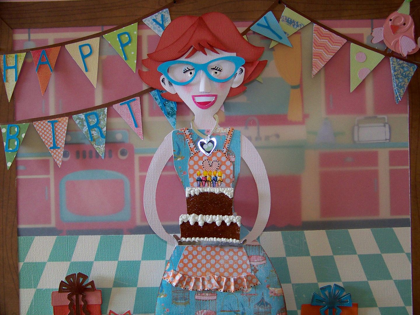
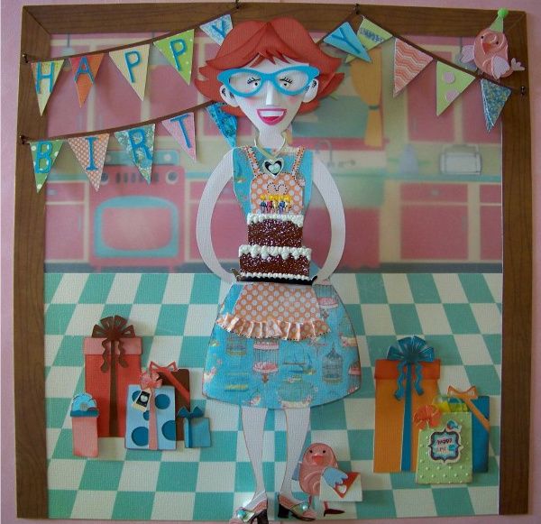
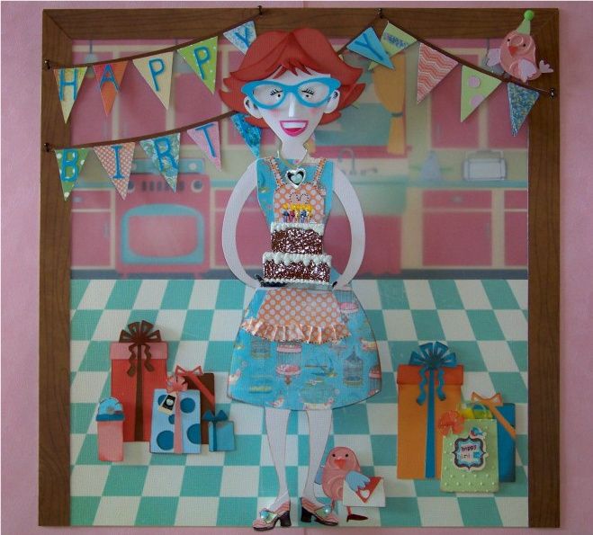
I am so excited to share with you my entry for the 5th Anniversary Design Challenge.  Working on this project has felt more like the first challenges I did with the Cricut Circle where my goal was to try harder, work out some paper building solutions, and the prize was getting to show off my work.  In that spirit, I wanted to share my project!  The rules for this challenge were simple:  make a 12x12 scrapbook page with a birthday theme and without photographs, using any Cricut cartridges.

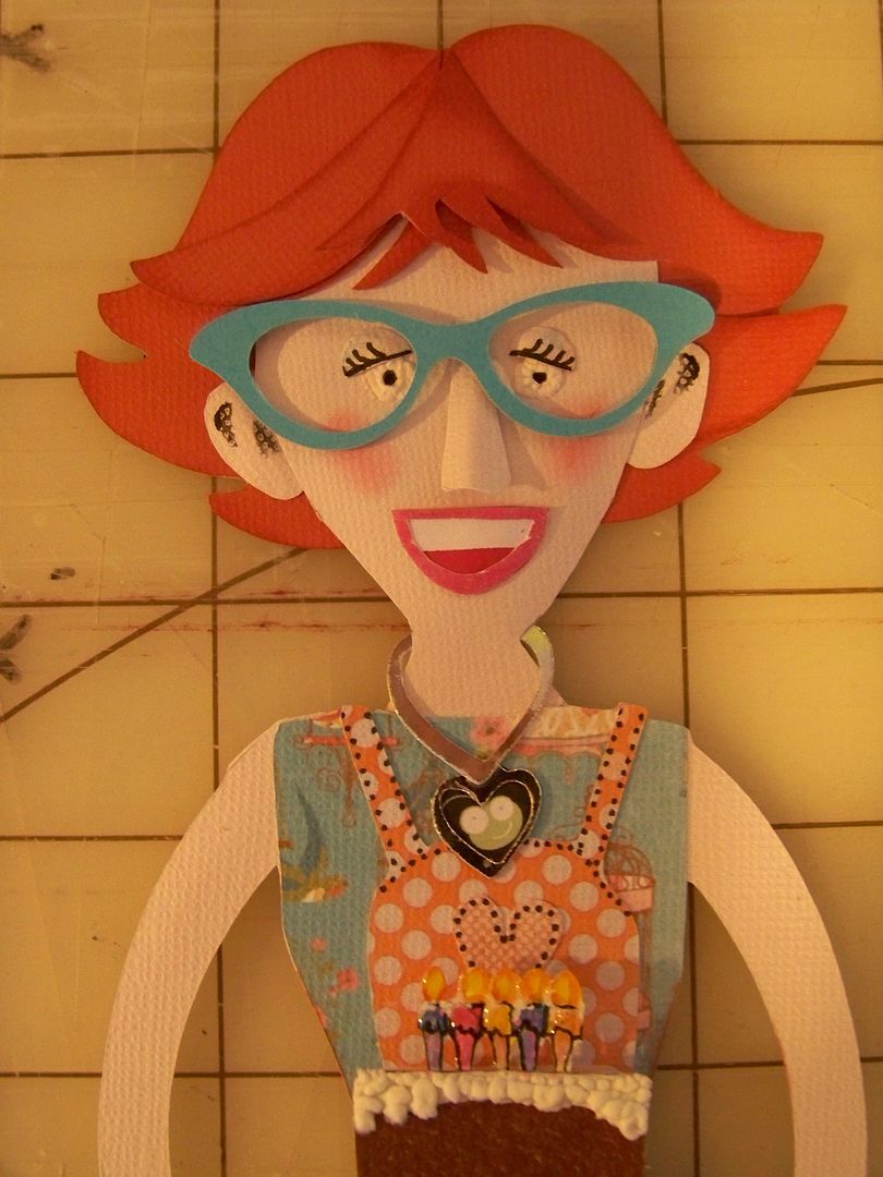
I don't like to sketch out a project before-hand.  I started, like I often do, by making individual elements.  This is the most fun for me!  I knew the figure would be central and I was most unsure of how she would look so that's where I started.  I used Country Life, cutting on the Imagine using Fit-to-Page and entering RGB 250, 229, 210 to create a skintone.  (Remembering that the Imagine does not have an indicator to know the actual cut size when using FTP, I plugged the cartridge also into my Expression and cancelled before the cutting began, in order to know that the cut size for this figure is 11.5" at FTP.) 

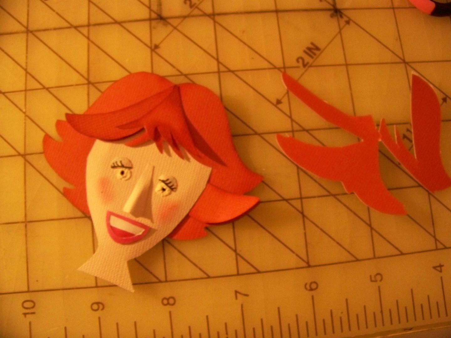
I traced a couple of extra heads to play with.  I have been looking at those fabulous works by Brittney Lee and Jayme McGowan (you can find links to their sites by looking on the list of Inspirations on the side bar!) and knew it was time to start "getting a little 3D" with my faces!  I also wanted to start using paper to add facial features instead of just my Zig fine pen.
I made a nose and eyelids by hand-cutting.  I used Everyday Paper Dolls for hairstyles and cut some ideas on my Expression, noting the sizes on the samples.
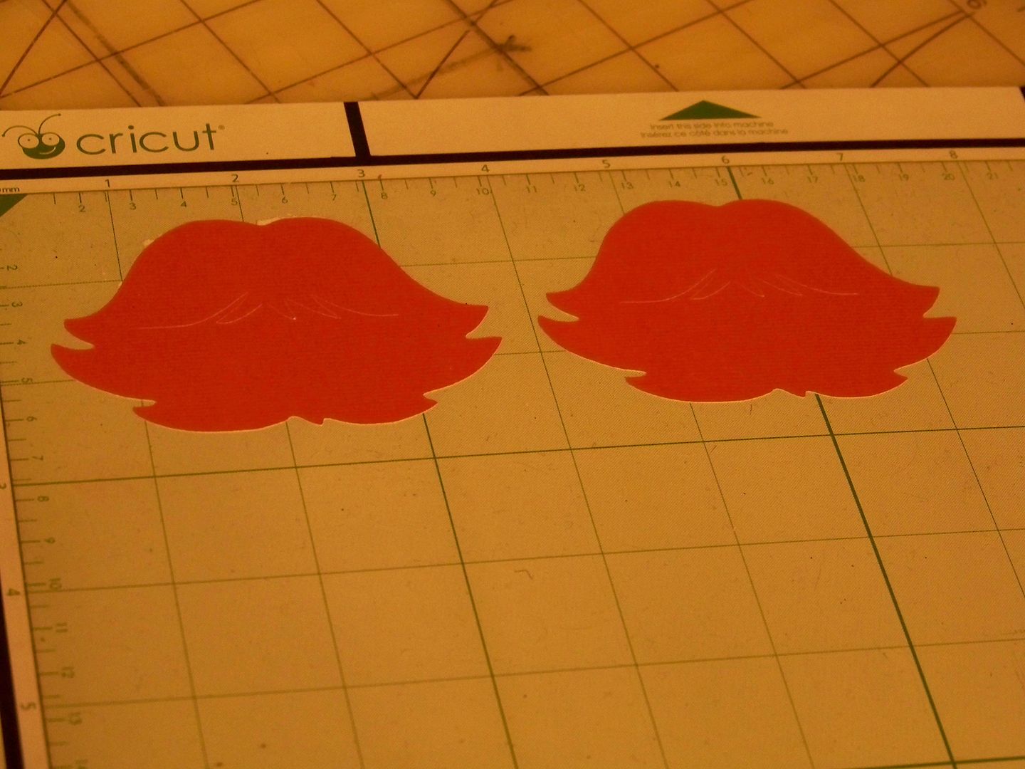
Once I decided on a style (in this case, 5" Everyday Paper Dolls page 31), I cut two (one for the base and one for some layers).  The hair color is RGB 181-82-57.
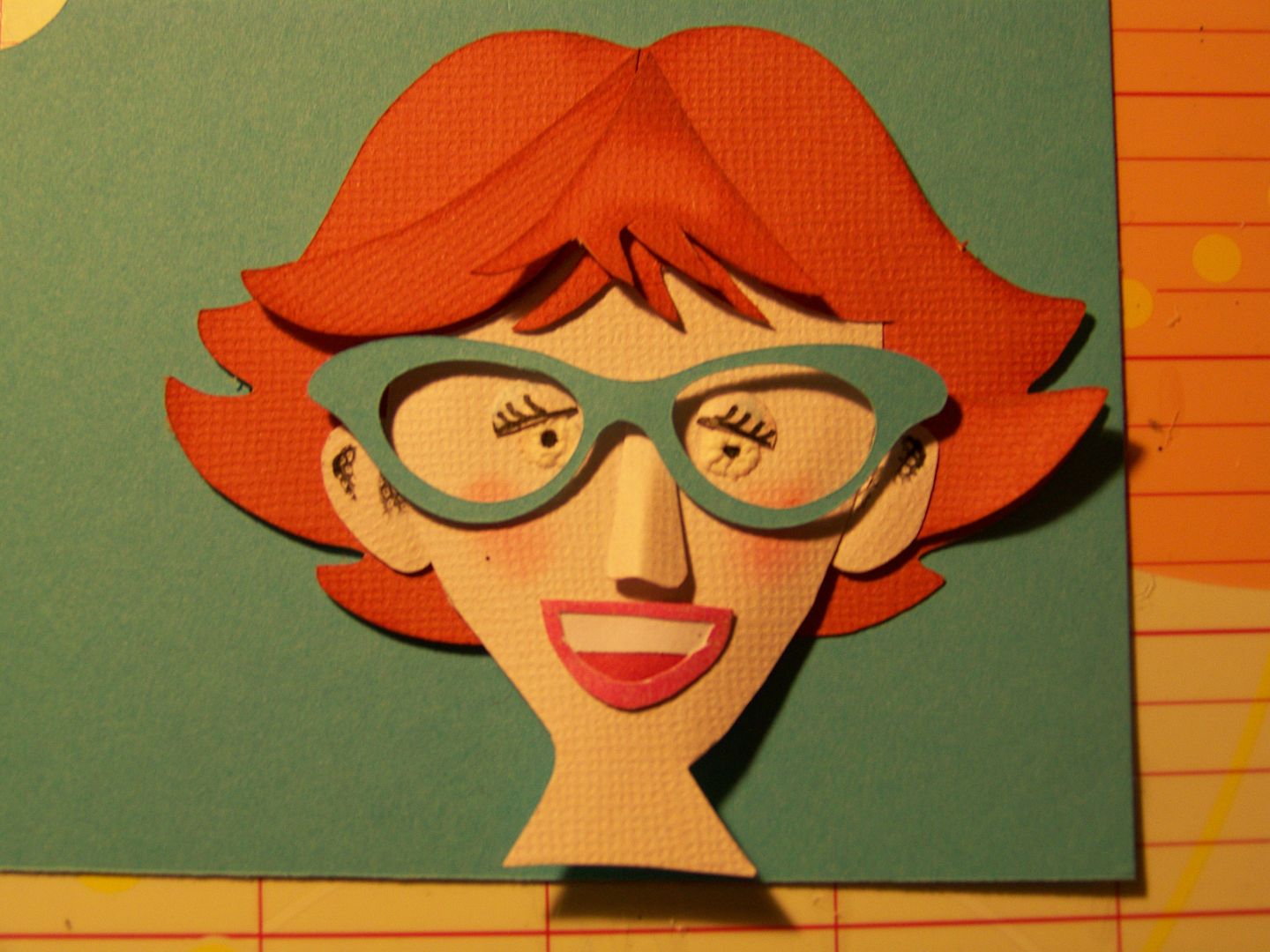
I used a bit of Liquid Applique to make eyeballs, removing my heat source before they got too puffy.  I drew, using a super fine Zig pen, eyelashes on paper crescent eyelids and attached them.  I hand-cut a layered mouth.  Layers of hair were inked before being glued on.  I glued the hair flat that was coming from the top of her head and popped up sections as they moved away from the scalp.  Cheek rouge came in the form of ink from an inkpad dabbed on with a sponge eyeshadow applicator.
I hand-cut ears, using a little ink to give detail.  The glasses are from Nifty Fifties, page 53, cut at 2".
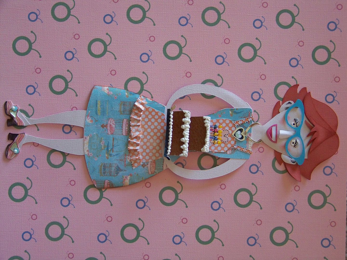
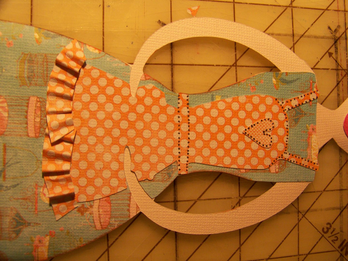
The dress and apron are cut using prints from Lori's Garden.  I cut two aprons so I would have extra 'fabric' to cut a 3D ruffle with the same scale print.  I printed a super small square (.9")  and flood-filled it with the same (shrunken) print.  This is the 'fabric' that I used to hand-cut my heart applique.  The print on the dress gave me a second layer to the theme:  birds.  I wanted this to be more than just 'Happy Birthday Cricut' and this paper gave me that!  In the tongue-in-cheek way that Provocraft cartridges use puns, this character became my 'bird-day' lady!

Well, I love details!  This is where I like to give a little extra 'love' to my characters.  I thought, even with those big ole ears, she needed a necklace more than she needed earrings!

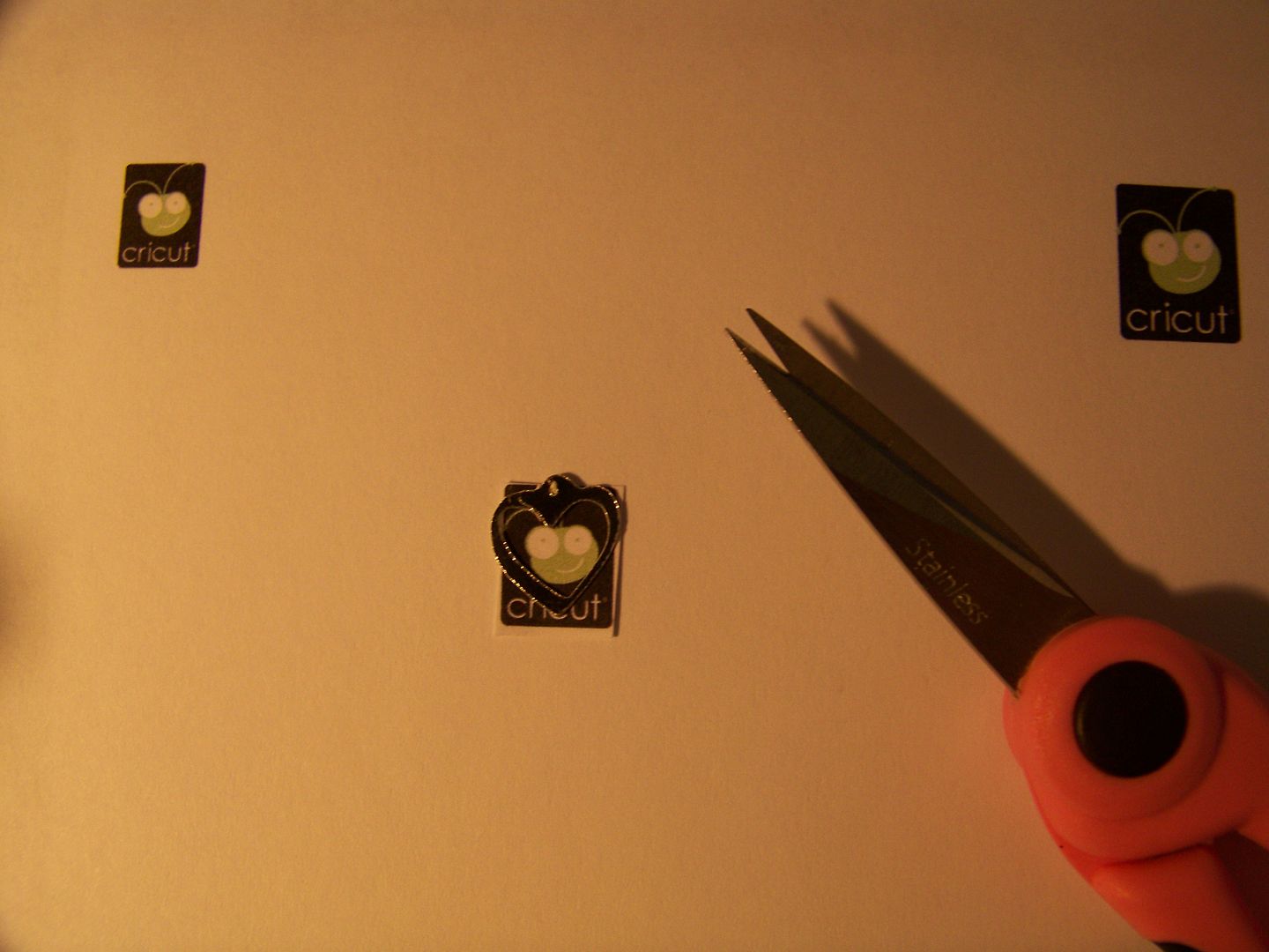
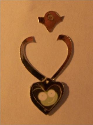
I found the Cricut logo on Google Images.  I copied the image and shrunk it down to teeny (that's the technical size).  I found a sweet charm on Paper Lace (page 68) and cut it twice - once at .75" and once at  .5".  The larger charm was cut to become the choker on which the smaller was a charm.

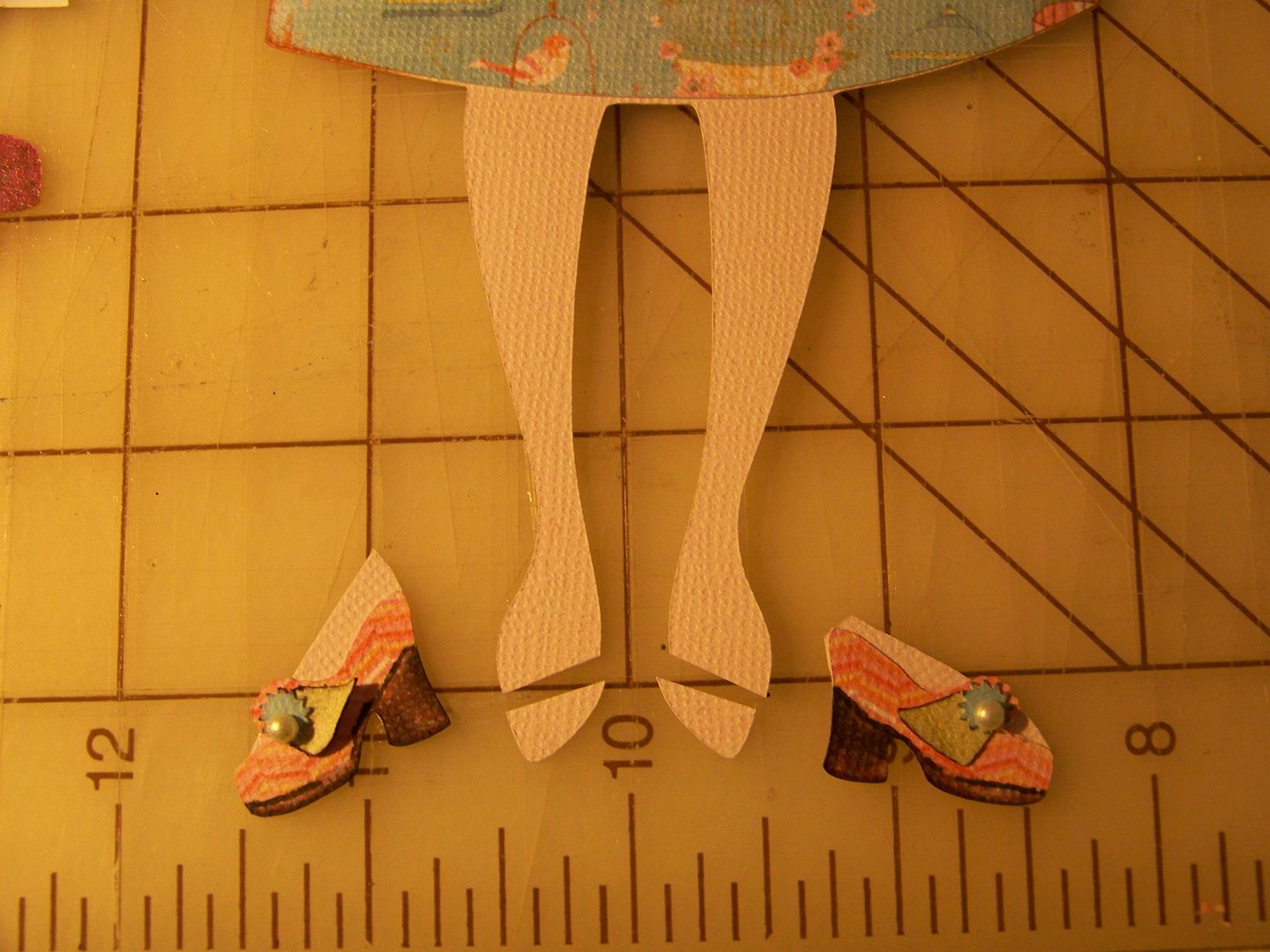
She needed great shoes... and slightly different feet.

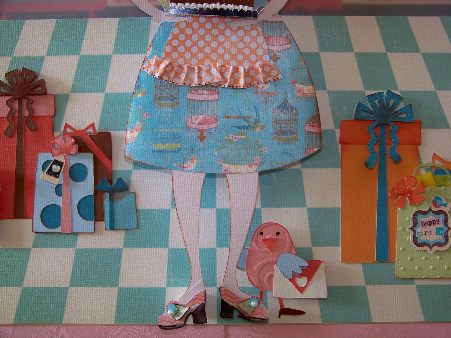
I cut away the figure's toes to make way for those fabulous shoes on the Paisley cart (page 51), cut at .6".  I had to add a little flesh for the tops of her feet.

What's a birthday without a great cake?  I had learned to make the exact cake I wanted from something I had figured out months ago for one of Doxie's Sunday Challenges.  You can find that project here.
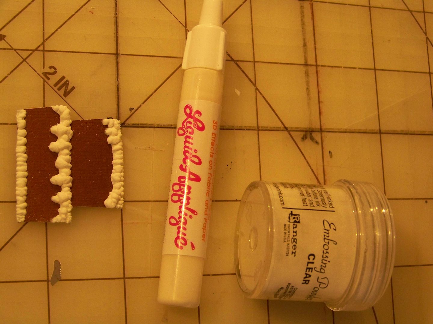
I used Sweet Treats for the cake (page 39), cutting off the top layer (so the height would be right once I added the candles).  It was cut at 2.2".  I used clear embossing powder to get a shiny chocolate frosting.  I used Liquid Applique for the decorative white icing and hand-cut a little silver tray.

The candles were cut from Birthday Bash.  I cut off one candle so there would be only 5 in honor of the 5th Anniversary.  Because the cut was so small, I hand-colored the candles.  I added Glossy Accents to the candles and flames!
I was so happy with the final character! 
My bird-day lady is kind of quirky so I thought her guests would be too, following the secondary theme, I made the party birds... and the gifts. 
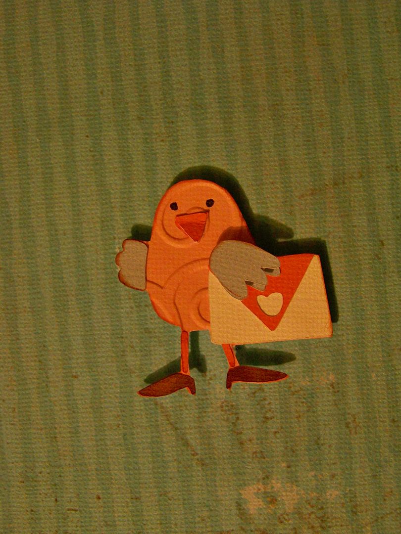
This bird is from Birthday Bash cut at 1.8".  An extra wing and beak were cut and popped up for dimension.  I used the Cuttlebug on both birds.
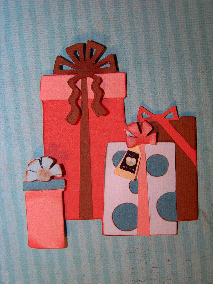
This was cut at 3.2" on the same cart.
I love how the Imagine has coordinated solids on the carts with the prints.  These are all printed using Lori's Garden.  The cuts are from Birthday Bash at 3.1" and Sweet Treats at 1.5".  Check out the tag -- another thing I printed from Google Images.  I cut extra bows and popped them up after inking.
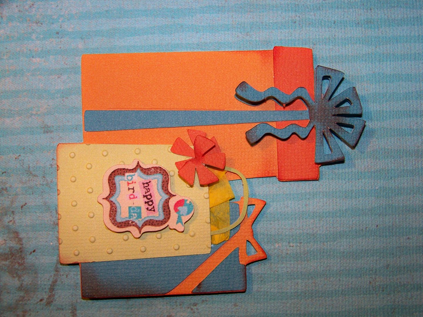
This is that same Birthday Bash cut, but this time cut at 3.5".  I transformed the front package into a gift bag, tucking in tissue paper, adding handles and a tag cut from Imagine More Cards at 1".  The gift bag was embossed with the Cuttlebug.

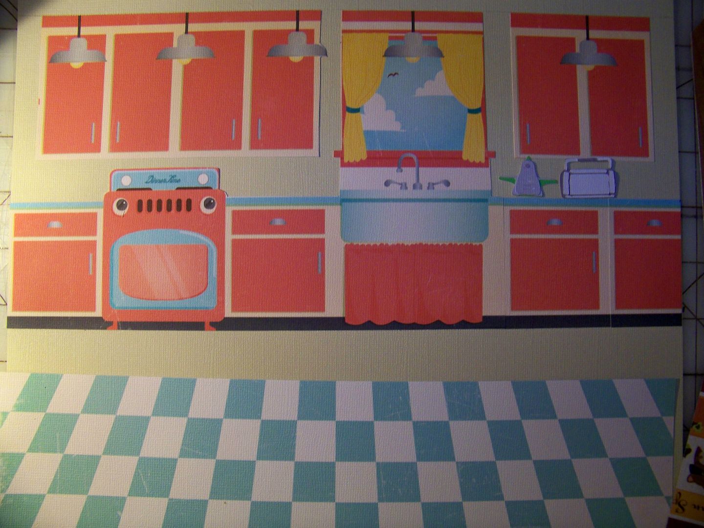
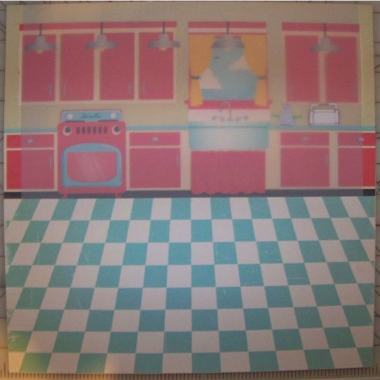
So, now I had all of these cute elements.  The next question:  how to make them work together.  I found that fantastic bonus paper on Kate's Kitchen and knew that was it!  I printed out two copies, cut off the floor and cut apart cabinets, removing the refrigerator (since it had a face) and adding extra cabinets.  I love that window!!!! 
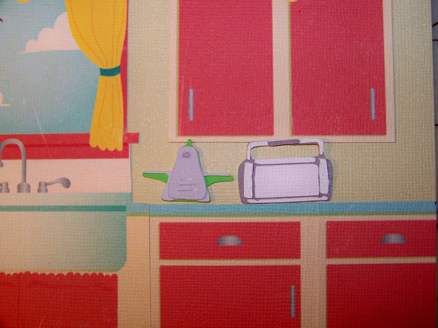
I added a Cuttlebug and Cricut Baby Bug from Cricut Everyday, cut at 1.2", for her counter. 
The floor and all the cut elements of the kitchen were adhered to a piece of tan cardstock.  I cut down the floor a bit and lowered the cabinets once  I decided that I would use woodwork to place the character at the edge of her kitchen, looking into the next room. 
I added a piece of parchment to cover the kitchen back wall (but not the floor).  I wanted to create atmospheric perspective and mute the colors a bit so the figure and elements in the foreground would pop and look closer than the kitchen elements on the 'back wall'.
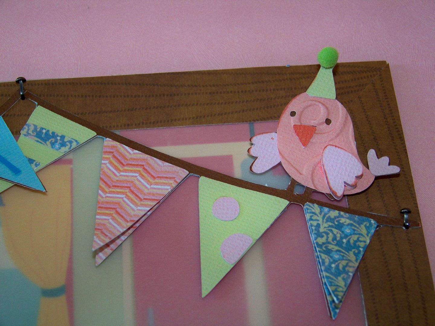
I added more banner cuts, just by making the same one as before and cutting away the bird, attaching as needed for added length.   The letters on the banner are from Cherry Limeade, cut at .8". 
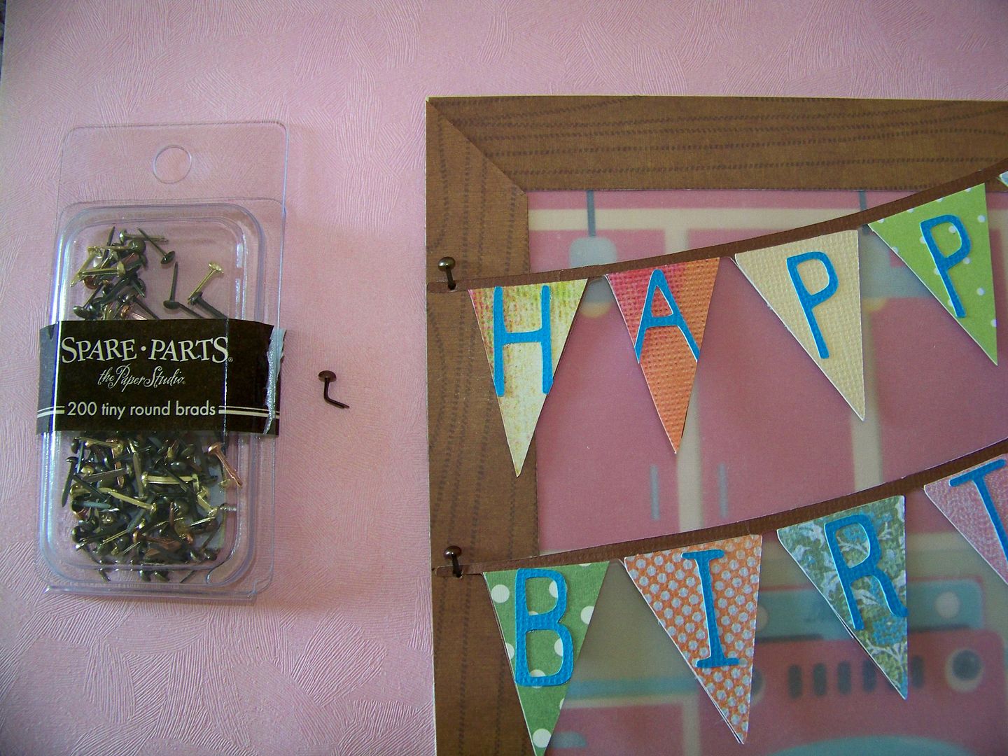
I added a mitered wood trim using Imaginisce paper I won at the Cricut Circle Ohio meetup.  This is one of my favorite details:  I bent a mini brad, leaving part of the shank on the top of the paper, to resemble a nail holding up the banners.
I placed my packages and the little bird, finally finished!  I also added a bit of ink to her legs, to keep them from blending in with the flooring.

I used pop dots that were 1" thick to pull the figure up off the page.  Other elements were popped up 1/8" to 1/2". 
 I absolutely love the 3D features that I figured out for this project.  This is my new favorite character.  She really seems to have a personality and somehow she looks familiar.  Once I finished her, I started thinking about pieced paper portraits of real people and even tried a self-portrait -- you can see it on the sidebar!  That is opening a whole new world for me!

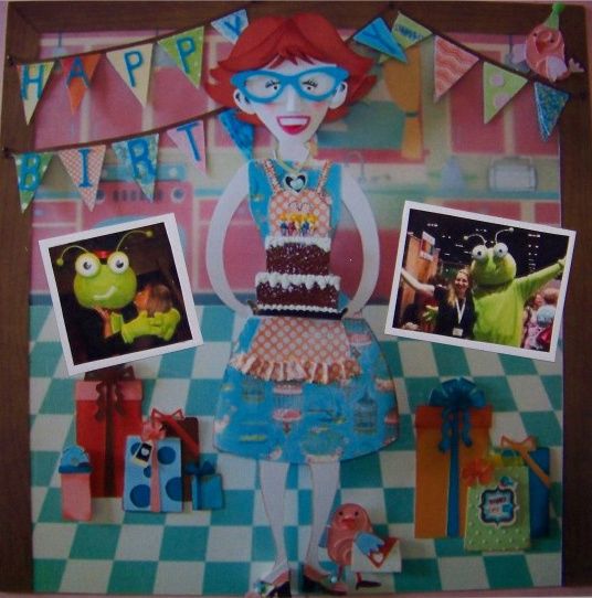
So, you say, what if this were a keeper and you wanted to add pictures from the party?  I love making vignettes and never really combine them with photos, but if this is supposed to be a scrapbook page, this is how I envisioned adding photos with these real party pics with The Bug!

Thank you Okie and Kendra for giving me permission to use your celebrity photos with our favorite birthday bug!  Looked like a rockin' party didn't it!
Thank you for visiting my blog!  I am so excited to share this project and I really hope you like details as much as I do!  I cannot wait to see everyone's projects -- I think this is one of those challenges that brings out the best in everyone!  I had so much fun with this... I hope it shows!

Thursday, April 21, 2011

Holy Week and Art by Peter Callesen

Today is Holy Thursday.  As a life-long Methodist, soon to be Catholic, I have always been most moved by Maundy Thursday (as we call it in the Methodist church), or Holy Thursday, services, leaving in silence and darkness, letting the reality of the pain of Jesus settle into our minds.  Although the Resurrection of Christ is the holiest of all events, and the force of Christianity, contemplation of the events that led to and include the cruxifiction, shape my understanding of Jesus.  Through empathy, it is at least possible to relate to his human side.

One of my favorite passages of all of the Gospels, if not of the whole Bible, is this from Jesus to God in the Garden of Gethsemane:  My Father, if it is possible, let this cup pass from me; yet, not as I will, as you will.  It is my reminder that Jesus knew what was ahead and did not want to suffer, yet he was obedient to the end.  I love this passage.

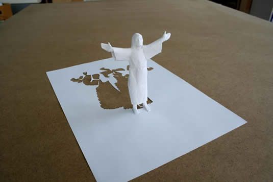
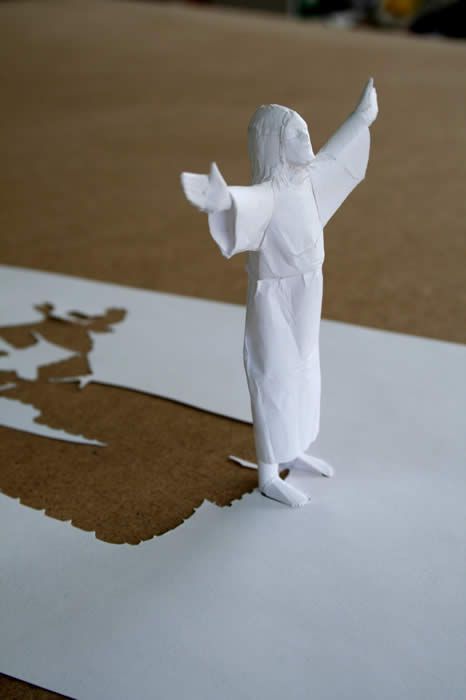
I wanted to share with you a little about a paper artist that I am astounded by.  Look at this piece by Peter Callesen.  His work is amazing.  He has an entire series of works where he starts with an A4 piece of white paper.  This one is "On the Other Side" from 2009.


Peter Callesen describes his work in this way:
"The paper cut sculptures explore the probable and magical transformation of the flat sheet of paper into figures that expand into the space surrounding them. The negative and absent 2 dimensional space left by the cut, points out the contrast to the 3 dimensional reality it creates, even though the figures still stick to their origin without the possibility of escaping. In that sense there is also an aspect of something tragic in many of the cuts." 

Some of his words almost describe Christ Himself with phrases like 'magical transformation' [read: mystery of faith] and 'negative space points out the reality it creates' [read: from death, new birth].  I love contemplating these works while thinking of the Passion reading from Palm Sunday.

I am moved that Jesus was obedient.  I am moved that, at the Passover supper with his apostles, he tells them that he is giving away his body and blood for them, and then creates the Eucharist for us to remember Him.  It was not until this year, during a retreat that I fully understood this, coming to me almost as an epiphany.  I had always looked at Jesus' willingness to die as pure obedience to His Holy Father, never quite understanding that this was an offering to us from God the Son, not just from God the Father.  I had understood for some time that Jesus is in effect the passover lamb; he arrived in Jerusalem during the time that the Jewish people went there to select a lamb.  His appearance followed prophecy as detailed in the Old Testament.  His blood is paralleled to the blood of the lamb.  Somehow, though, I had not fully understood his speech with his apostles that night, that this was His offering as a servant to us.

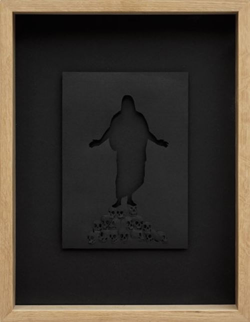
This piece is called "In the Kingdom of the Dead."  Here, Peter Callesen moves away from the white paper for depth of meaning.  The negative space to me indicates the hollowness that we feel on Good Friday. 


I am drawn to the skulls that He stands on; power over death as the foreshadowed theme here.  This framed piece is so powerful to me.

It is my quest to remember that we are Easter people.  For us, the darkness, of course, turns to light.  The hope of Easter, new birth as we have moved through the cold days of Lent into the Triduum, is beautifully depicted in this work from 2008, called "Resurrection."
Peter Callesen is masterful as he makes the two dimensional paper become a three dimensional sculpture.
What most moves me is that this is reflective of how we are moved by the Holy Spirit; our flattened lives transform to fullness through our faith and prayers to God.    Readings for the Easter Vigil this weekend will include Genesis 1:1 Then God said, "Let there be light," and there was light.   This piece speaks that to me.

This Easter Vigil is special for me as I will be confirmed in the Catholic Church and will have my First Communion.  I am honored that you have visited my blog!  Tomorrow, I will be sharing my own work again, but today, I wanted to take a break to show you these works that are multi-tiered inspirations to me.  Please find Peter Callesen's work at his site, PeterCallesen.com .  There, you will find his biography and other works, including his unbelievable "White Window" installation.  Most of his works are not overtly religious, so please do not hesitate visiting his site if the religious nature of the ones I chosen here are contrary to your personal beliefs! 

Thank you for letting me share these wonderful paper creations and my meanderings about my faith.  Although I am a Christian, I respect all paths to God, compassion, and peace.
Sunday, April 17, 2011

Paper Flowers!

This weekend, I worked on three challenge projects that go together.  I wanted to make a special gift for a friend who has helped me this past year.
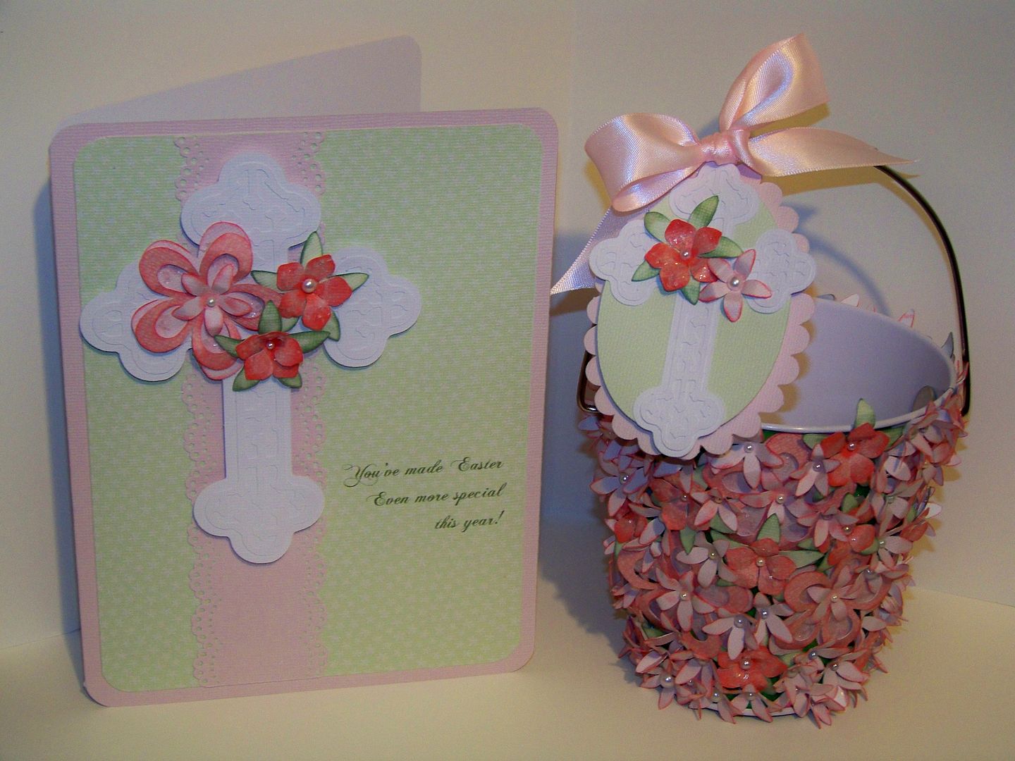
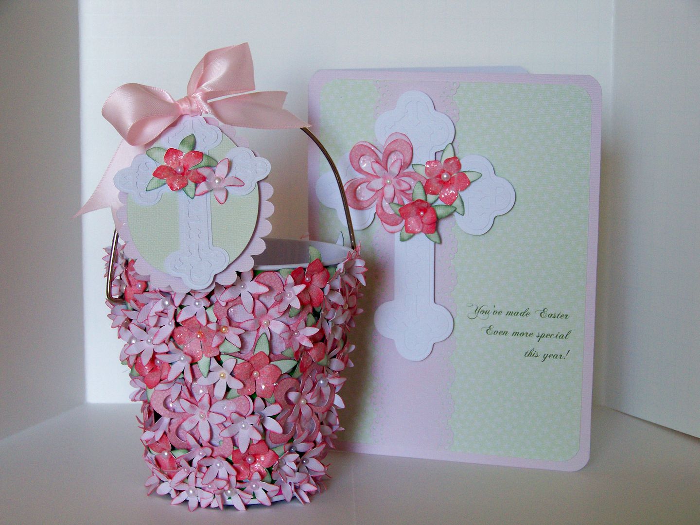
The card, tag, and basket are challenge projects I have created to match!
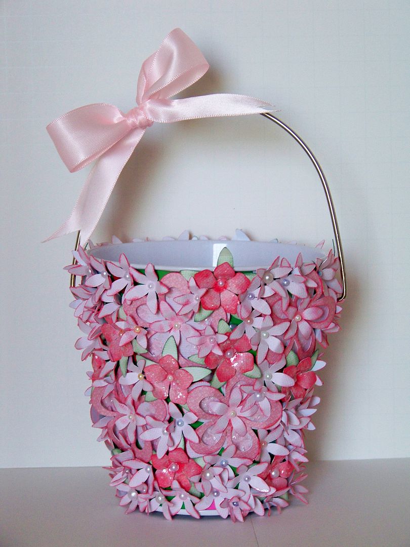
The Circle Blog's Weekly Challenge #29: Handmade Flower Challenge piqued my interest because I love making dimensional flowers.  I have played a bit with Mother's Day Bouquet and decided that it would be fun to cover an object with flowers.  I have some leftover metal buckets from Christmas that I purchased for $1 at Target.

I cut TONS of flowers using that cart and flood filling them with colors from Nursery Tails.  After I made a few test cuts, I decided on several that I liked best.
I was so glad I had this chart once I decided to make additional flowers for a card and tag!

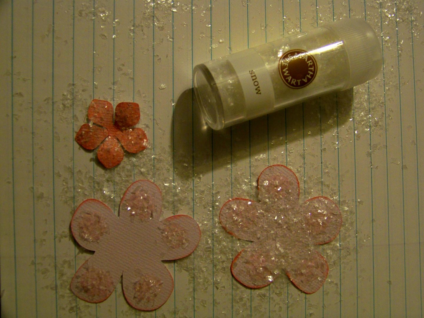
I inked, glittered, and added pearls to accent them.
I used a chunkier glitter than I normally use and really liked the results. 
I used E6000 plastic adhesive to ensure that the flowers would not pop off of the metal can.  I started crowding the flowers together and went back to fill any with additional small flowers at the end, covering the bucket completely and hiding the polka dots.  The gluing process took quite longer than I expected because  I had allow time for the glue to dry before being able to roll the bucket to a new section.  Patience definitely pays off on a project like this!

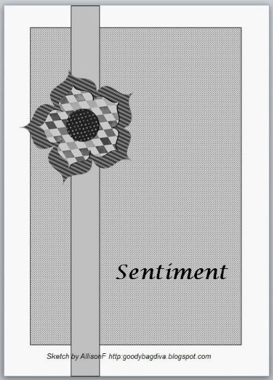
I really liked the way it finished!  When  I read Allison's Weekend Challenge on the MB and saw her fantastic card sketch, I knew I wanted a matching card!
Allison created this sketch!!!  I have to learn to do that.

I started with the cross on Easter 2010.  I cut it at 2.9" with the shadow.  I used matching flowers to decorate the cross.
I printed pink and green cardstock using the same colors from Nursery Tails that I had floodfilled on my flowers to use for the card base and mat.  The base was cut at 12" wide by 8" tall and then scored to finish folded at 6" x 8".  The mat was cut at 5.5" by 7.5".  I used my Zutter 1/2" Corner Chomper to round the edges of the base and mat.  I used a Martha Stewart edge punch to decorate a paper ribbon, applying with double-sided tape.  I printed the sentiment on my computer using Microsoft's Chopin Script at 20 point, using the darkest green under 'theme colors'.  The cross was popped up with foam dots.
Doxie's Sunday Challenge gave me a little incentive to continue on my theme to create a tag for my basket and submit an entry for her Shape Challenge: Ovals.  Using the scalloped and smooth egg shapes on Easter 2010, I cut them at 1.8.  The colors were also from Nursery Tails.  I cut another cross from the same cart, just like the one I cut for the card, but this one was 2".  More flowers and pop dots to add depth to the tag and I ended with this.
I think the basket is really enhanced by the tag.  It really adds to it.  I love it when things work out that way!
I was so pleased with this set.  I will be filling the bucket with cake bonbons to present to my friend after the Easter Vigil next weekend.

Today is Palm Sunday.  As we lead up to Holy Week, I wanted to be free for the extra services and events and am thankful to the challenge ladies for prompting me to do this project now!
Thank you for visiting my blog!

Monday, April 11, 2011

What makes up a face?


I spent this past weekend working on my entry for the Expression 2 Challenge, which I will be posting here in a couple of weeks.  I am so excited about that project because it pushed me to do something I have been wanting to do --give faces more dimension-- and opened the door to something I had no idea that I could do --make faces that look like a unique person.

So, today I am sort of skipping a step that lead me here so that I can keep my entry to myself for a bit longer, and jump to making portraits.  This is a leap of faith because I only just started this and I have so much to learn, but I think figuring this out will make my die cut vignettes more real and more interesting.

To add to the difficulty, although that wasn't the point, I started with a picture I took of myself.  It helps that I don't really know most of the people who read this blog in my day-to-day life because I took a picture in our messy office, without makeup or my hair styled!  Lots of forehead showing too!

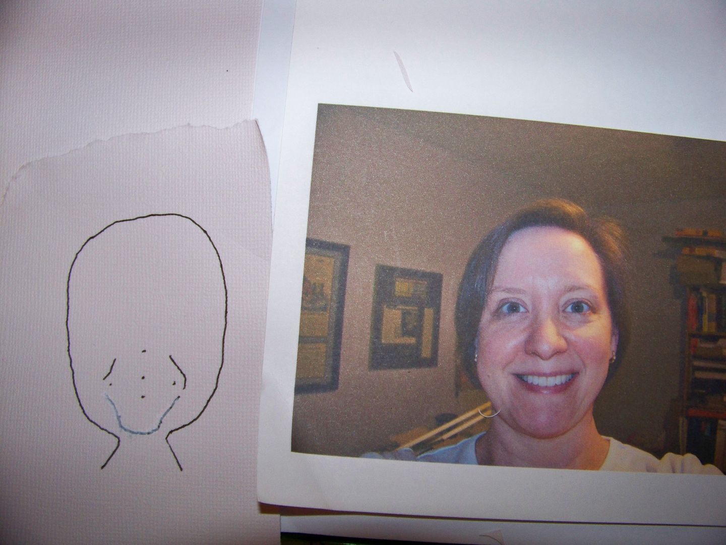
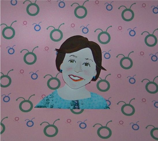
This is the process I took to figure out my face.  As you may know, we don't really know what we look like.  At least I don't.  We don't see ourselves nearly as much as we see our co-workers, spouse, child, and neighbors.  I know generally what I look like, and I certainly recognize myself in a reflection, but to duplicate my features, I had to take a picture.  What I did not want was a paper replica of a portrait; no, I wanted a unique piece of work that looked like me.
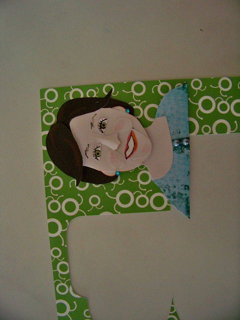
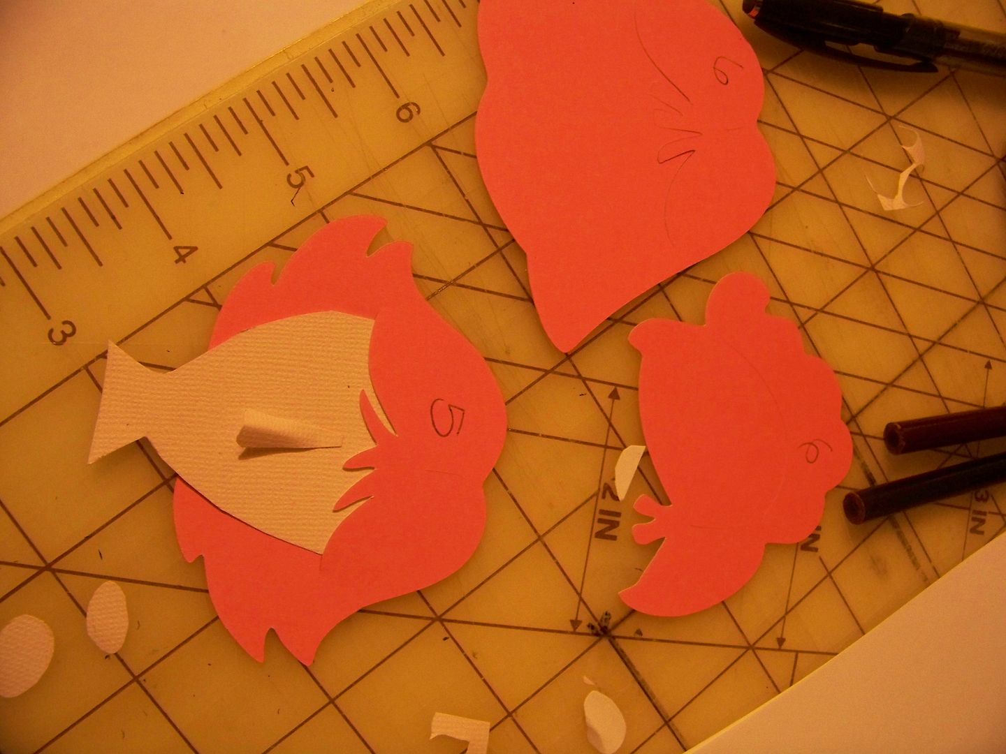
I took a picture of myself and then used a reject head that I had sitting on my craft table from my entry.  It is the head from the pie lady on Country Life with her hairdo cut off, cut at 11.5".  I needed a starting place.  I added jowls -too much - see I don't really know what I look like.  Ignoring that for now, I noted my chin, points for the dimensions of my mouth and nose, and added smile lines. 
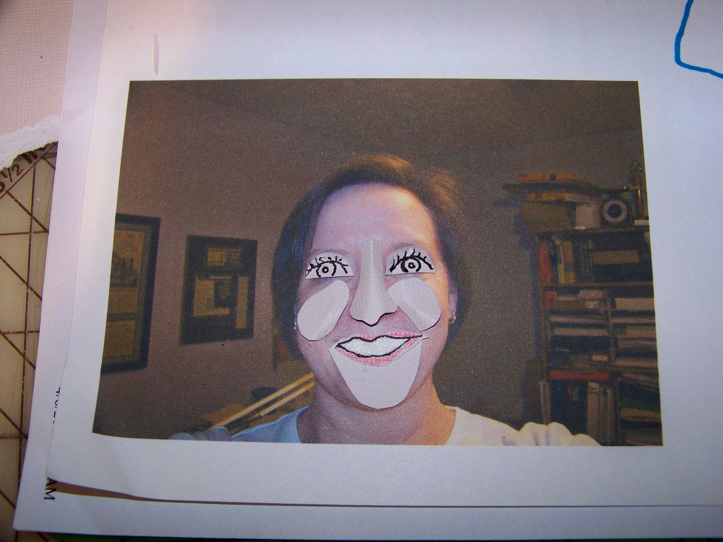
I hand-cut features and then fit them back on the original photo to test them.  The nose, surprisingly was the easiest part.  Happily, I can say I thought my nose was much larger than it actually is, and I was able to shave some off to get to this point!  I bent the papers to get dimension.
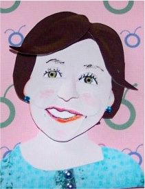
Satisfied, I trimmed away the jowls at bit - this is a family feature that really will get worse, so  I was happy to get to remove some!  I added hair by cutting out a style from Everyday Paper Dolls and then trimmed it down.  And yes, I used a little artistic license and gave myself a hairstyle and covered up some of that forehead!  I mean, come on people, it needed to be done.  I also gave myself some new earrings and a colorful shirt-  next time I'll go designer for sure!
I played around with background colors to see what I liked best.  I have all that fun Circle paper to play with so that's what I grabbed for fun.
In taking pictures, I found that maybe I didn't need to add the cheeks and chin -- maybe just the dimensional nose and the shape of the face would convey identity.  What do you think?

I am excited to try more of these and already see changes that need to be made here to improve.  I just wanted to share what I learned.  Thank you for visiting my blog today!

Sunday, April 3, 2011

My Dancing Mermaid... and a Quick Best Friends Frame!

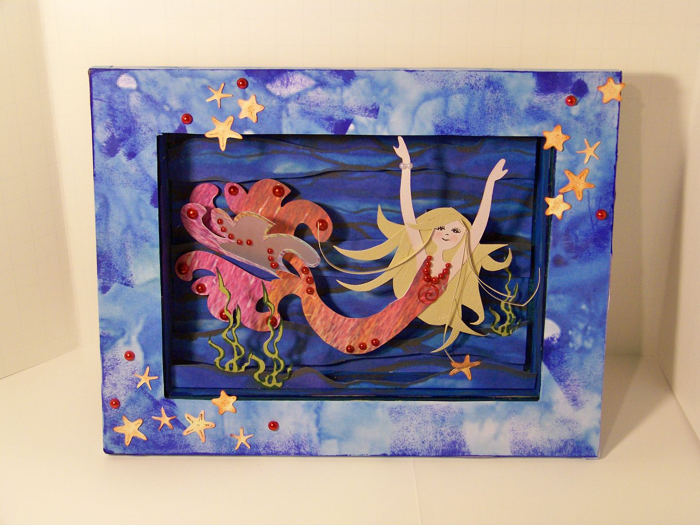
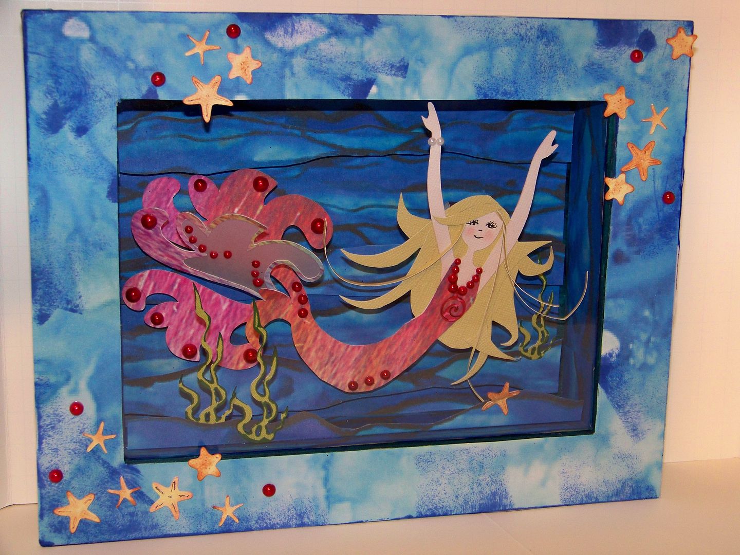
This is my entry for the April Monthly Challenge:  Reuse, Repurpose, Recyle. 
Mermaids have been swimming in my mind.  I have been doing a little surgery to combine fish and figures to find a mermaid I liked.  Not yet happy with the results, once I read the requirements for the April Monthly Circle Blog Challenge:  Reuse, Repurpose, Recycle, I knew it was time to figure out the mermaid.  I grabbed all my rejects and a little trash too!

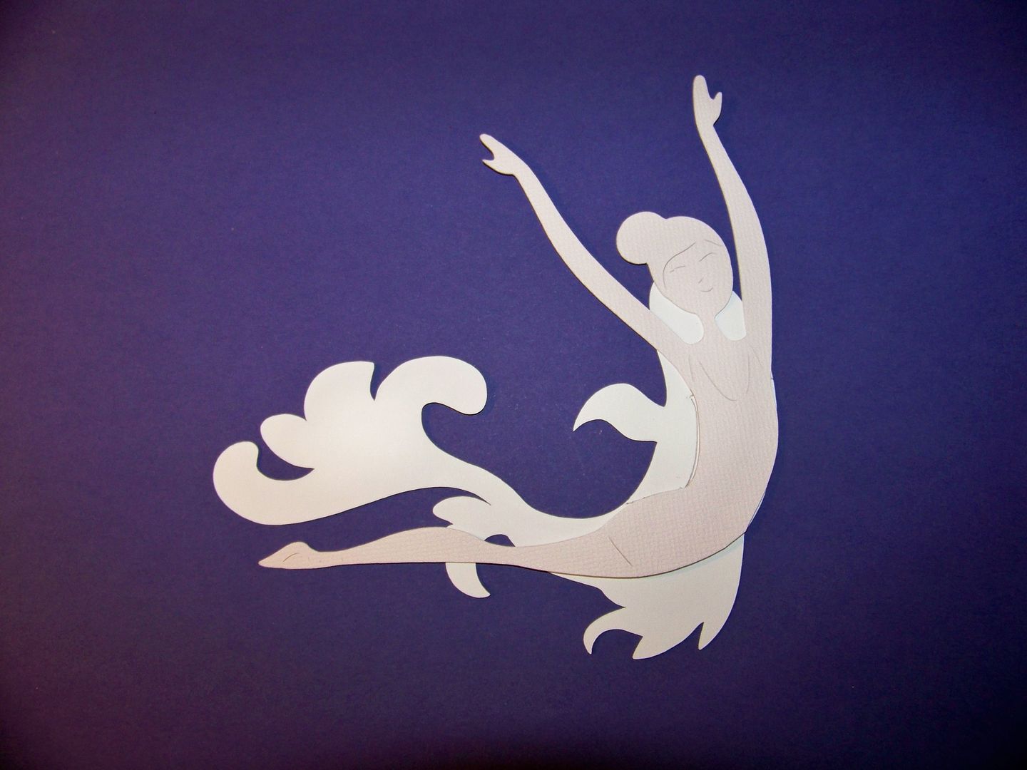
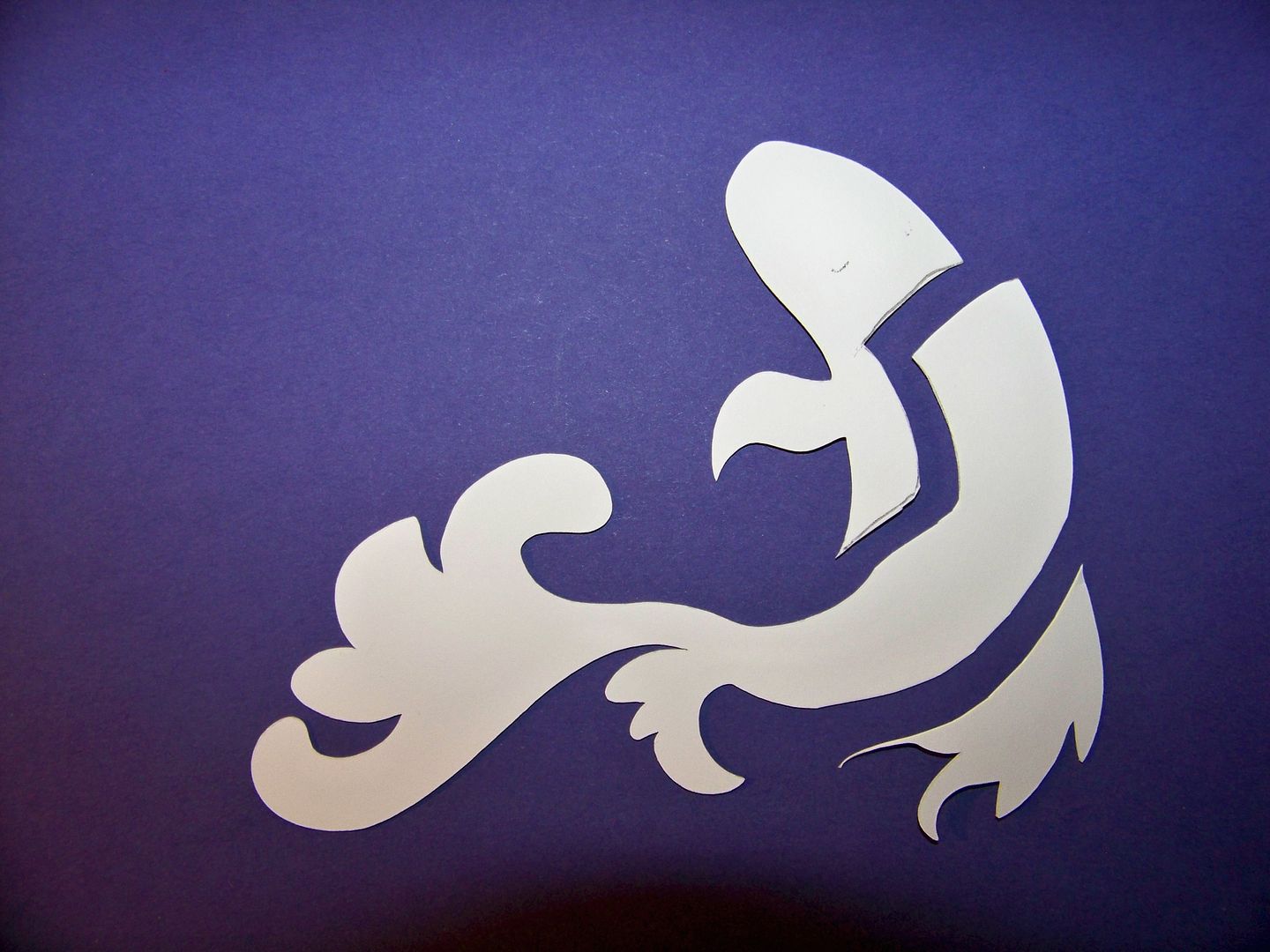
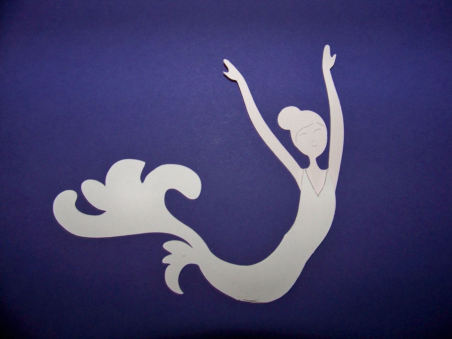
I figured out combining the cuts to create a mermaid.


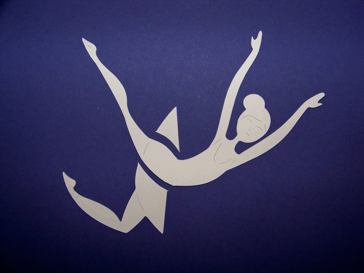
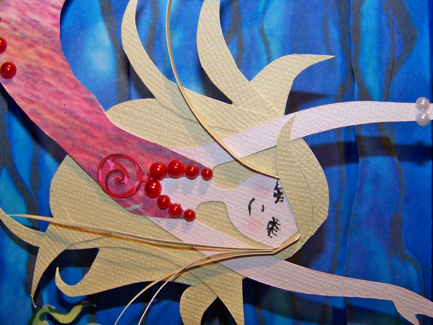
Using an old folder divider with an interesting print, I cut the fish body.  This was my first recycled/repurposed element.  The dancer is from Shall We Dance (page 29), cut at 4-1/2".  The fish is from Pagoda (page 42), cut at 5-1/2".  I cut additional fish at 5-1/2" and 4-1/2" to add to the tail.  I used a little vellum on the second 5-1/2" tail and embellished with adhesvide beads.  The mermaid's hair is all hand-cut. The charm on her necklace was cut from Life is a Beach, page 45, at 1/2" and detailed with a Sharpie and a Zig fine pen.

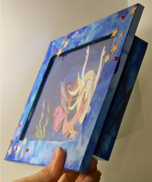
The shadowbox itself is my second recycled/repurposed element.  This was headed for the garbage can after getting wet and the original artwork was destroyed.  For the purpose of this challenge,  I was so glad I had held onto it after so many times wanting to toss it in the trash! 

I used a beautiful box lid for the frame of my shadow box (my third recycled/repurposed element), adding extra ink to get some darker areas so that it would relate to the darker paper inside the frame.  This covered up the damaged areas on the shadowbox!

The background paper was also a fun way to use a previous mess-up.  That paper was actually fabric I found on-line and printed out.  Having miss-cut it for another project, I had tossed it aside but was able to use it for this project.  I cut additional strips and popped them up to get a little more dimension in the background.
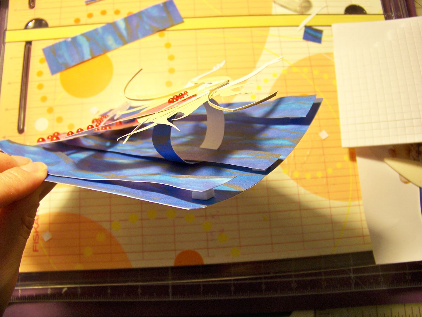
I used a loop of paper to pop up only the head and torso of the mermaid.

I was able to add layers of dimension by folding an element for the floor of the scene.  This allowed for the seaweed, which was cut from the Spongebob cartridge (page 76), at 2-1/4" and 1-3/4". 
The starfish were cut at 1" from Life is a Beach (page 65).
My daughter told me yesterday that she wanted this when I finished it.  This morning, I asked her if she liked it while I was photographing the finished project.  She told me the starfish needed smiles.  I think I know who ProvoCraft consulted with for carts like Simply Charmed!  I have a feeling she will be adding to this project once it gets to her room!


I also wanted to share a super quick little project that I did on the Imagine:
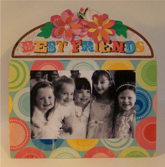
This is the 3D frame from Sesame Street Seasons, cut at 7".  I used a pattern on Cricut Imagine cartridge Hopscotch.  The 'Best Friends' topper is from Imagine More, cut at 1.6".  Super fast and the perfect size for a 2-1/2" x 3-1/4" wallet size (standard size in Windows Gallery).  I added some flowers I had laying around that I cut out from Mother's Day Bouquet -- just some that I had cut for fun when I first received that cartridge.  The colors just happened to match.

Thank you for visiting my blog today!

But wait! There's more! Click 'older posts' above!

But wait!  There's more!  Click 'older posts' above!