
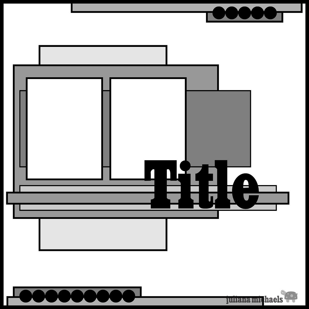
I have been delighted lately to find more and more fun sketches by some of my favorite crafty people! I just found one created by Juliana Michaels on her blog that led me to a challenge on The Paper Bakery, a new site to me. And do they ever have awesome stuff!!
What I love about this challenge is that you don't have to use specific papers or other merchandise-- anything goes! (Anyone who knows me knows that I am very big into using up my crazy stash.)
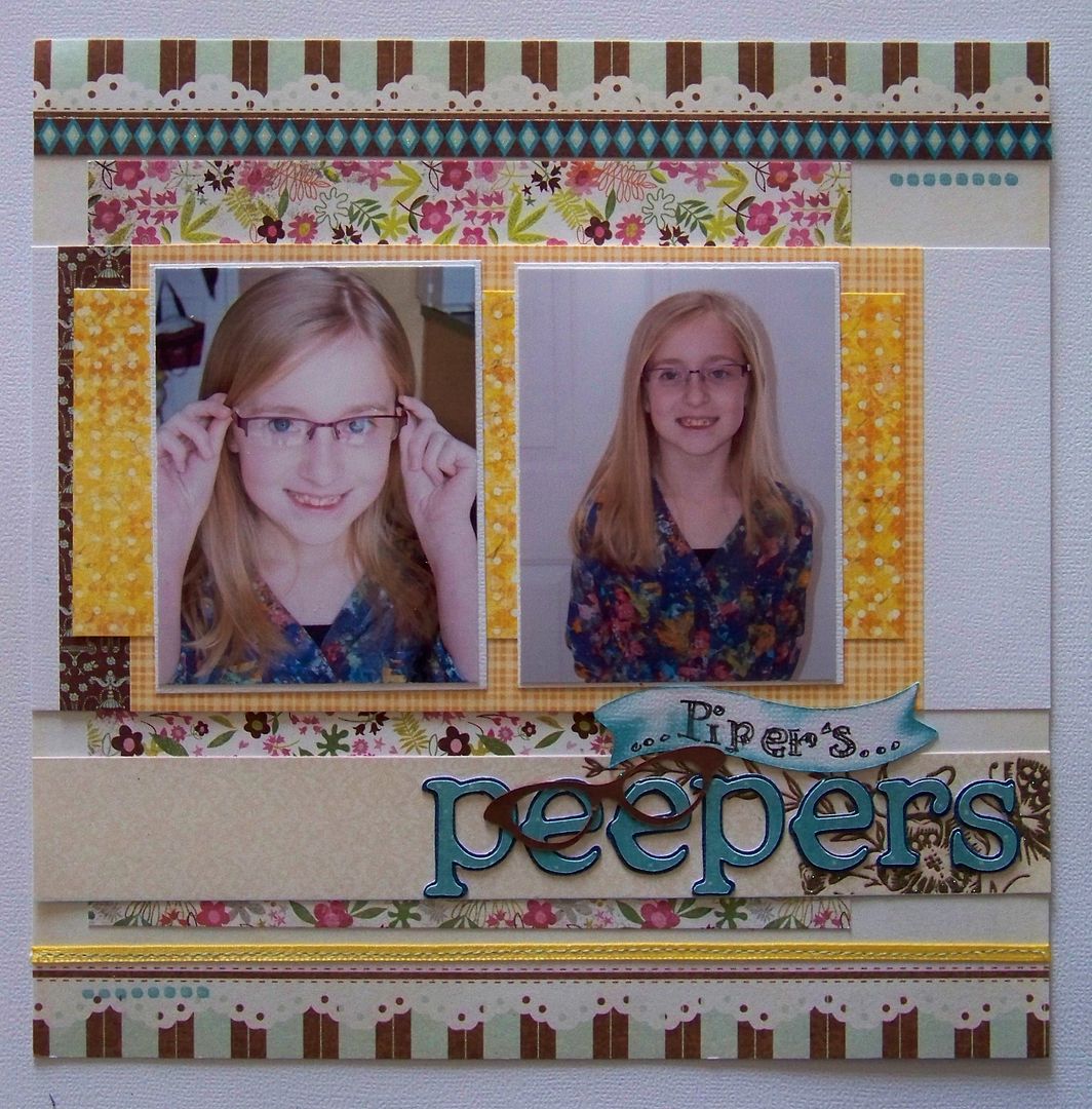
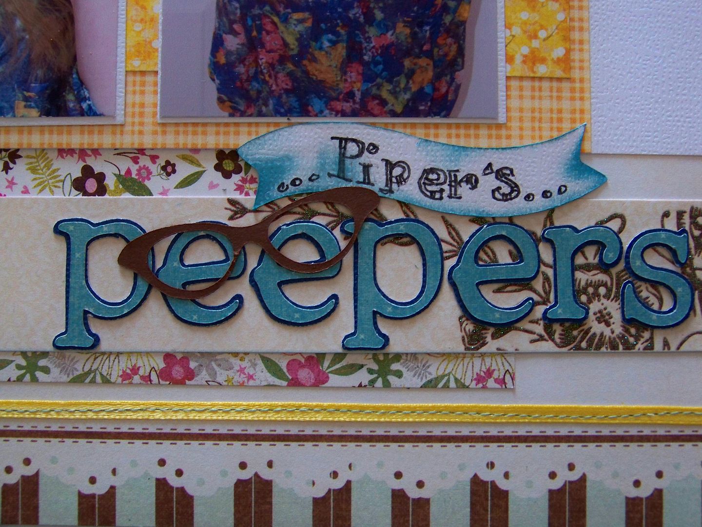
For my project, I used a couple of photos of my daughter from the day she got glasses.
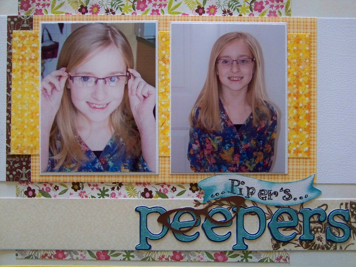 |
She had wanted glasses when her two best friends got them so... when she suddenly showed the symptoms of needing them, I thought she might have been faking! She is the most honest, compassionate, and kind person, so I should have known that simple vanity and peer pressure was not directing her. In the end, she is near-sighted and really needed them! I felt like the worst mom ever for doubting her! These pictures are of her purple pair-- I can't believe how grown-up she looks here.
From the sketch, I used the idea of overlapping rectangles the left-of-center placement of dual photos, the title placement, and the rows of upper and lower dots.
The font is from Cricut's Doodletype cartridge, cut at 1" with shadow. The glasses are cut from Cricut's Nifty Fifties cart, cut at 1-3/4" (layer one). The banner is cut from Cricut's Artiste cart (page 58), cut at 3/4". My page finished at 8"x 8".
Thank you for checking out my post today! To see many of my previous paper projects, check out My Project Gallery.
I'm linked up and loving everyone's take on this sketch!
 |


14 comments:
Super layout! And I love the eye glasses on the title! Thanks for playing along with The Paper Bakery!
What a sweet lo! Perfect title for this! Love what you've done with the sketch! Thanks for playing along with us at The Paper Bakery!
This is such a sweet page. The same thing happened to us with my granddaughter, we thought she was faking it to get glasses because two of her friends got them and she "loved" them, but we just found out she really does need them and she is nearsited and picks up her glasses today!
This is a great layout! Your take on the sketch is youthful and fun. Love the pics, Piper looks adorable in her glasses.
Awesome page, Nadia! Piper looks good with glasses on. I love the LO inspiration too.
OH awesome!!! I love that you decided to play along with us after seeing this on my blog!!! You rocked the sketch and I love your layout!!!
Love this layout. The title really pops with the photos
Great Layout. Love it! TFS
This is so cute!!! I love the title and your details! thanks for playing with us! Hugs, Katrina
Such a fabulous LO - love love the papers and your daughter looks fab in her glasses. Both my girls wear glasses:-) Thanks for stopping by my blog today. Enjoy the rest of the weekend.
This is too cute!! Love the pics of your daughter and her new glasses, and the cute glasses you used on the "e's" in your title! Very fun! Really great take on the Sketch! Thanks for playing along with us @ The Paper Bakery!
I absolutely LOVE your title!! So stinkin' adorable. Love the pics too. Thanks for playing along at The Paper Bakery! Hope to see you joining us next week, too.
I absolutely adore this layout. The glasses add such a great touch, and I love the title.
Another a wonderful layout - love the details and the title is perfection! She looks great in her new glasses!
Post a Comment