Sunday, October 31, 2010

Weekend Challenge and Halloween Fun Stuff!

I thought you might like to see some fun projects I have been working on.

With the craziness of the Cricut Message Board this weekend, I am actually getting to post my weekend challenge here first and will have to post on the MB once it gets straightened out!

Allison has asked that we use non-traditional materials for our projects so I chose Shrink Film and ... socks!
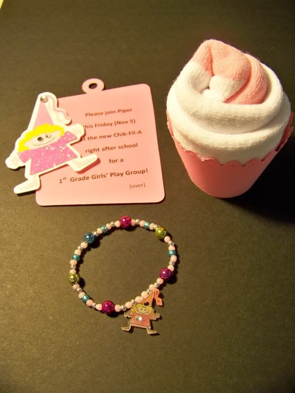

My daughter's school is just down the road from a new Chik-Fil-A (my fast-food weakness) so we are planning a 1st Grade Girls Play Date at their playplace. Of course those climbing, twisty-tube play areas always require socks for Kentucky health code compliance, so my invitations to the little girls include socks just for fun.

This past spring, I found a great craft idea on GreenBean's Crafterole blog for the instructions for rolling socks into the shape of a cupcake and placing it in a cupcake holder. They really look like a frosted cupcake! I love that idea. You can see it here! Carrie is one of my favorite crafters with her seemingly endless string of GREAT ideas!

Cupcake Details:
2-1/2" Cupcake wrapper is cut from Easter cartridge (on 8-1/2x11 paper, Autofill cuts 3).
The socks are from WallyWorld.
Clear bags are from Hobby Lobby and the cheapy ribbon is from the stash.

I placed each "cupcake" in a clear bag with a tag.
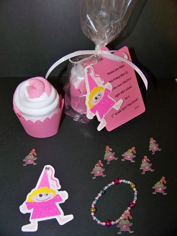
Tag Details:
2-1/2" Princess is cut from Mini Monsters (on 8-1/2x11 paper, Autofill cuts 10 shadows).
4" Charm tags are cut from George (charm, shift, H) (on 8-1/2x11 paper, Autofill cuts 6).
I put glitter on the dresses using my Xyron. I learned about using the Xyron 2-1/2" Sticker Machine to apply glitter from the fabulous girls on the Cricut Circle, AllisonF and Caroline (Doxieluv01). Wow is that addictive! Placing the cut shape upside-down in the machine, peeling them off the sticker paper, and applying glitter (I lightly press it in using a piece of the sticker paper) creates a perfect surface and once the glitter is applied, no flaking! So easy and effective!
I printed directly on the tags with my computer after they were cut out on the Cricut. The princesses were applied onto the printed tags with pop dots.

I also made little bracelet favors with a Shrinky Dink charm that matches the Mini Monsters character on the invitation.


Bracelet Details:
2" Princess is cut from Mini Monsters on Shrink Film.
Misc beads, .5mm Stretch Magic jewelry cord, and sterling split jump rings are used to string together the bracelets.

Just a bit of quick info on working with Shrink Film...

I received so much great info from a thread on the Cricut Circle on using this stuff! First, it will curl up. I had not been baking long enough and, on previous failed attempts, did not leave them in long enough to uncurl, which they will eventually do! Once that was pointed out, it changed the game. Second, the Cricut will cut it, but it takes using the Multicut function.

These are my settings: Multicut 3, Blade 6, Pressure 5, Speed 3 and baked 6 minutes at 325. I was able to outline and write on the film best using a Zig 01 fine pen. You have to punch out a hole before it bakes or the force of trying to punch it later will break your charm in two! I used a regular office hole punch. It looked huge but was perfect! My daughter's Crayola Markers colored the shrink film with no problems. Since the colors will darken as they shrink, I found that not coloring in the skin and just adding rosy cheeks worked best for me. You can glue onto the film after it is baked. I use E6000 adhesive. I love that stuff. It is made for non-porous materials.

I cut my character at 2" and it baked down to 3/4".

I found the princess on Mini Monsters while doing a different project earlier this week. I made treat bags for my daughter's ballet class. Her ballet school allows the children to wear dance-appropriate costumes and to bring treats for one another the week leading to Halloween. Those different sized googly eyes were first used on that project.
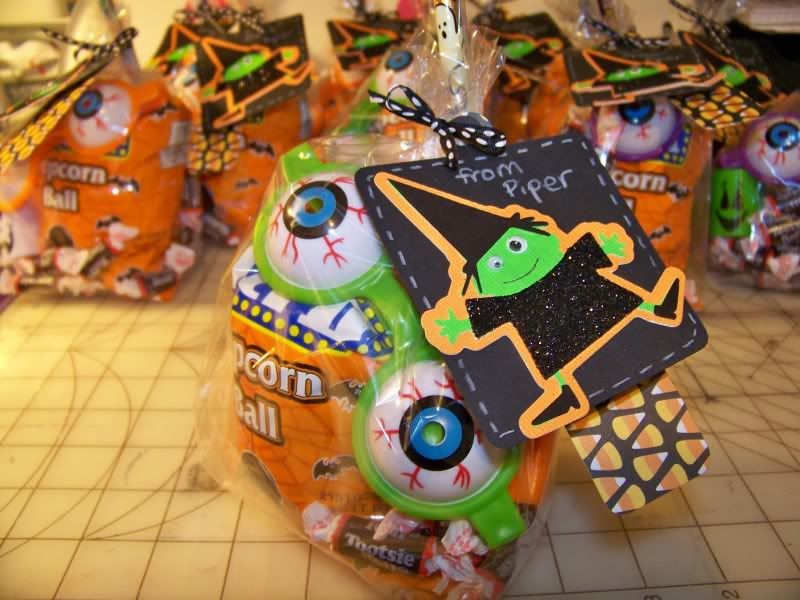
The tags were made with Mini Monsters, page 41. I started with the orange shadow and found that on 12x12 paper, autofill will cut 12 at 3". Two different sizes of googly eyes finished up the characters super quick. That was an idea I found on the Circle Blog. I used a Zig microfine pen to write on her smile.

The black tag behind the witch is a charm on page 99 of George & Basic Shapes cut at 3-3/4". Autofill will cut 9 on 12x12 paper. The candy corn patterned tag behind that is also from George, cut at 4-1/2". Autofill will cut 14 of those on 12x12 paper.

Speaking of Halloween, that is the perfect holiday for the craziness of the challenging challenges at Olive Juice Studio. I adore the funky mind of Kim Du Chene! Her challenge for October is to create a scrappy scarecrow, of course she has a list of requirements (such as including a rubber band, a feather, and items starting with the letter "P") to spice it up and make you think! That is the part I love, naturally!
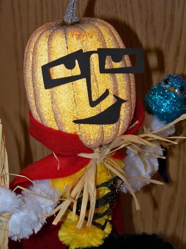
This is Supa Scare. Apologies for that, but part of the challenge was to create an appropriate name for the scarecrow created.
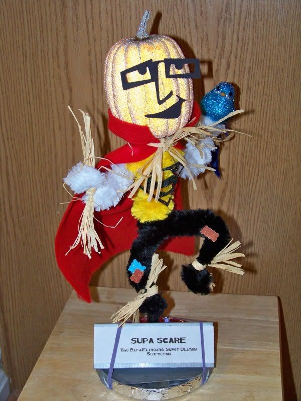
He is made completely from found items at our house (it kinda shows). His glittery head and bird are from leftover items from the church bazaar stuff I donated. His base is a CD holder, wrapped in metal tape (leftover from attaching the dryer hose) and duct tape (that my husband borrowed from a neighbor last night for me). The black and glitter papers on him are from my drawer of little scrap papers, the giant pipe cleaners are ones I raided from my DD's craft stuff (she is 6 so it required trading and begging). The rubber bands are from the asparagus that I cooked last night. (How can a house not have any rubber bands except what shows up from the produce department??!!) The raffia has to be from 1992, leftover a project I did then for school. That is the only time I remember using it and I had quite a time remembering where I put it. The felt is left over stock from when I thought that I needed every color made to create my little 2" acorn fairies. (Note: 2" fairies do not require a case of felt to get completed). The dowel rod inside him is leftover from DD's birthday party in 2007 when the girls made magic wands. The face is from Pumpkin Carving (cut at 3-3/4") and the "S" on his chest is from Superman (cut at 2").

Silliness is par for the course in October! I just heard a great editorial on the radio who praised Halloween as a celebration of creativity. That was not the point of his message, but it was one that made me take note.

My daughter's Christian school (and her previous preschool for that matter) does not allow any mention of Halloween or use of Halloween symbols. Until this year, I really underplayed it for this reason. I have never attended a church that disallows the holiday, in fact, my current church had a Halloween party and a haunted house for the kiddos instead of RE this week. For this reason, I have gone back to my love of Halloween. How could I not love a celebration of creativity?! We continue to respect the rules of the school and wishes of some of the other families, but that is part of being a member of a community. I think it is a better lesson to teach my daughter to be respectful but still true to our family's values and preferences.


Now... I am off to get ready for tonight's family hooha for Halloween! Best wishes for a safe, happy, and creative Halloween! Eat extra treats for me!
Thursday, October 28, 2010

Have you seen this? A new blog I want to share!

I work pretty hard to make two dimensional scenes pop up and off the surface of the paper to get some three dimensional elements, but I haven't really done anything with my Cricut that uses those 3D cuts.

Well, check out a project by Therese Leyden! Her blog is just beautiful. Click here to go see it! I love the music, the style and, of course, her magical creation. Be sure to check out the slide blox at the bottom- those angles of her project are just terrific. She makes me want to try something in 3D!

Therese's little room is so inspiring! I love to find a piece of work that opens my mind for possibilities! The beauty of her photographs, using other outside elements, like the plant and black iron Eiffel Tower miniature, really enhance her project and create a little world of its own.

I hope you enjoy it as much as I do!

Monday, October 25, 2010

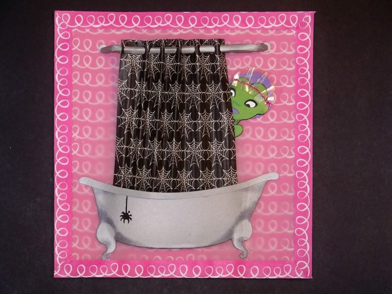
Who's Afraid of Spiders? Boo! Challenge

This is my fun little entry for the Cricut Circle Blog: Weekly Challenge #4 BOO! Challenge
Create a Halloween project that incorporates some kind of transparent element (vellum, acrylic, plastic packaging, overlay, etc.)
I am having such a great time with the Mrs. Frankenstein figure on Happy Hauntings! The rendering of her face is just so pretty and the layers really are perfect. I have used the whole figure, and more recently, just the face cuts. I do plan to use her face when it is not Halloween -- without the green skin!
My personal challenge on this was to see just how much of a figure is needed in a scene. I am finding, like in this case, that the whole figure is often not needed to convey a message.

This has been the most technically difficult challenge on the blog for me. The obvious issue is with adhering transparent elements. Kudos to Jana for making us think! I used two transparent elements in my project. I knew I wanted to do another bath scene with this character to contrast an earlier one I did. You can check that out here. This time, I wanted the project to be brighter and less traditionally colored for Halloween. I used a bright paper for her background and placed vellum on top to mute the brightness slightly so it would not compete with the brightness of the figure's face. I wanted to demonstrate this by also using the same base paper as a mitered border without the vellum. (This is called 'making sure they know I used a transparent element'). The border also serves to hide the glue that holds the two together and that shows through!
The shower cap is my second transparent element. This is made from the protective shield that comes on Cricut Expression mats! I always keep them even after the mat is thrown out so I have lots of them to play with. I pleated it and then stitched it in place with thread. Then I stitched it to the paper figure! This solved my problem of adhering it to the head.
The figure's face was cut using The Bride of Frankenstein from Happy Hauntings, page 31, cut at 5". I hand-cut the hair and shoulder. I inked it all in black.
The tub is from Splish Splash and cut at 2-1/2". I used this tub at this size in a previous project. This time, I inked it and really like the effect. The shower rod and shower curtain were hand-cut. I really like the spider web paper. Why does she have spider web paper if she is afraid of spiders you ask? hmmm... Why do I have snake skin shoes if I hate snakes? Hard to say. I just like how that paper brings back the Halloween theme.
The hanging spider is also from Happy Hauntings, page 54, cut at 2".
I hope you like my project. Whacha think of hot pink for a Halloween color? I am thinking hot pink is good for all holidays!

Wednesday, October 20, 2010

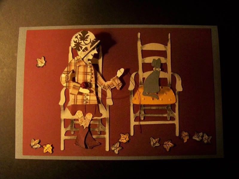
Cricut Circle Weekly Challenge #3: AUTUMN SPLENDOR! Color Challenge

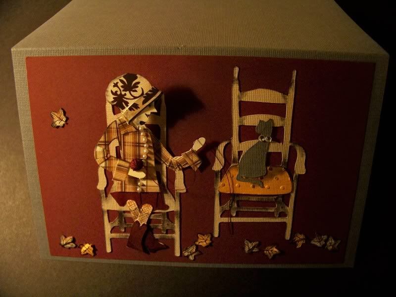
I have been asking myself how do I make a standing die cut figure into a seated one. I have been bothered by that for a few weeks now. Ever hopeful that a front-facing seated figure will show up on a cartridge, I was holding out until now.


This week's blog challenge only required that the colors gray, orange, tan, and burgundy be used, along with texture. This was not nearly as hard as creating a seated figure with a twist at the waist (knees forward and shoulders sideways). This took every bit of my memory from studying nudes in college art classes to pull this off. The problem comes in with the chair, which is rendered as though you are looking at it from above, not eye level, which means you need to see more of the thigh with perspective that is the same as the chair.

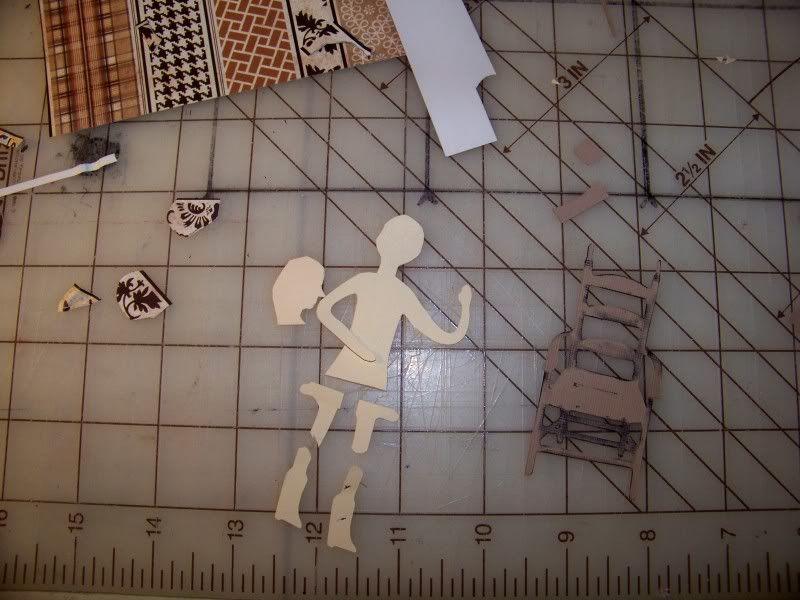
I started this by using Country Life. This is the figure that is playing the guitar. I chose her because her arms were out and active and she was partially turned. I cut her initially in flesh to start. Then I cut her up!

I manually cut away her guitar and hat/hair. I cut around her hand to separate it from the clothing. I decided I wanted her face in profile so I cut a second head and started thinking about her hat. I cut out her chair so I could place the parts on it to be sure my cut sizes were correct. For the chair (also Country Life), I simply cut away the cat. I inked it to get a little depth.

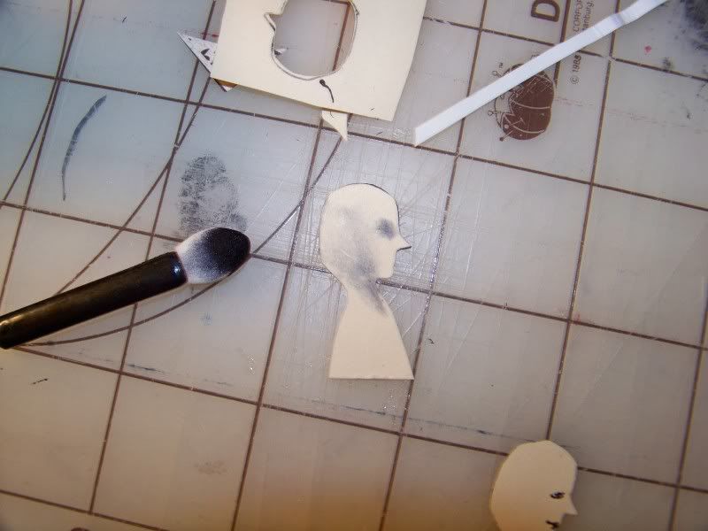
I shaded her face after doing a mock up to be sure where the shading would be placed.
Then I started working with the hat.

Next, the body. The die cut figure is already turned a bit, but I wanted to emphasize this. I also needed her to twist a bit since the chair is facing forward, so too would her hips and knees. This was done by cutting away her arm, popping up her body from it, and adding a line of pearls that work like a little arrow to really show off the twisting by simply shifting toward the middle of the figure as it approaches the waistline.

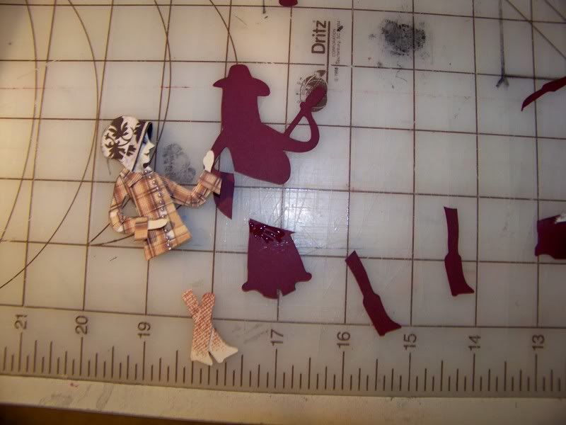
I wanted to use a plaid paper for her clothing. The challenge here is that a bent arm means that the plaid should break up caused by the folds at her elbow. I did this by cutting little wedges of the plaid and just glued them on top of the shape.

I added french cuffs to the shirt, that line of buttons, and then started working on the lower body. Can you tell I was putting this off?!

I used the knees, calves, and feet from the figure cut in flesh. I used a bit of ink and a stamp with a mesh design to create pantyhose texture. Then I crossed her legs as a ploy to help the viewer see the figure as seated. Then I cut the figure again in burgundy. I cut away her upper body. I used the skirt and boots. The boots were simply glued to the flesh-colored legs and the skirt was glued on behind the shirt. I did add a few pieces of skirt color to emphasize the shape of her thighs. I just glued them right on top of the skirt, careful to cut out her knees.

I cut another chair, this time, keeping the cat for my gray element -- and to give the figure something to be turned toward! The cushion was embossed and inked and voila! My orange element! Since the challenge was 'Autumn Splendor' I decided a few leaves tossed about might be in order. These are from Straight from the Nest.


I think I made this project a bit more work and a bit less fun, but I feel like I am on the right path for creating seated figures. I have so many ideas that require seated characters. Now, I might just be able to complete them!

Thanks for looking at my project. Can you believe it? This one is actually a card!

Sunday, October 17, 2010

Circle Blog Monthly Challenge for October!

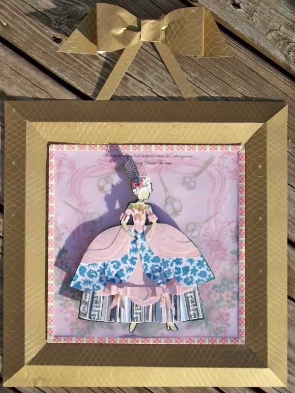
This is my entry for the Circle Blog challenge CELEBRATING CREATIVITY. I knew from the moment that this challenge was announced, that I wanted to do a character in a Louie style of garment. I have been working on altering the clothing for die cut figures in order to pull this off.

This challenge requires using the 'shadow feature', patterned paper, and embellishments to create a scrapbook layout or home decor project. Patterned paper and embellishments are par for the course for me, but shadow feature is what makes this one a real challenge!

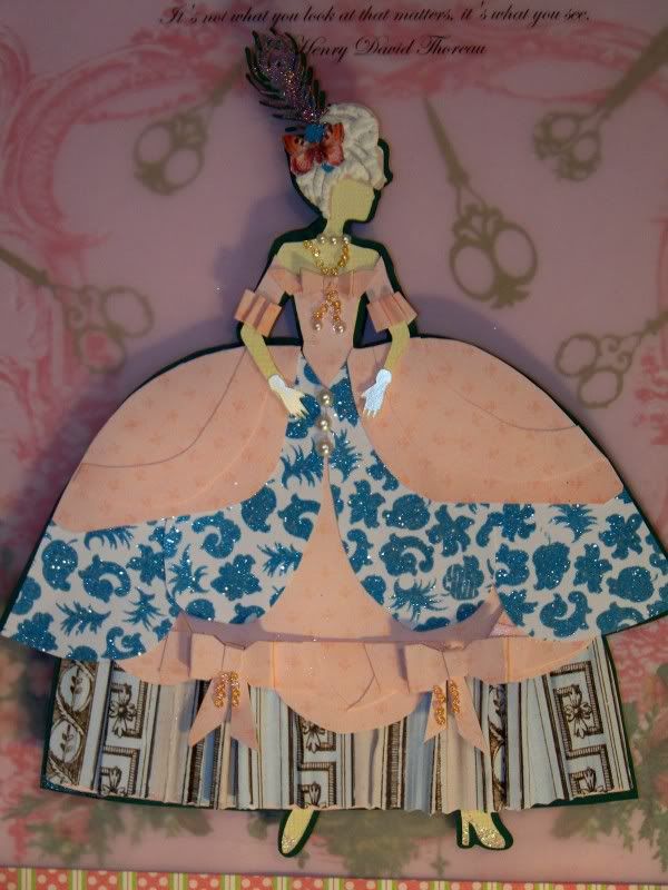
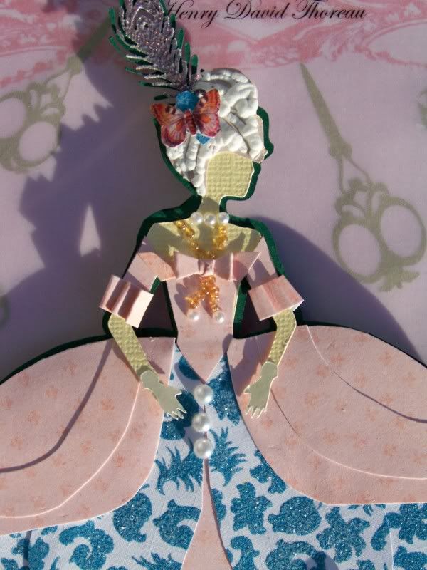
I have been waiting and hoping that I would get Shall We Dance for this project and then remembered my ignored Forever Young cart that is loaded with figures I have never used! My figure is from Forever Young (page 29), cut at 6". I hand-cut that dress with all its layers, bows, and pleats. I added rocaille beads and pearls. The headpiece features a peacock feather from French Manor (page 47), cut at 3/4". I added embossing powder and heat set it to get the glittery irridescent finish on the feather. The little butterfly is one I cut from a patterned paper. I cut this figure all in flesh color and then manually cut away her arms from her clothing. By adding the glove from Sentimentals (page 25), cut at 1/2", she has fingers! Her powdered wig is made by using Liquid Applique.

This is where that little detail about shadow feature got tricky. I really tried to think of just a shape that could be used for the requirement, but sometimes, the project really dictates what is needed. I wanted this figure to stand away from the base. I achieved this by reducing the saturation of the background colors, popping up the figure 3/8" off the page, and using the shadow feature. I cut the shadow for the figure on the cart and then hand-cut the outline of the skirt. Because Sentimentals does not have a shadow feature, I created a "shadow" of the feather by cutting it at 1". All the shadows were glued together and placed behind the figure.


The background took me longer to figure out than the figure. I wanted it muted and with an element that represented creativity - for me, that symbol is SCISSORS!! I love shadow quilting and used that concept to create my background. Shadow quilting is where shaped elements are sandwiched between a base fabric on the bottom and a sheer on top. The shapes are seen through the sheer and quilted around. This creates a new fabric! With this project, I used a beautiful paper by Melody Ross, covering up her text by super-imposing pieces I cut up from a second page. I glued on various embroidery scissors from Sentimentals in 1-1/4" and 1-1/2". (There are three styles on that cart and they are so beautiful! I was thrilled to get to use them all.) I covered the paper with a sheet of vellum. This reduced the saturation, or brightness, of the paper and looks like the scissors were part of the paper. I also printed a quote from Henry David Thoreau, "It's not what you look at that matters. It's what you see." I wanted to emphasize the theme of Celebrating Creativity with this quote.

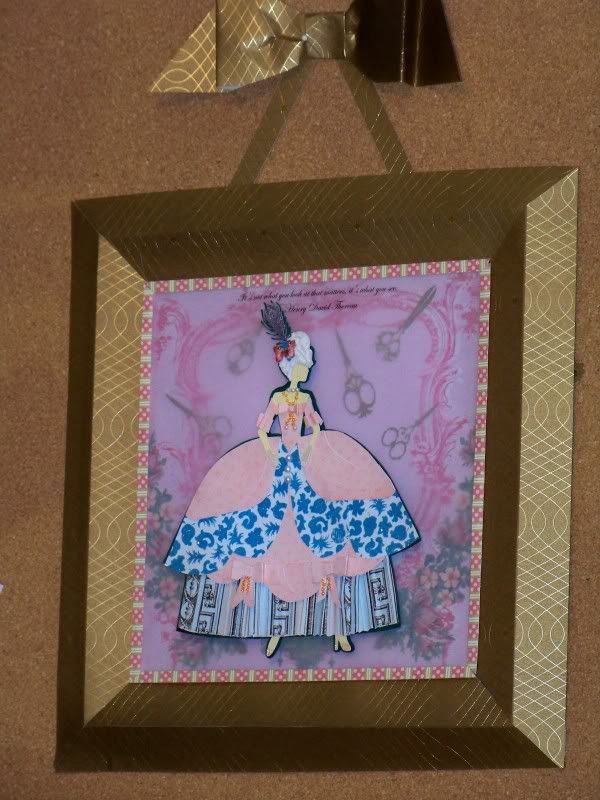
Since this is a home dec project, I wanted to find a way to finish it by framing it. Part of my goal in this is to learn alternative presentations; part is to follow the theme of creativity. I did this by creating a paper frame and paper ribbon hanger. I cut two inch strips of a beautiful Martha Stewart paper, mitered the corners, scored down the middle, and assembled it into a frame shape. I hand cut the ribbon and glued it all together. I am so happy with the presentation. I just didn't want to be stuck with a shadow box and wanted to create my own options.

The frame finishes at 11-1/2" by 11-1/2". The paper bow and hanging strips adds an additional 3-1/2" to the height of the project.


Thank you for looking at my entry!

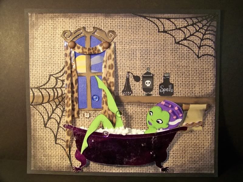
Monster Beauty Treatment!


I am having a great week! LindaK has given me a shout-out on her blog The Paper Boutique and Sweet Sassy Diva has asked me to be a guest designer and is featuring one of my vignettes on her blog!

This is my little Halloween tribute. I made this for Bobbi Jo last week during our Stay-At-Home Swarm, but didn't share it until now. It was killing me! I had so much fun with this!


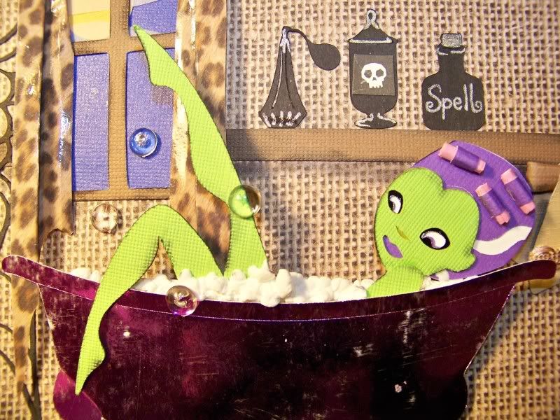
This is something I have had on my mind for a while: how to combine figures on the carts together to get unique characters or poses. This is made with Mrs. Frankenstein on Happy Hauntings (page31) and the reclining girl on Rock Princess (page 37). I did trim down the monster's hairdo and created little hair curlers by simply rolling paper into little tubes. She is inked in black.

The bathtub is from Splish Splash. I wanted a claw-foot tub and found that terrific and creepy hand on Happy Hauntings (page 47) to use for this. I sanded the foil paper to scuff up the tub, which was cut at 2-1/2" from paper I bought super-cheap because it was damaged. "Damaged" is just what is needed here! (Have I told you I like discounts?)

The window is slightly altered from October 31st. I manually cut away the shutters and sill. I love the arched top with its jagged curls. I hand-cut a swag-and-jabot window treatment and created an outdoor scene behind the window.


That bathwater is made from Liquid Applique. It adds dimension that helps create the illusion of a filled vessel. Those soap bubbles are flat-sided beads. I love those!

The spider webs are from October 31st, manually cut as needed to fit. These were cut at 4".

The room details were in the back of my mind throughout this project, though I really had not figured them out until I started adding them. The potion bottles are from Splish Splash with a few details drawn in with a silver gel pen. (The little skeleton is a happy accidental find -- a bit of a printed paper that I had in my drawer of little scraps.) I had so many ideas of a bathroom filled with little potion bottles for her. Sometimes I change my mind over and over while doing a project. The woodwork and towel rack were hand-cut. The towel is slightly altered; it's from Everyday Paper Dolls.

I heavily inked the corners of the room to give the effect of grubbiness for this haunted house bathroom. The vignette is mounted on a black mat and finishes at 6-3/4" x 8".

Thank you for looking at my work. I hope it makes you smile...

Edited November 14, 2011 to add:  This piece has been published in the October 2011 issue of Cricut Magazine!  Photos were contractually removed and have now been replaced.  This physical piece is now property of Paige Evans but copyright is still under my ownership and photo rights are mine by agreement.   ~nsh-m

Tuesday, October 12, 2010

Virtual Swarm Challenge Projects


This past weekend was the Swarm in Utah. I just could not go and was so disappointed. Those wonderful Cricut Circle gals, AllisonF and Doxieluv01 (Caroline) created group therapy for those of us left behind with a multi-day challenge! This was a kind of virtual swarm. These are some of the projects I posted.

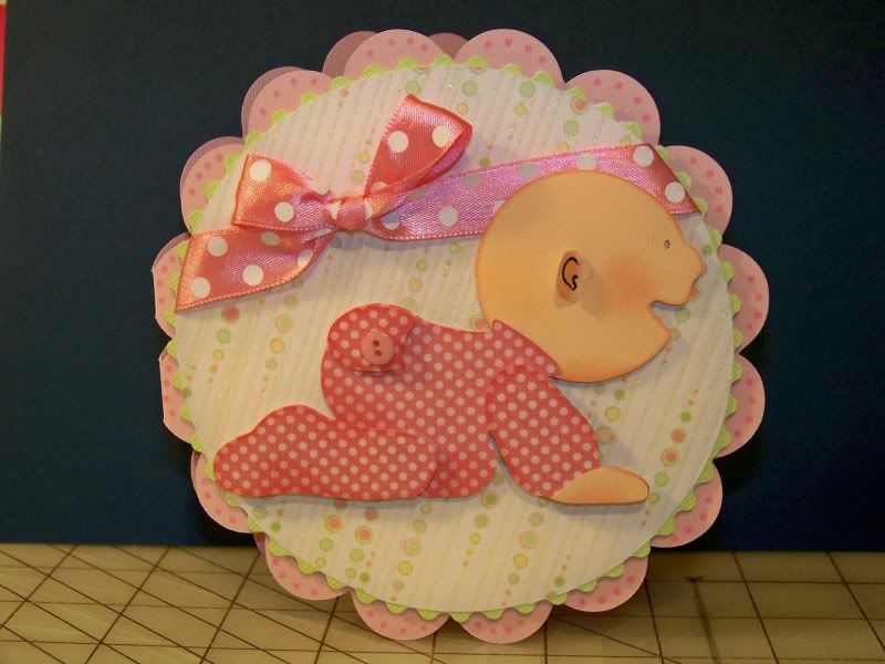
This was my entry for the Circle challenge on Thursday. I used Everyday Paperdolls, cut at 5". (I did hand cut an ear for that poor baby - why did they miss that?) I used George for the top circle-- I think also at 5" real dial size. The green circle was cut at 5-1/4 or 5-1/2 (not sure) then I used those scissors that make me cuss to get the ric-rac edging. Mini monograms with CDS set at 6-1/4, welded & nudged, and one side flipped. The printed papers are from a stack called Nana's Nursery. Ribbon and button from my RAK package. Other papers are from my stash.

This was my entry for the Sketch Challenge. We could choose between a page lay out or a card.
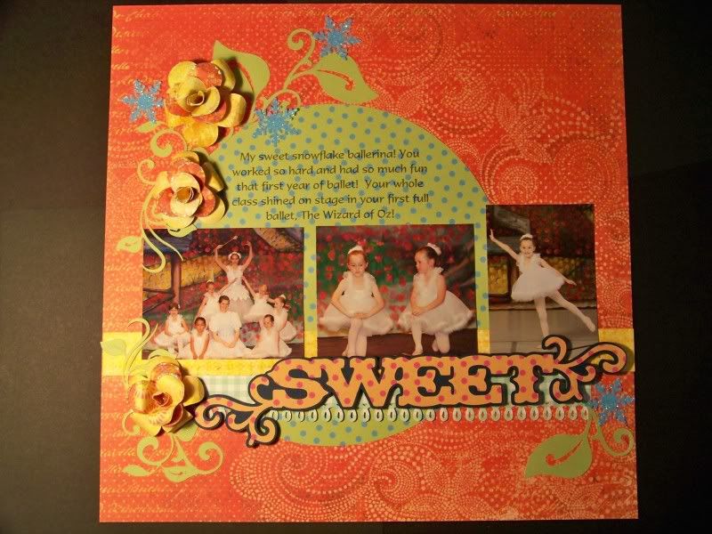
I really am not very good at making scrapbook pages and want to do wonderful lay-outs like the talented girls on the Circle Blog. They wow me and I want to try a bit harder to get results I like for my pictures. I decided to use the LO sketch. I picked that over the card sketch hoping that a little practice might improve my work. My subject could not be any closer to my heart -- my sweet girl and her ballet efforts. Her class were all snowflakes who killed the poppies so that Dorothy and friends could make their way along the yellow brick road-- in case you are wondering why I have snowflakes on here. Now, you should be asking why I have yellow roses for the poppies. Let's just say that was artistic license.

I used George for the circle, cut at 7-3/4". I used Rock Princess for "Sweet", cut at 2-1/4". The vines and leaves were from Wall Decor & More, cut at 2-1/4". I used the flower on George (blackout/shadow)cut at 2" and 1-3/4" to make the 3D flower. I learned how to do the flower by watching a video that Kathy Orta did. The snowflakes were cut with a Martha Stewart punch.

My daughter and I exchanged art projects during the challenge on Sunday, which required embellishment. I made sure to put lots of embellishments on the one I made for her so I could use it for the challenge. This is for her room. I guess we will just pop it up with thumb tacks.

I bought this cart, Live Simply, for this frame. Once my daughter saw it, she wanted a "girl with all the animals" but luckily she didn't make me cut ALL of them!! The girl is from Rock Princess (yes, I have Happily Ever After, but the style is all wrong for these animals). I changed her up a bit to turn her into Snow White, cutting and reversing her arms, adding locks of hair, cutting a basket, and changing her dress. I was really pleased with figuring out the dress. She is cut at 4-1/4" Everything else is from Live Simply: Butterfly 3/4", Tree 4-3/4", Fox 1-3/4",Deer 2-1/2", Bird in next 1", and Frame 8".

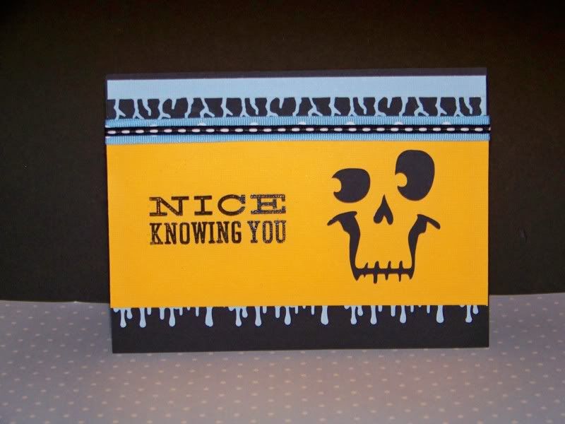
This was my entry for the Monday color challenge, using orange, black, and baby blue. This is Pumpkin Carving cut at 2-3/4" with the Drippy Goo and Cracks Martha Stewart edge punches. This is a Martha Stewart stamp. I almost never put a sentiment on my cards, but I LOVE the creepiness of this. I used a little heat embossing powder to get it good and dark.

I had such a great time creating these little paper projects. I almost forgot about missing out in Utah. Thank you for checking out my projects.

Saturday, October 9, 2010

Queen of the Tatas -- Circle Blog Weekly Challenge #2


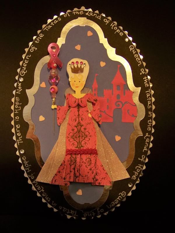
This is my entry....a silly little plaque with a bit of humor mixed in for my mom!

In honor of my mom, I decided to have a little fun with a subject I NEVER thought I would use as a theme. I have always thought that there was plenty of awareness of the issue of breast cancer. The cancer itself has seen to it.

Since this week's challenge, however, is "in honor of Breast Cancer Awareness month," I decided to lighten up and focus on my mom and just embrace it! Although my mom is a survivor, it hardly personifies her. In fact, it is easy to forget because of her personality. Mom is the most generous, whimsical, thoughtful, and understanding person I know. She is always thinking of others.

It is in that spirit, that I cut this, The Queen of the Tatas in the Land of Hope. The Queen is cut from Country Life (page 30) at 4.5". I hand-cut a dress and glitter-covered cape, using the cart dress as a base. I also added a little anatomy-- I mean she is the QUEEN of the Tatas, so she needed some! My mom is big on hair and makeup (I must be a disappointment to her on this!) and so she needed a hairdo. This is hand-cut with curls from PaperDoll Dress up. I use the waste from the bride hair cut at 5" (not the actual hair itself thought). Her crown is from Rock Princess (page 30), cut at 1/2".

All queens need a scepter. This one is from a sweet package that was sent to me from CriCutCase (Anne) on the Circle MB. She actually said she had looked up someone who had posted about a mom who survived cancer before sending me the beautiful pink package of gorgeous embellishments. I added a few glue-on stones and made the pink ribbon at the top. The ribbon is from Stand and Salute (page 31), cut at 1".

The challenge required that we use at least three elements including the color pink, ruffles, scallops, flourishes, glitter, and jewels. I have yet to embrace the world of flourishes, so I decided to include a flourish! I love the castle on Wall Decor & More. I used the layer only with the flourish, cut at 2.25".

The frame is from French Manor, cut at 1.5". (Yes, I typed 1.5. I have no idea why this was programed to be so big, but I learned after a few trials!!) The black oval is from George, page 114, cut at 8". The silver oval behind it as been scalloped with scissors. It was also from George, but cut at 8.5".

Those little scattered hearts are a bit of an inside joke in our family that I will let you in on. My mom has, for years, put confetti in all her cards. Of course, unsuspecting recipients tear into the card and confetti bits go all over the place. Everyone who had received a card from her (and that is a lot of people because she makes and sends LOTS of cards!) opens all mail from her in the most careful and controlled way. It is kind of funny when she forgets the confetti to watch someone open the card. Kind of like a bomb that doesn't detonate.

Thanks for looking at my little project. I have been working on a few fun things that I will be posting soon.

Sunday, October 3, 2010

The Sunday Challenge -- Party Planning

This has been such an ego-boosting weekend! I was cleaning up this blog a bit so I could use it to post pictures on the Circle Blog and suddenly got a follower..and another. I was shocked! I even started a thread on the board that said that! Later in the day, minding my own business, lurking on the MB and reading everyone's posts, I get to one that called out a great project. Then I read my name. Holy cow! That was a post about me! Then the replies... it actually made me cry!

I called my husband up to read some of the posts. I just could not believe the sweet and kind words that were being said about my projects! And then my followers list started growing. That was so much fun!

This morning, my husband was teasing me about it a bit, asking if I would be harder to work with now (I work for my husband). I just want everyone to know how much the kind and positive words really mean to me!


Well, today is Sunday and that means I get to Cricut! Two days of papercrafts in a row -- that NEVER happens! This is a project I did for Doxieluv01's Sunday Challenge on the Circle MB. The challenge is to use embossing folders or embossing powder on a project.

I changed my mind on this only a few hundred times. The highlight of the whole project was using the Liquid Applique on the cake for icing. This paint-like liquid just puffs up like crazy when heat is applied. I really don't see how it looks anything like applique, but it looks exactly like frosting! This was a fun surprise. I bought this not really knowing what it did. The package doesn't give too many clues either. I don't know why I even opened the package and used it but I am so glad I did.

The table is from Sentimentals, page 42, cut at 3" without the drawers, and inked. The table cloth is hand cut.

The chandelier is from French Manor, page 37, cut at 2-1/2". I sprayed it with Glimmer Mist. The shades are hand cut.

The figure is from Country Life, page 36, cut at 6". I used the swiss dot Cuttlebug embossing folder and glue-on pearls to the dress that I hand cut. Her hair was trimmed and curls were added. The curls are the waste from cutting the bride's hair on Paperdoll Dress Up at 5"-- didn't use the hairdo just the waste that was cut out.

The wainscoating was done with Cuttlebug Decorative Squares #2. I sanded the paper a bit for a little color.

The cake stand is from Sweet Treats page 42, cut at 3/4". The cake is also from Sweet Treats, page 39, cut at 1-1/2". I coated it with the embossing pad and then sprinked on Holographic Embossing powder. I really like the color that it turned out. (The paper was a light pink). As I mentioned, the dimensional accent is from Liquid Applique.

The banner is from Country Life, cut at 1" and then sewn together.

Thank you for looking at my project! I have another work week to go before I get to craft again... until then!

Saturday, October 2, 2010

I have been in my own little world...

I have been over-indulging in paper-crafting lately. These are a few of the projects I have been working on.


This first piece is the latest one. I have been doing cards, but along the way, realized that these are cards I will never send. Even if I wanted to send them, they are so dimensional, they could not be sent! I would need a box!

This one features a figure from Rock Princess. I manually removed her guitar and gave her a bit of couture, even changed her hair. Like her necklace? That is a bit of required challenge bling.


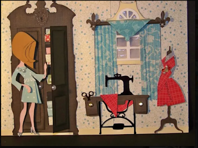
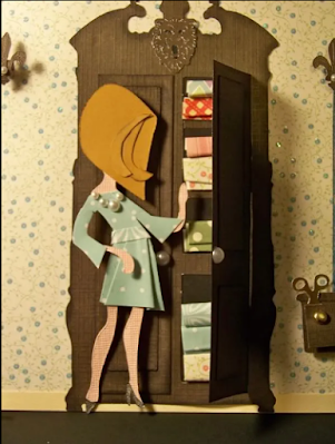
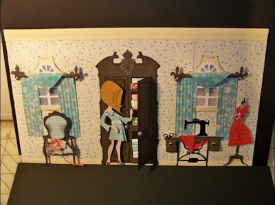
The windows, finials, armoire, and even the lion's head on the armoire, are from French Manor. So many people hated this cartridge. Not me! I love it! I created doors and shelves using the elements that were cut. Stacked fabric is made from folded and rolled papers from my stash.

The dress form is from Summer in Paris. I created my own little folded dress and added the required [for the challenge] pearls and stones. I just got a tool to heat set stones. I can't say I love the tool. Glue worked better for me. Maybe a bit more practice! The sewing machine is from Country Life. I changed the drawers a bit to be larger. Who in the world would want those tiny drawers? Not my Rock Princess! The scissors are from Happily Ever After.

The widows are from French Manor. I used cloud paper and vellum behind the window. Then I used a crystal lacquer to give it a gloss like glass. This was the fun part! I created the wood poles by hand. The finials are from French Manor. The drapes are hand-cut and then crimped. A bit of Glimmer Mist and a bit of detail with a pen to look like pleated drapes.

The chair is from Sentimentals. I love this chair. With a bit of inking, it really looks dimensional. More folded fabrics and a skinny strip of paper rolled to look like ribbon drape onto the floor.

Last night started this idea of creating rooms with another challenge. 


This one was for a challenge using prints. This is right up my alley! The window is from French Manor. The valance is too! (It is an upside down border). The stove, utensils, pot, and potholder are from the cart From My Kitchen. The figure is from Country Life. I created a look of cabinets by using the drawers off the desk in Sentimentals.

I was still working out how to do a window on this one. I used a brochure picture from My Old Kentucky Home. I definitely do not like this now that I have worked out the vellum and crystal lacquer technique!! (It is distracting now that you are looking at it, right!?) This one is a card too- but again, why did I do that?

This is a challenge card. 


The text in the blue circles says "Dang Bees". I just think the word 'dang' is hilarious for some reason. The challenge involved using a kit. Not having a kit, I bought a paper pack at Walmart that had coordinating papers, stickers, puchouts. This is what I came up with. The figure is from Country Life. I removed the dog manually. I finally figured out shading a tree trunk. The grass is from an edge punch. Clouds are from Serenade. I love the clouds on that cartridge!

The next challenge involved using only the colors pink, black, white, and gray. I loved this challenge. I had never done anything with color restrictions. This pushed me in a creative direction I would never have gone and I love the results!


The figure and hanging clothes are from Country Life. The edges are made with that terrific tatting edge punch from Martha Stewart. How does she know what I like? I used a mini toile for the apron and Hocus Pocus paper for the jeans that I sanded to show the pink underneath. Someone on the MB called it "urban chic" which just made me smile! They are so nice to me and my silly creations on the Circle MB! Just really boost my confidence!

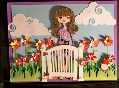
This was for a flower challenge. I wanted it to be very dimensional. There are seven layers to this card. (Again, this could never fit in an envelope so why did I think "card" on this?


The images are from Rock Princess, Freshly Picked, Serenade, and Pagoda.

The Rock Princess was manually altered -- I actually removed her arm.

The gnome, gate, and background flowers (without petals) are from Freshly Picked. I bought that cart for the gnome, so he was going to make an appearance!


The flowers are from Pagoda. I use the shift image on two flowers and glue them together.
I was new to shading so I was hooked once I figured out how to shade on white and get an aged or outdoor look.

I used a ton of pop dots and squares for this project. That was one of the fun things on this card for me.

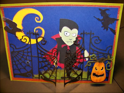
On to the next group-- Halloween. I used to love Halloween, then with all the anti-Halloween stuff at Piper's school, I kind of got away from it. This is impossible with carts like Happy Haunting! Check out these! 


You can see the idea of an open door started here.

Don't you just love the way PC made this guy? This is one of those good news/bad news things. Good news: I will get a great ghoul every time. Bad news: I will get the same ghoul everyone else gets. This is a really hard cart to make special or different.

Nonetheless, I have used it a lot. I also used October 31st and Pumpkin Carving on this card. (Another card that would be impossible to mail due to the 3D nature of the elements.


This is from a challenge that (not too challenging) asked that we use our favorite cartridge. I have too many favorites! I decided to use Happy Hauntings for this one too. It was my favorite that day.

Here is what I like the most: I figured out how to make black cardstock look like brushed metal. This was totally an accident, but having figured it out, I have used it over and over.

If this was the most un-challenging challenge, the toughest was one for Olive Juice Studio. We had to make a project that hangs with a Halloween theme, black and white picture, a key or bottlecap, one of several words (I used eerie and mothballs), and gauze or a bandage. This is what I came up with and I am so happy with it. I really had so much fun with it. It was one of the few challenging challenges!!


I used a picture of Piper from a couple of Halloweens ago. This is actually at a church function. The ghost was the real challenge. I glued the gauze to vellum then used the roller white-out that I scratched to look shaggy. This was necessary not just to make the ghost have a bit more to him, but also I needed areas that weren't see through for the pop dots I used! I loved this project!

The other Halloween challenge that I did, and was a lot of fun, was one that required that we bling out any project. I picked Halloween just because I love that Happy Haunting cart!

Check out her glasses! She was a hoot to do. The figure is from HH, the shape behind her is from Superman (yay for me for finally finding a use for that cart!!!!), and the glasses are from Paisley.


I got to use an adhesive glue pad and glitter to bling out the print on her dress. I LOVE doing that!!

Her glasses were covered in glue and glitter and shaped a bit and glued down. The earring and cufflinks were the three required brads for this challenge!


This was very quick and just a fun tension tamer! I sometimes get caught up in thinking that there have to be tons of details for any of this to be any good-- probably because I am using a die cutter and what is the art in this if I don't really work at it!

The idea of a lot of small elements and details probably started with a fall challenge that Provocraft sponsored on their message board. I loved playing with these leaves. I found great paper in my stash and inked like crazy those little guys! I didn't know how to do tree texture then, and it shows!


The little kid is from Winter Frolic. I was so pleased with him. This is a project in early September, and at that time, I had not used characters in ways other that what the guidebook illustrates. This little sledding kid became a kid playing in the leaves and that really opened up a new way of looking at the figures. Really helpful for the projects like the one I did today (the first one here).

So.. these are some of the projects that I have been working on.


I have to figure out a way to finish them- -let's hope I find frames and don't have to make something! That could be a whole new obsession!


Cricut Circle Weekly Challenge


This is my entry!  This is a bit of art for my craft room! It finishes 6-1/2" x 11".

The armoire is from French Manor, cut at 5-1/2". Doors were cut by hand at 1" x 4-1/8". I used the elements that the Cricut cut on the doors. I also added shelving by hand. The lion head on the top of the armoire is also French Manor, cut at 3/4". I added rolled and folded papers to look like folded fabric. Pearl accents create the doorknobs.

The windows are French Manor, cut at 2-1/2". The finials are from French Manor, page 66, cut at 2/3", and have pearl accents. The drapes were cut by hand, sprayed with Glimmer Mist, and put through a crimper. The crimped lines were outlined with blue Micro Sharpie. The glass in the windows are backed with a cloud-printed paper, then vellum. I used Glossy Accents on each pane of glass to look more realistic. The valances were hand cut and curled.


The chair is from Sentimentals, cut at 2-3/4". Inking really helped to make it look dimensional. Folded papers are set to look like fabrics; rolled strip of paper is ribbon.

The sewing machine is from Country Life. Cut in shiny black and without the extra detail on the cart. It was cut at 2-1/2". I used drawers from the desk on Sentimentals instead of the smaller drawers on Country Life.


The scissors sticking out of the drawer are from Happily Ever After, icon, cut at 1/2".

The dress form is from Summer in Paris. I cut it twice, once for the wood base, and once in gray print for the body. Cut at 3-1/2". I added my own little folded paper to make a dress draped on the form. Pearls, glue-on, and heat-set stones were added.


The figure is from Rock Princess, page 30. I used the flip feature and cut at 4-1/4". I hand-cut her new dress- a bit more of a couture look for her! I changed her hair a bit and inked the added-on locks of hair. Pearl accents create her necklace. I manually altered her, cutting away her guitar. I cut her body twice so I would have a "free arm" and legs in a skin tone.

I really loved doing this challenge! I am learning how to alter figures for my projects, create dimension, and adding my own hand-cut elements to make pieces appropriate for my projects.


But wait! There's more! Click 'older posts' above!

But wait!  There's more!  Click 'older posts' above!