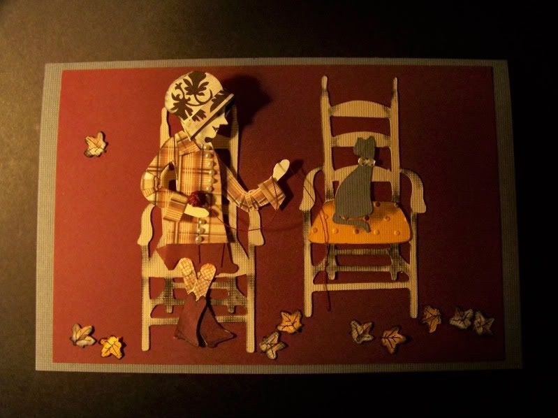
This week's blog challenge only required that the colors gray, orange, tan, and burgundy be used, along with texture. This was not nearly as hard as creating a seated figure with a twist at the waist (knees forward and shoulders sideways). This took every bit of my memory from studying nudes in college art classes to pull this off. The problem comes in with the chair, which is rendered as though you are looking at it from above, not eye level, which means you need to see more of the thigh with perspective that is the same as the chair.
I started this by using Country Life. This is the figure that is playing the guitar. I chose her because her arms were out and active and she was partially turned. I cut her initially in flesh to start. Then I cut her up!
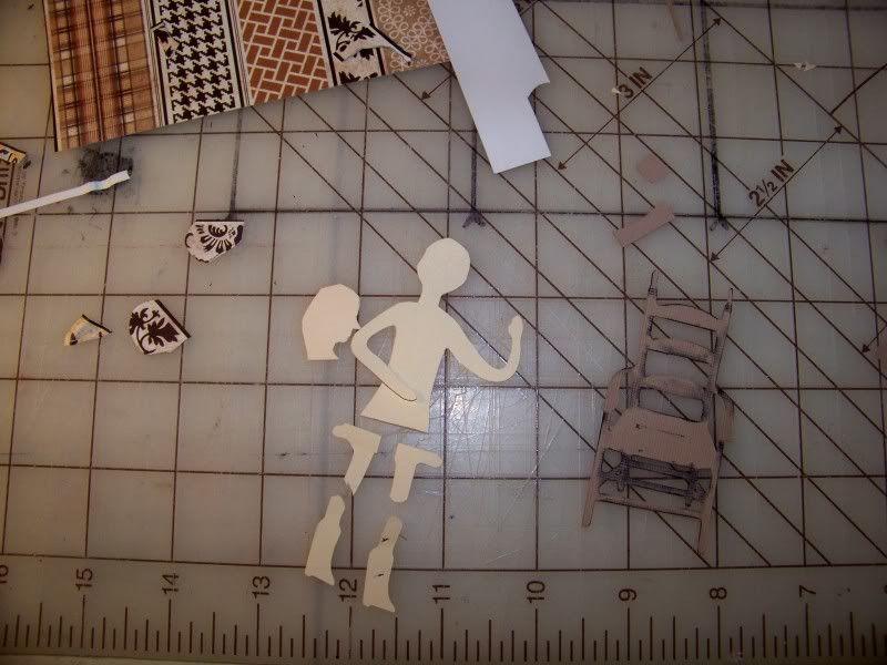 I manually cut away her guitar and hat/hair. I cut around her hand to separate it from the clothing. I decided I wanted her face in profile so I cut a second head and started thinking about her hat. I cut out her chair so I could place the parts on it to be sure my cut sizes were correct. For the chair (also Country Life), I simply cut away the cat. I inked it to get a little depth.
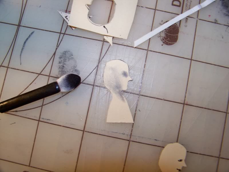 I shaded her face after doing a mock up to be sure where the shading would be placed.
Then I started working with the hat.
 Next, the body. The die cut figure is already turned a bit, but I wanted to emphasize this. I also needed her to twist a bit since the chair is facing forward, so too would her hips and knees. This was done by cutting away her arm, popping up her body from it, and adding a line of pearls that work like a little arrow to really show off the twisting by simply shifting toward the middle of the figure as it approaches the waistline.
 I wanted to use a plaid paper for her clothing. The challenge here is that a bent arm means that the plaid should break up caused by the folds at her elbow. I did this by cutting little wedges of the plaid and just glued them on top of the shape.
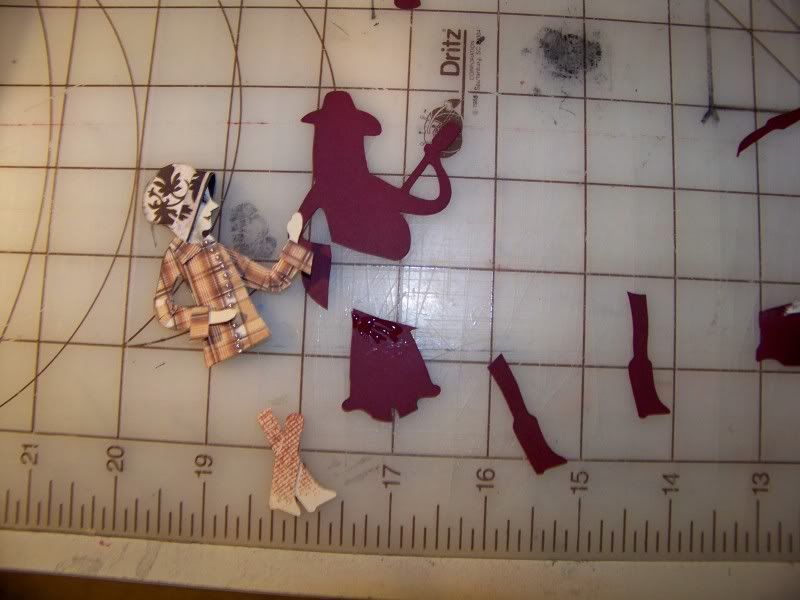 I added french cuffs to the shirt, that line of buttons, and then started working on the lower body. Can you tell I was putting this off?!
I used the knees, calves, and feet from the figure cut in flesh. I used a bit of ink and a stamp with a mesh design to create pantyhose texture. Then I crossed her legs as a ploy to help the viewer see the figure as seated. Then I cut the figure again in burgundy. I cut away her upper body. I used the skirt and boots. The boots were simply glued to the flesh-colored legs and the skirt was glued on behind the shirt. I did add a few pieces of skirt color to emphasize the shape of her thighs. I just glued them right on top of the skirt, careful to cut out her knees.
I cut another chair, this time, keeping the cat for my gray element -- and to give the figure something to be turned toward! The cushion was embossed and inked and voila! My orange element! Since the challenge was 'Autumn Splendor' I decided a few leaves tossed about might be in order. These are from Straight from the Nest.
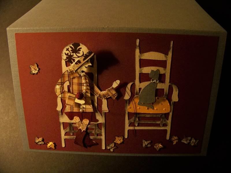
I think I made this project a bit more work and a bit less fun, but I feel like I am on the right path for creating seated figures. I have so many ideas that require seated characters. Now, I might just be able to complete them!
Thanks for looking at my project. Can you believe it? This one is actually a card!

8 comments:
I was thinking as I read this that the last time I read this close of detail was when I was ordering Threads Mag and a mag, I think, was called Victoria. There was always something you just did not want to miss.
My fav parts of this detailed description (that I would not have noticed had you not said anything) was the nylons!!!! and the elbow triangles. You cleaver cleaver one! :) Of coarse you took art in college. sigh.
I was thinking. You may not want my opinion but there it is anyway. hahaha Maybe some shading at the waist area to push it back visually. Oh.. and a shorter shirt that stops higher. Just my thoughts. But hey! I didn't go to college or art school so who am I? *smiling big*
TR
I ALWAYS love ideas for improving!!! I really want to figure this out! Thank you TR for this and all your help!
BTW, I love Threads Magazine! I don't sew much any more but I still love it. My mom subscribes to Victoria -- or at least she used to. That's funny that you picked these two!
Since we seem to like the same things...... :)
You just may like this blog:
thepioneerwoman.com
AND she is giving away a new camera today!
I love the winter/icy picture of your dear daughter in the pink coat. Holding the barbi. Pioneer Woman holds contest for different themed pictures. This is a good one to put in. She likes that depth-of-field look referring to how much of your photo is in focus.
Also, I just got around to reading your profile. Our passions change I think. As long as our love for our lord doesn't we will be fine in whatever we do. :)
hugs, TR
I love the card. Your ideas are wonderful. I dont think I would have even attempted this but Im so glad you did. It gave me a whole new way to look at my cutouts. Thank you so much for sharing.
Terri
As soon as I saw this entry I knew that it was your's. Thank you so much for including your thoughts and creative process. You have a generous spirit and it comes thru in your sharing. Wonderful work. You have made me look at my cartridges in a whole new way. Thank you. Penny
You never cease to amaze me. You take these cartridges to a whole new level of fun. Again it looks amazing. Looking forward to what you've got up your sleeve for next week.
I LOVE seeing your takes on the challenges each week! Everything you create is truly a work of art. I could sit and stare at the details for an hour! LOOOOVE! :D
Nadia... You are simply AMAZING! I always look forward to seeing your creations. I would love to try to make a scenery card one day... thanks for the inspiration.
Lori
http://got2bcrafting.blogspot.com/
Post a Comment